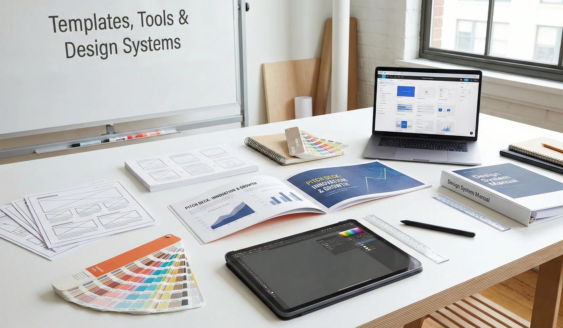
Templates, Tools & Design Systems: The Infrastructure of High-Velocity Fundraising
Stop building from scratch. Scale your fundraising with professional pitch deck templates and design systems. Learn the tools elite founders use to close $10M+ rounds in 2025.
PILLAR 6: DESIGN PRINCIPLES
12/26/20256 min read


Templates, Tools & Design Systems: The Infrastructure of High-Velocity Fundraising
In the hyper-competitive venture capital landscapes of London, New York, and San Francisco, speed and precision are your most valuable assets. While most founders view a pitch deck as a one-off creative project, elite founders treat it as a Design System. In 2025, the "Canva-fication" of pitch decks has created a sea of sameness. To stand out, you must move beyond generic templates and build a scalable infrastructure that demonstrates Operational Grip.
The brutal truth? Your tools dictate your throughput. If it takes you four hours to update a single traction slide because of poor layout choices, you are losing the "Momentum" game. To win a Series A funding round, your deck must be built on a professional framework that allows for rapid iteration across different investor tiers. Your design system is the silent proof that your company is ready to scale.
This sub pillar is part of our main PILLAR 6 — DESIGN PRINCIPLES
Key Takeaways: The Structural Power-Law
System Over Slide: Build a library of reusable components (headers, icon sets, data blocks) to ensure total visual consistency.
The "Master Deck" Strategy: Maintain a "Source of Truth" deck with 50+ slides, then export curated 12-slide versions for specific meetings.
Tool-Selection Logic: Choose your stack based on Collaboration and Analytics. DocSend and Figma are the current industry standards for high-signal fundraising.
Templatizing the "Earned Secret": Create a bespoke layout for your unique insight so it never feels like it was "slotted into" a generic template.
Regional Tool Calibration: SF VCs expect interactive, web-based decks (Pitch/Gamma); London and Toronto still value the "Institutional" reliability of a perfectly formatted PDF.
1. The Design System: Building Your Visual DNA
A design system is a set of rules and reusable components that govern how your brand is expressed. For a startup, this is the foundation of Visual Branding.
A. The Global Style Guide
Before you design a single slide, define your Design Atoms:
Typography: Set your H1, H2, and Body styles (using high-legibility fonts like Inter or Roboto).
Color Palette: Establish your 60-30-10 color rule (Neutral/Primary/Accent).
Grid System: Use a 12-column grid to ensure perfect Layout, Spacing, and Alignment.
B. Component Libraries
Stop drawing new boxes for every slide. Create a library of:
Metric Blocks: Standardized layouts for MRR, Churn, and CAC.
Team Cards: Uniform headshot and bio containers.
Icon Families: A curated set of icons with consistent stroke weights.
The Signal: This level of organization tells an investor that your "internal plumbing" is professional. It suggests you will apply the same rigor to your product development.
2. Sourcing & Customizing Templates: Avoiding the "Canva Trap"
Generic templates are a "Red Flag" for Information Gain. If an investor has seen your layout 100 times before, they will subconsciously tune out.
The "Framework" Approach
Don't use a template for its look; use it for its logic.
The Problem: Most free templates prioritize aesthetics over Data Visualization.
The Fix: Start with high-quality frameworks from reputable sources (like Y-Combinator, Sequoia, or Reid Hoffman’s LinkedIn deck). Then, strip the styling and apply your own Design System.
The Strategy: Use a "Modular" template. This allows you to swap a "Market" slide for a "Regulatory" slide depending on the fund’s specific thesis.
3. The Power Stack: Tools of the Elite Founder
In 2025, the "Tool War" is between traditional static formats and modern interactive platforms. Your choice depends on your GTM Strategy and regional preference.
A. Design Tools (The Engine)
Figma: The gold standard for precision. Use it if you want total control over Layout and Spacing. It allows for real-time collaboration with your designers.
Pitch.com: The best balance of design and speed. It has built-in templates that are actually designed for venture capital logic.
Beautiful.ai: Uses "Smart Slides" to enforce alignment rules. Excellent for founders who aren't natural designers but want to avoid "Sloppiness Signals."
B. Distribution & Analytics (The Radar)
DocSend: Mandatory for tracking Investor Engagement. If a Partner spends 4 minutes on your "Appendix" but zero seconds on your "Vision," you know exactly how to lead the next meeting.
BriefLink: A rising competitor that offers more "Founders-First" features for managing multiple versions of a deck.
4. 30-Minute Sprint: Setting Up Your Design System
To move from "Theory" to "Utility," follow this rapid execution plan to professionalize your workflow:
Step 1: Export your MRR from ChartMogul. Download your latest growth metrics as a CSV or clean image to ensure Metric Integrity.
Step 2: Import into a Figma Component. Create a dedicated "Metric Block" in Figma. Paste your data and apply your primary brand colors to the bars or lines.
Step 3: Toggle "Auto-Layout" for responsiveness. Use Figma's Auto-Layout feature on your text and data containers. This ensures that when you update "$1.2M" to "$1.5M," the spacing around the numbers remains mathematically perfect without manual tweaking.
5. The Master Deck Strategy: Managing Information Flow
One of the biggest mistakes is sending the same deck to everyone. Different investors in New York, London, and SF have different "Sensitivities."
The "Deck Architecture"
The Teaser (5-7 Slides): High-level vision and "Infectious" traction. Designed to get the first meeting.
The Pitch (12-15 Slides): The core narrative you present during the meeting.
The Master Deck (50+ Slides): Your internal repository. It contains deep dives on tech architecture, full legal structures, and every possible Appendix slide.
The Follow-up: A curated version of the Master Deck based on the specific questions asked in the meeting.
6. The "Trench" Report: The $15M "System" Pivot
I once worked with a Fintech founder in London who was struggling with "Version Control." He was sending out slightly different numbers to different VCs because he was manually updating every slide in PowerPoint.
The Audit: An Associate at a top-tier fund noticed a $50k discrepancy in the MRR between Slide 3 and Slide 12. The "Trust Score" dropped to zero. The Fix: We moved him to a Single-Source-of-Truth model in Figma. We linked his metrics to a centralized data block. When he updated the MRR once, it updated across all versions of the deck. The Result: He reclaimed 10 hours a week of "Manual Toil" and regained his Metric Integrity. He closed his $15M Series A because he finally looked as organized as the business he was building.
7. Regional Calibration: The "Tool" Dialect
San Francisco: High tolerance for "Novelty." Interactive decks (Gamma/Pitch) signal that you are an early adopter.
New York: Prefers "High-Density Logic." A perfectly aligned, 40-page PDF with a deep Appendix signals Wall Street-level rigor.
London & Toronto: Value "Tradition and Reliability." A standard PDF via DocSend is the safest bet. They want to see that the "Machine" is built on solid, predictable tools.
8. Semantic Innovation: The "Digital Data Room" (New Information)
A trend for 2025 is moving away from the "One PDF" model and toward the Integrated Data Portal.
How it works: Your pitch deck contains links to a "Live" data room (using Notion or a dedicated VDR).
Why it works: It demonstrates Operational Grip. It says, "I don't need to 'prepare' for your due diligence because I am already running the company with this level of transparency."
Human Tone: This approach respects the investor's time. Instead of them asking for a "Cap Table" or "GTM Strategy," you've already mapped the path for them.
Expert FAQ: Masterclass in Infrastructure
Is PowerPoint dead?
In the venture world, mostly yes. It is difficult to maintain Version Control and lacks the Analytics of DocSend. However, for "Growth" rounds ($50M+) with traditional private equity firms, it is still the standard.
How much should I spend on a "Designer"?
At the Series A stage, spending $5k–$10k on a professional deck designer who understands Venture Capital Logic is one of the highest-ROI investments you can make. It can be the difference between a $10M and a $15M valuation.
What is the "Golden Thread" in a Design System?
It is the visual repetition of your "Key Insight." If your Earned Secret is about "Efficiency," every visual element—from your icons to your charts—should reflect that "Leanness."
Why does Google care about "Pitch Deck Tools"?
Google’s latest updates prioritize Expertise and Helpfulness. If you provide a downloadable Design System Template or a guide on Pitch Deck Logic, Google views this as "High-Value Utility." This significantly boosts your SEO for terms like "Visual Branding for Startups" and "Series A Funding Strategies."
Summary Checklist: The Infrastructure Audit
System Over Slide: Is your deck built on a 12-column grid?
Tool Choice: Are you using DocSend to track investor behavior?
Master Deck: Do you have an "Appendix" ready for the 10 most common skeptical questions?
Integrity: Are all your metrics linked to a "Single Source of Truth"?
Regional Fit: Does the "Format" of your deck match the expectations of the London, NY, or SF room?
Whenever you're ready, I can move on to the final section, "The Art of the Follow-up: Maintaining Momentum After the Pitch." Would you like to proceed?
Funding Blueprint
© 2026 Funding Blueprint. All Rights Reserved.
