Tactical Design Rules for Problem & Solution Slides VCs Actually Respect
Learn the tactical design rules VCs expect on problem and solution slides—and how poor layout quietly signals weak founder judgment.
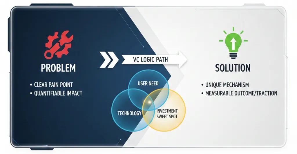
PILLAR 2: PROBLEM & SOLUTIONS SLIDES
12/14/202515 min read

Tactical Design Rules for Problem & Solution Slides VCs Actually Respect
The myth killing your raise: Your Problem slide is not a problem slide. It's a confession.
Most founders treat the Problem slide as an industry overview. A warm-up. Context-setting before the "real" pitch begins. This is the single most expensive misunderstanding in early-stage fundraising.
Your Problem slide is where a VC partner decides whether you have proprietary insight or borrowed narrative. Your Solution slide is where they decide whether you have a product or a feature. Get both wrong and no amount of polished financial modelling saves you. The partner closes their laptop. Politely. Permanently.
Here is the contrarian truth no pitch coach will say directly: a deck that is easy to read but impossible to interrogate will lose to a deck that is harder to read but forensically sound. Every time. Because decks don't raise money. Partner meetings raise money. And partner meetings are built on the structural integrity of slides four and five.
This sub pillar is part of our main Pillar Problem & Solution framework used by investors.
The Trench Report: How a £9.8M Series A Died on Slide Four - Then Came Back
A specific deal. A specific failure. A specific fix.
In Q3 2023, a London-based B2B logistics SaaS company entered a Series A process with genuine commercial traction: £1.1M ARR, 94% gross retention, three mid-market logos with recognisable names. The deck had been reviewed by two advisors and a fractional CFO. It looked clean.
The Problem slide read: "Supply chain inefficiency costs global enterprises $1.6 trillion annually." The Solution slide read: "Our AI-native platform reduces operational friction by up to 60%."
The lead partner at the primary target fund — a £180M vehicle with two active logistics investments — stopped the pitch at slide four. Not during Q&A. Not at the model review. Slide four.
Her question: "Which 60%? Of whose cost base? Measured how? Over what period?"
The founder could not answer from their own data. The $1.6 trillion figure was sourced from a 2019 Gartner report. The "up to 60%" improvement claim derived from a single pilot with a 14-person SME, not the mid-market enterprise segment they were pitching to. The partner closed her laptop and the conversation ended in eleven minutes.
The Structural Error: This was not a design problem. It was an Operational Grip failure — the founder could not demonstrate forensic command of their own customer economics at the unit level. They were presenting a category argument inside a company pitch. Category arguments do not fund companies.
The Pivot: We rebuilt slide four over six working days. The Problem slide was restructured around three anonymised customer archetypes, each with a verifiable, customer-confirmed cost mechanism:
Excess dwell time costing £23,000/month per depot
Manual exception handling consuming 1.4 FTE per 10,000 shipments processed
Carrier reconciliation errors creating 4.2% revenue leakage on gross freight spend
No Gartner. No global statistics. Primary data from 14 customer discovery interviews conducted over the prior eight months — data the founder had but had never surfaced in the deck.
The Solution slide was rebuilt as a mechanism map: three product functions, each causally linked to one cost pain, each validated by pilot data with explicit conditions stated.
The deal closed at £9.8M six weeks later with a different lead investor who received the revised deck at a warm introduction. The original fund passed. The lesson is not that the first fund was wrong. The lesson is that Metric Integrity determines which rooms you get to stay in.
The Forensic Framework for Slides That Survive Partner Meetings
Operational Grip - You Must Own Every Number on Both Slides
Operational Grip is your demonstrated ability to define, measure, and manage the specific mechanism by which your product creates or captures economic value. It is not conveyed by confidence or industry experience. It is conveyed by unit-level specificity that no one without access to your customers could have fabricated.
On the Problem slide, Operational Grip looks like this: you are not describing an industry condition. You are describing a workflow failure with a cost attached — a cost your customers have confirmed in their own language, on their own P&L.
The test is ruthless. Remove your company name from the slide and replace it with a competitor's name. If the slide still holds, you have written a category slide. Category slides describe the water. They do not explain why your customers are drowning.
On the Solution slide, Operational Grip means every claimed improvement has three attributes: a baseline, a post-solution metric, and the conditions under which the improvement was observed. "Reduces cost by 40%" is a marketing claim. "Reduces carrier reconciliation time from 11 hours/week to 4.2 hours/week across three enterprise clients processing 8,000+ shipments monthly, measured over a 90-day pilot" is an Operational Grip statement. One of these survives due diligence. One does not.
Metric Integrity - The One Formula That Matters Here
Every number on your Problem and Solution slides must be traceable to a methodology you can defend in a 90-minute technical DD call. This is Metric Integrity: the chain of custody from raw observation to slide headline is unbroken and auditable.
The two most expensive Metric Integrity failures in early-stage decks:
The Unpinned Statistic — A macro loss figure ($X trillion wasted annually) with no bridging calculation connecting it to the specific workflow your product addresses. This signals to an experienced investor that the founder has done secondary research, not primary research. It is the pitch equivalent of citing Wikipedia in a doctoral thesis.
The Vanity Improvement Claim — "Reduces process time by 70%." Seventy percent of what baseline? For which customer archetype? Measured over what duration? Under what operational conditions? This single failure pattern surfaces in almost every deal that stalls during DD.
The one formula worth committing to memory:
Defensible ROI Ratio=(Baseline Cost Per Event−Post-Solution Cost Per Event)×Annual Event Frequency
Annual Contract Value
For an enterprise SaaS product, this ratio should be at minimum 3x. Below 3x, the investor's DD analyst will flag a weak value proposition or a pricing problem. Above 6x, you have a pricing conversation, not a value conversation. Know your number before you enter the room. If you cannot calculate it from your own pilot data, you are not ready for a Series A.
The Slide Must Win Without You in the Room
Cognitive Load is the total mental processing tax your slide imposes before the investor reaches your core argument. Every design element that does not serve the argument adds cost. Every word requiring context the investor does not already have adds cost.
The operational standard: your Problem slide must be comprehensible to an intelligent generalist investor in under eight seconds. Your Solution slide must make the causal link between problem and mechanism legible without verbal explanation.
This is not a simplicity argument. It is a precision argument. You are not removing complexity. You are removing the redundant expression of complexity.
System 1 vs. System 2 Thinking — Why the Sequence Matters
A partner reviewing 25 to 40 decks per week operates predominantly in System 1: rapid pattern recognition, categorical heuristics, trained intuition. Your deck will be processed in System 1 unless it earns the shift to System 2 deliberate analysis.
The critical error most founders make is designing Problem and Solution slides for System 2 engagement — dense, layered, nuanced — without first clearing the System 1 gate. If the System 1 pattern match fails (i.e., the partner cannot categorise your company within their existing investment thesis in the first three seconds), the slide is closed before System 2 is ever activated.
Design rule: the primary visual read of your Problem slide must trigger a System 1 match with a category the partner has already funded or is actively tracking. The data that distinguishes you from other investments in that category belongs in the body copy and in the Q&A — never in the headline.
Regional Calibration - San Francisco vs. London/Toronto
The same slide that wins in San Francisco will be interrogated to death in London. This is not cultural preference. It is a structural difference in how capital is deployed.
San Francisco: Aspirational Frame, Velocity Evidence
A Bay Area investor — particularly at the Seed and Series A stage at a firm running an emerging markets or horizontal software thesis — is pattern-matching for category potential and founder velocity. They are not primarily auditing your unit economics on slide five. They are asking: Is this a $1B outcome? Does this founder move fast enough to get there?
For a SF audience, your Problem slide should open with a framing that establishes the size of the structural failure in the market, followed by a single, visceral data point that makes the problem feel urgent and unavoidable. Your Solution slide should prioritise mechanism clarity and growth rate evidence over granular cost-benefit analysis.
What SF investors need to see: evidence of momentum. Pilot velocity, customer acquisition speed, week-over-week active usage growth, qualitative proof that the market is pulling you rather than you pushing the market. The financial forensics come in the model, not in the Solution slide.
What they will forgive early: imperfect unit economics, if the growth signal is strong. What they will not forgive: a founder who cannot articulate the mechanism of their own product in plain English.
London/Toronto: Audit Frame, Unit Economic Evidence
A London or Toronto-based investor — particularly at a firm deploying from a fund with institutional LP reporting requirements, which is most of them — arrives at your Problem slide with a fundamentally different prior. They are running an internal DD checklist before the pitch is finished.
Their first question is not "Is this a $1B outcome?" Their first question is: "Can I defend this investment to my LP advisory board in 18 months if the market softens?"
For a London or Toronto audience, your Problem slide must establish the problem cost at the unit level before establishing it at the market level. The macro figure earns credibility only after the micro figure has been validated. Your Solution slide must show the economic mechanism in explicit terms: what specifically changes in the customer's cost structure, how it is measured, and what the payback period looks like.
What London/Toronto investors need to see: unit economic integrity. CAC payback period, gross margin by customer segment, net revenue retention trajectory, and the contractual structure that protects those metrics. The narrative arc comes second. The numbers come first.
What they will forgive: a smaller current market, if the unit economics are clean and the expansion logic is credible. What they will not forgive: a founder who cannot explain why their gross margin is at 68% rather than 75%, or who has not modelled the R&D cost allocation correctly.
The practical adjustment: maintain two versions of your Problem and Solution slides with the same underlying data and different emphasis hierarchies. This is not duplicity. It is investor-audience fluency. The $497 Funding Blueprint Kit, available on the home page, includes a pre-built dual-market slide calibration template that automates this adjustment without requiring you to rebuild the architecture each time.
Three Red Flags This Framework Eliminates in Technical DD
Identifying what could kill your deal before the investor does is the highest-leverage pre-raise activity available to a founder.
Red Flag 1 — The Metric Source Collapse
During DD, analysts will trace every number on your Problem slide back to its origin. If your primary problem quantification is a third-party report published more than 24 months ago, and you cannot bridge that figure to your own primary research, the analyst will flag it as "founder has not conducted independent market validation." This single flag has killed deals at the term sheet stage — after legal fees have been incurred on both sides.
Prevention: every macro statistic on your Problem slide must be accompanied by a primary data bridge — a customer-confirmed unit-level equivalent that you derived yourself.
Red Flag 2 — The Solution-Problem Misalignment
In technical DD, the analyst maps every claimed capability on the Solution slide back to the pain articulated on the Problem slide. If there is a gap — a problem stated that the product does not directly address, or a feature claimed that solves no stated problem — it surfaces as "product-market narrative incoherence." This is not a messaging problem. It registers as a strategic clarity problem at the partner level.
Prevention: conduct a one-to-one mapping audit before submitting your deck. Every problem element has a named solution element. Every solution element addresses a named problem element. If you have solution capabilities with no corresponding problem, cut them from slide five or add the problem statement to slide four.
Red Flag 3 — The Condition-Free Improvement Claim
"Our solution reduces [X] by [Y]%" with no conditions attached is the most common DD flag in SaaS and deep tech decks. The DD analyst will immediately ask: what was the baseline? What customer archetype? What implementation timeline? If the founder cannot answer with specific pilot data, the improvement claim is reclassified as "unvalidated marketing assertion" in the DD memo. This reclassification changes the risk profile of the investment and directly impacts valuation negotiations.
Prevention: every improvement claim carries three data attributes: baseline measurement, post-solution measurement, and the conditions under which the measurement was taken.
What the Top 1% of Founders Know That General Advice Will Never Tell You
These are not best practices. They are operational realities learned inside specific deals.
Earned Secret 1 — US Hiring Friction Inside the DD Problem Narrative
When pitching US VCs on a problem in the B2B HR or workforce management space, founders consistently underestimate how much the legal complexity of US employment law — specifically the interaction between at-will employment in most states and the ADA/FMLA compliance burden — affects the actual cost of the problem they are describing. A software solution that reduces manager time spent on accommodation request documentation by 3.2 hours per case is worth materially different amounts in California (where DFEH enforcement creates a hard liability exposure) versus Texas (where the same failure is lower-risk to the employer).
If your Problem slide names a cost that is jurisdiction-sensitive and you are pitching a US fund that has portfolio companies in multiple states, an LP-level investor will ask whether your solution's value scales with regulatory exposure or delivers uniform value across geographies. Founders who cannot answer this question cleanly are flagged as not having thought through their go-to-market sequencing at the regulatory layer. Build this into your Problem framing early.
Earned Secret 2 — UK SEIS/EIS Compliance as a Hidden Operational Debt Signal
In the UK, founders who have taken SEIS or EIS investment face specific HMRC compliance requirements that interact directly with how their business model is categorised. A company that pivots its primary revenue model — for example, from a software licence to a data licensing or managed service structure — after SEIS investment may have inadvertently triggered a "disqualifying event" under HMRC's qualifying trade rules, retroactively jeopardising the tax relief for early investors.
What makes this an Earned Secret is that very few founders surface this proactively in their Problem or Solution slide narrative when pitching institutional follow-on investors. But a London-based VC with institutional LPs will always have a solicitor review the cap table and investment history during DD. If a SEIS compliance issue is discovered in DD rather than disclosed in the deck narrative or data room, it reads as either negligence or concealment. Either interpretation stalls or kills the deal. Founders who proactively note SEIS/EIS status and any relevant model pivots in their data room cover note signal operational maturity.
Earned Secret 3 — The Hidden CAC Inflation Inside Canadian SR&ED Claims
Canadian founders who are claiming SR&ED (Scientific Research and Experimental Development) tax credits — a legitimate and significant source of non-dilutive capital for tech companies — frequently allocate a portion of their engineering costs to SR&ED claims without adjusting their reported R&D cost base for investor-facing unit economics.
The practical effect: when a Toronto investor calculates your true fully-loaded CAC or your R&D-as-a-percentage-of-revenue metric, they may be looking at figures that have been partially subsidised by SR&ED refunds that will not persist at scale or after a US incorporation event. A company reporting 72% gross margins with a $8,200 CAC looks different when the investor's analyst realises that $1,400 of the apparent CAC reduction is attributable to SR&ED credits on sales engineering time — credits that evaporate post-Delaware reincorporation for a US Series A.
Proactively strip your SR&ED benefit out of your core unit economics and present a "gross" and "net of SR&ED" view in your data room. Founders who do this signal that they understand the difference between structural economics and subsidy-inflated economics. Founders who do not do this get caught in DD and spend two weeks re-running models under time pressure.
Narrative Breadcrumb: The Question This Article Deliberately Does Not Answer
There is a sequencing decision inside the Problem-Solution slide architecture that determines whether your second meeting converts to a term sheet at a statistically higher rate — and it has nothing to do with the content of either slide.
It is the structural decision that sits between slide four and slide five. The transition mechanism. The one design choice that either maintains the investor's System 1 conviction through to the market slide, or breaks it.
It is the single most consistent pattern across the 40+ decks reviewed in the past 18 months that reached term sheet stage versus those that stalled after the second meeting. It is also the single element that most pitch consultants and template decks get categorically wrong.
That answer lives in the next article in this series — and in session two of the Funding Blueprint Kit's slide architecture module.
Expert FAQ: The Questions Only the Top 1% of Founders Know to Ask
Q: Should the Problem slide quantify the total addressable market or keep it focused on the pain?
Keep it focused on the pain. The TAM argument belongs on a dedicated market slide. Conflating market size with problem severity on a single slide creates two arguments competing for the same cognitive space. The investor's System 1 pattern-match cannot process both simultaneously. The result is that neither argument lands cleanly. State the problem. Quantify the cost. Let the market slide do its own work.
Q: How many customer data points are required before a Problem slide claim is defensible in DD?
For a pre-seed or seed-stage company, a minimum of eight to twelve primary customer discovery interviews with independently confirmed cost data is the operational floor. Below eight, an analyst will classify your problem quantification as "directional" rather than "validated," which is acceptable at pre-seed but creates friction at seed and Series A. At Series A, you need at least three current paying customers who can confirm the problem cost from their own operational data, supplemented by discovery interviews. One anchor customer whose data drives the headline metric is a concentration risk flag, not a validation.
Q: Is it ever correct to use third-party research data on the Problem slide?
Yes, under one specific condition: the third-party data is used as context, not as the primary evidence. The structure is: third-party macro figure establishes the category relevance, your own primary data establishes the specific cost your customers bear. The sequence matters. If the third-party figure is the headline and your own data is the footnote, you have inverted the credibility hierarchy.
Q: At what stage does the Solution slide need to show pricing architecture versus product mechanism?
Pricing architecture belongs in the model and the business model slide, not the Solution slide. The Solution slide should show the mechanism — what the product does at the workflow level — and the validated improvement outcome. Introducing pricing on the Solution slide creates a premature negotiation frame before the investor has accepted the value premise. Sequence: establish the mechanism and its value, then present pricing in the context of the model.
Q: How do you handle a Solution slide when the product is still in build and has no pilot data?
You do not present improvement metrics you cannot validate. Instead, you present the design rationale for why your mechanism addresses the stated problem — the technical or operational logic of why your approach will work, grounded in analogous evidence from adjacent markets or academic literature. Then you name the pilot conditions and metrics you will use to validate the claim. This is called a "validation architecture" frame. It is more credible than fabricated pilot data and it signals scientific rigour to a technical investor.
Run This Before You Hit Send
Every Problem and Solution slide should clear five forensic checks before it enters an investor's inbox.
Check 1 — The Source Audit. Can you trace every statistic on both slides to either your own primary research or a source published within the last 24 months? If any number fails this test, replace or re-source it before sending.
Check 2 — The Condition Test. Does every improvement claim on the Solution slide include a baseline, a post-solution metric, and the conditions under which it was measured? If any claim is presented without conditions, it will be flagged in DD. Attach the conditions or cut the claim.
Check 3 — The Competitor Name Replacement Test. Replace your company name on the Problem slide with the name of your primary competitor. If the slide still holds, you have a category slide, not a company slide. Add your proprietary data or rewrite the framing around your specific customer archetype.
Check 4 — The One-to-One Mapping Audit. List every pain point on the Problem slide. List every product capability on the Solution slide. Draw a line between each pair. Any pain point without a solution element is an unaddressed problem. Any solution element without a corresponding pain point is an unexplained feature. Both are DD flags. Resolve every gap before sending.
Check 5 — The 8-Second Read Test. Set a timer for eight seconds and read your Problem slide cold. Can you extract the core argument — who is bleeding, how much, and why existing solutions fail — within that window? If not, reduce the copy, increase the visual hierarchy, or split the argument across two slides. Cognitive Load is the enemy of conviction.
The five checks above are manual. Experienced founders run them in approximately 40 minutes per iteration. Founders in active raise processes, managing investor pipeline, data room preparation, and legal diligence simultaneously, often do not have 40 minutes to run five structured checks before each deck revision.
The $497 Funding Blueprint Kit, available on the home page, includes a pre-built Forensic Slide Audit Template that automates all five checks, generates a DD-readiness score for your Problem and Solution slides, and includes the dual-market calibration framework for San Francisco versus London/Toronto positioning. It runs in under six minutes per deck version. It was built from the same structural standards used in the deals described above.
The audit is not decoration. It is the difference between a deck that earns a second meeting and a deck that earns a polite pass email three weeks after submission.
The best Problem slide you will ever write is the one that makes the investor feel the cost of inaction in the market before you present a single line of product. The best Solution slide you will ever write is the one that makes the answer feel structurally inevitable. Neither outcome comes from design. Both come from forensic discipline applied before the designer opens the file.
Forensic Deep Dives: Tactical Design Rules for Problem & Solution Slides
Pitch Deck Layout Mistakes: Why Great Content Fails Bad Design
Pitch Deck Negative Space: Highlighting Your Core Startup Pain
Complex vs Simple Pitch Deck Visuals: The Ultimate VC Preference
The "Single Insight" Pitch Deck Slide: Why Less Text Wins Funding
Pitch Deck Slide Redesign: Before and After Examples for Founders
Pitch Deck Design Patterns That Signal Startup Founder Maturity
Funding Blueprint
© 2026 Funding Blueprint. All Rights Reserved.