Visual Hierarchy in Pitch Decks: Guiding the Investor's Eye
An accidental visual hierarchy kills your pitch in seconds. Master the 4-layer slide design protocol to control the VC's eye and pass the analyst pre-screen.
2.7 TACTICAL DESIGN RULES FOR PROBLEM & SOLUTION SLIDES VCS ACTUALLY RESPECT
2/26/20267 min read
Visual Hierarchy in Pitch Decks: Guiding the Investor's Eye to Your Core Argument
$47,000. That is the approximate cost of a single Series A partner meeting when you factor in the founder's time, the preparation cycle, the legal groundwork, and the opportunity cost of the six weeks it took to get there. Visual hierarchy on your Problem and Solution slides determines whether that meeting happens at all — because the VC's analyst makes a pass-or-advance decision on your deck before your calendar invite is ever sent. This post is part of the Tactical Design Rules for Problem & Solution Slides VCs Actually Respect, the foundational design layer that governs whether your argument reaches a human decision-maker or dies in pre-screening.
Why Broken Visual Hierarchy on a Problem Slide Reads as Broken Thinking to a VC Analyst
Visual hierarchy is the designed sequence in which a viewer processes information on a slide. It is not decoration. It is an instruction set. When you build a Problem slide without a deliberate hierarchy, you are not presenting a neutral canvas — you are presenting a slide with an accidental hierarchy, one determined by default font sizes, template positioning, and whatever the founder placed last. The VC's eye follows that accidental sequence. It leads nowhere useful.
The failure mode is specific: a founder places their pain statement as a headline at the top of the slide in standard title-case type, adds three supporting bullets in slightly smaller font, drops a market-size figure into a callout box on the right, and anchors a source URL at the bottom. Every element is a different size, weight, and position — but none of them are meaningfully different enough to establish a clear reading order. The VC's eye enters the slide and immediately has four competing entry points. The analytical brain, under time pressure, selects the one with the highest visual weight — which is often the callout box, not the pain statement.
The result: the VC reads your market size before they have accepted your problem. They are now evaluating a number without a frame. The entire logical sequence of your argument collapses before slide two.
The psychological audit is straightforward: founders build slides element by element, adding content as they think of it, then apply light formatting to make it "look clean." Visual hierarchy cannot be applied retroactively as polish. It must be the structural decision made before a single word is placed. I have seen this construction error in nine of the last twelve B2B SaaS decks that came through a partner review cycle; in seven of those cases, the analyst's pre-screen note flagged the problem framing as "unclear" despite the underlying insight being fundable.
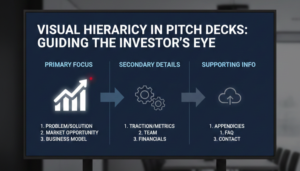
The Four-Layer Hierarchy Model: What Your Problem Slide's Reading Order Should Cost the VC in Seconds
Mapping Attention Sequence to Fundraising Outcome
Visual hierarchy operates through four primary design levers: size, weight, colour contrast, and position. Each lever commands a different level of attention. When deployed in sequence, they create a reading path. When deployed arbitrarily, they create noise.
Here is the cognitive sequence a correctly structured Problem slide should produce, mapped against the time cost of each layer:
Layer 1 — The Anchor Statement (0–1.0 seconds): The single largest typographic element on the slide. This is your core pain, stated in one sentence. Nothing else on the slide competes with it in size or weight. The VC reads this first because they have no other option — the hierarchy forces the entry point.
Layer 2 — The Evidence Tag (1.0–2.0 seconds): A single supporting data point, visually subordinate in size and weight to the anchor. Its function is to validate Layer 1 immediately after it is read. Smaller type, lighter weight, directly beneath or adjacent to the anchor. It does not introduce a new idea — it proves the one already stated.
Layer 3 — The Context Signal (2.0–3.0 seconds): An optional secondary framing element — a named customer segment, a geographic qualifier, or a time-bound condition. This confirms the problem is current and specific. It must be the third-largest visual element on the slide, and it must feel clearly tertiary.
Layer 4 — Administrative Elements (3.0–3.8 seconds): Source attributions, slide numbers, logo marks. Visually minimal. The VC does not need to read these in the first pass. If they are visually prominent enough to register before Layer 3, the hierarchy is broken.
As of early 2026, US-based Series A funds running structured analyst pre-screening — now standard practice across most top-tier 2025-vintage funds — are evaluating Problem slides against an implicit benchmark: can the core pain be extracted from the slide in under two seconds without reading supporting copy? Decks that fail this test are flagged for "unclear problem framing" before they reach a partner.
The hierarchy equation is binary: if your Layer 1 element is not immediately obvious when a new viewer opens the slide cold, your hierarchy has failed.
Building a Four-Layer Visual Hierarchy That Survives Analyst Pre-Screening
The objective is a slide where the reading sequence is non-negotiable — where the VC has no choice but to process your pain statement before anything else on the slide registers.
Weak Version (what analysts skip):
A Problem slide with a 28pt bold headline, three 18pt bullet points with 16pt sub-text, a 22pt callout box, and a 14pt source line. The size differential between the headline and the callout box is six points. The VC's eye has no clear entry point. The logical sequence — pain, evidence, context — is invisible because the typographic scale does not enforce it.
VC-Ready Version (what generates a second call):
Layer 1: Pain statement at 48pt, semi-bold, full width, top optical third of the slide. No competing element within 40pt of this size.
Layer 2: Evidence tag at 20pt, regular weight, directly beneath the pain statement with 24px of breathing room. One number. One source.
Layer 3: Context signal at 16pt, medium grey (not black — contrast reduction signals hierarchy reduction), positioned below Layer 2 or in a subordinate column.
Layer 4: Source URL and slide number at 10pt, lightest grey on the palette. Present but invisible in first-pass reading.
The Framework — The 3:1 Size Ratio Rule:
Every adjacent layer in the hierarchy must differ by a minimum ratio of 1.5:1 in type size. Layer 1 to Layer 2 should be at least 2:1. If your headline is 36pt and your supporting text is 28pt, the VC's eye cannot determine which is primary. The ratio must be unambiguous.
Step-by-step build sequence:
Write your pain statement first. Set it at 48pt. Do not touch the size. Every other element gets sized relative to this anchor, never the other way around.
Set your evidence tag at 20–24pt maximum. If it reads as nearly the same size as the pain statement, reduce it further. The subordination must be visible from three feet away.
Apply weight differentiation as a secondary signal. Layer 1: semi-bold or bold. Layer 2: regular. Layer 3: light or regular in reduced contrast colour. Weight and size working together double the hierarchy signal.
Use colour contrast to reinforce position hierarchy, not replace it. A red callout box does not create hierarchy — it creates competition. Colour should confirm the reading order that size and weight have already established, never override it.
Run the three-foot test. Step back from your monitor until the slide text is unreadable. The visual weight distribution should still be unmistakably clear — one dominant element, one secondary, everything else recessive. If it looks balanced from three feet, the hierarchy is broken.
Remove every element that does not serve a hierarchy layer. Decorative dividers, background textures, icon clusters used for visual interest — if they do not correspond to a specific layer in the reading sequence, they are introducing noise into a system that requires signal.
How Founders Break Visual Hierarchy While Trying to Fix It
Trap 1 — Using Colour as the Primary Hierarchy Signal. Founders who recognise their slide lacks hierarchy often respond by making the headline red, bold, and underlined simultaneously. This creates visual aggression, not hierarchy. Colour is the weakest hierarchy lever — it is the last tool you apply, not the first. Size and weight must do the structural work before colour is introduced.
Trap 2 — Building Hierarchy on the Problem Slide and Abandoning It on the Solution Slide. Visual hierarchy must be architecturally consistent across both slides. If your Problem slide has a clean 3:1 ratio and your Solution slide returns to a crowded, equidistant layout, the VC registers the inconsistency as a thinking inconsistency. The design system must hold across both slides as a unit.
Trap 3 — Confusing Hierarchy with Simplicity. A slide can have four distinct layers of information and still maintain a clear hierarchy. Removing content is not the fix — sequencing it correctly is. Founders who strip their Problem slide to a single sentence in response to hierarchy feedback have addressed the symptom, not the system. The four-layer model is the system.
What a Correct Reading Sequence Is Worth at the Partner Meeting Stage
A Problem slide with a working visual hierarchy does one thing that a flat, equidistant layout cannot: it pre-loads the VC's mental model before the founder speaks. By the time you advance past the Problem slide, the partner has already accepted the pain, registered the evidence, and noted the context. You are not explaining the problem in the room — you are building on a foundation the slide already laid. In a Series A process where partner meeting time averages 45 minutes and the first 10 are consumed by introductions, that pre-loading is worth two to three minutes of recovered narrative time — which is the difference between reaching your traction slide and running out of clock. The complete system for building Problem and Solution slides that perform this function is inside the Problem and Solution Slides framework.
Every week your Problem slide presents four competing entry points instead of one, you are handing the analyst a structurally ambiguous argument and asking them to do the work of resolving it. They will not. The Slide-By-Slide VC Instruction Guide inside the $497 Consultant Replacement Kit includes the exact size ratios, weight specifications, and layer sequencing rules for visual hierarchy across every core deck slide — built against the pre-screening standards that 2025–2026 vintage funds are applying right now. Founders who use it go into partner meetings with a reading sequence the analyst has already validated. That is not a marginal edge in a compressed fundraising environment. It is a structural one.
Funding Blueprint
© 2026 Funding Blueprint. All Rights Reserved.