Pitch Deck Typography: Best Fonts and Rules for VC Clarity
Is your pitch deck typography killing your fundraise? Bad fonts act as a legibility tax. Learn the exact font rules VCs demand to pass the pre-screen.
2.7 TACTICAL DESIGN RULES FOR PROBLEM & SOLUTION SLIDES VCS ACTUALLY RESPECT
2/26/20266 min read

Pitch Deck Typography: The Font Decisions That Tell a VC You Are Not Ready Before Slide Three
$2.4M in ARR means nothing if your VC cannot parse your Problem slide in under four seconds — and the single most common reason they cannot is not your argument. It is your typeface. Typography is not a cosmetic decision in a pitch deck. It is a legibility tax that compounds across every slide, and founders who treat font selection as a preference rather than a precision tool are handing analysts a subconscious reason to disengage before the financial model appears. This post is part of the Tactical Design Rules for Problem & Solution Slides VCs Actually Respect — the foundational layer that separates decks that get read from decks that get archived.
How Poor Typography Signals Operational Immaturity to a Series A Analyst
The error runs deeper than aesthetics. When a VC analyst opens your deck and encounters three different font weights, a serif headline paired with a display body, and a font size below 22pt on a slide intended for a projected conference room screen, they do not consciously think "bad design." They think "this founder does not understand their audience." That is a fatal re-categorisation to trigger on slide two.
The forensic reality is this: typography communicates hierarchy. When your hierarchy is broken — when the headline does not visually outrank the supporting data point, or when your call-out stat is the same weight as your body copy — the analyst's eye has no instruction. It wanders. Wandering attention on a Problem slide means your market framing is not absorbed. If your framing is not absorbed, your solution has no foundation, and no foundation means no second meeting.
The psychological reason founders make this mistake is a form of proximity blindness. You have read your deck 200 times. You know which line is the key insight. The VC is reading it for the first time at speed, and they are relying entirely on visual hierarchy to tell them where to look. In a deck reviewed last quarter, a B2B SaaS founder used four font families across eleven slides — the partner meeting was cut short at slide five, and the feedback memo noted the deck was "difficult to follow." As of early 2026, top-tier US funds are running analyst pre-screens on decks in under six minutes before escalating to a partner — your typography has to do the hierarchy work automatically, with zero reader effort.
The deeper error is bad advice. Founders are often told to "make the deck look premium" by a designer who optimises for brand identity work, not investor communication. Brand design and pitch deck design are different disciplines. A typeface that looks beautiful in a brand campaign can destroy readability at 28pt on a 16:9 slide viewed on a laptop screen at arm's length.
The Legibility Equation: What Typography Costs You in Analyst Attention Per Slide
VC analysts processing a first-pass deck are not reading — they are scanning. The average dwell time on a non-financial slide is 3.5–4.5 seconds. Typography choices directly determine how much of your argument survives that window.
Here is the performance breakdown by font category for pitch deck context:
System Sans-Serif (Inter, DM Sans, IBM Plex Sans):
Scan-to-comprehension time: 0.8–1.1 seconds for headline
Legibility at 24pt projected: High
Signal to analyst: Clean, modern, operationally literate
Best use: Body copy, data labels, sub-headers
Geometric Sans-Serif (Söhne, Neue Haas Grotesk, Aktiv Grotesk):
Scan-to-comprehension time: 0.9–1.2 seconds
Legibility at 28pt: Very high
Signal: Premium, institutional, considered
Best use: Headlines, cover slide, section breaks
Serif (Freight, Tiempos, Georgia):
Scan-to-comprehension time: 1.4–1.8 seconds in slide context
Legibility projected: Medium — kerning breaks down at standard slide resolutions
Signal: Editorial, traditional, financial services
Verdict: Only appropriate for a fund or financial institution pitch — not a growth-stage startup
Display/Decorative (any variable-width, script, or brand-specific custom font):
Scan-to-comprehension time: 1.8–2.6 seconds
Legibility projected: Poor
Signal: "This founder prioritised their brand over our time"
Verdict: Eliminated from consideration
The core equation: Every 0.5 seconds added to headline comprehension costs you approximately 15% of the residual attention available for your supporting argument. On a Problem slide, that is the difference between a VC who absorbs your market framing and one who moves on holding only a vague impression.
Building a VC-Ready Typography System in Three Decisions
The goal is not "pick a good font." The goal is to construct a type system with a clear three-tier hierarchy that requires zero interpretation from the reader. This is an information architecture decision, not a design one.
Weak Version (what fails): A Problem slide using Canva's default "Modern" template — a mix of Playfair Display (headline) and Lato (body), with the key stat in bold italic at the same size as the surrounding text. The visual weight is undifferentiated. The VC cannot locate the core insight without reading every word.
VC-Ready Version (what passes): One typeface family, two weights maximum (Regular + Bold or Medium + SemiBold), three size tiers locked across the entire deck. The headline communicates the argument. The sub-header qualifies it. The data label proves it. The eye moves in one direction: top to bottom, argument to evidence.
The Framework — Three-Decision Typography Protocol:
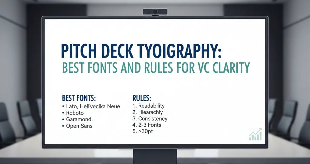
Decision 1 — Select a Single Family with a Wide Weight Range. Inter, DM Sans, or Neue Haas Grotesk give you six or more usable weights within a single family. This means your entire type system — headlines, sub-headers, body, data callouts, footnotes — stays visually cohesive while maintaining clear hierarchy. One family. No exceptions for investor-facing decks.
Decision 2 — Lock Your Three Size Tiers Before You Build a Single Slide.
Tier 1 (Headline/Argument): 36–44pt, Bold or SemiBold
Tier 2 (Sub-header/Qualifier): 22–28pt, Medium or Regular
Tier 3 (Body/Data Label): 16–20pt, Regular
Do not deviate from these tiers mid-deck. Every time a founder introduces a fourth size or an ad-hoc "emphasis" size, the hierarchy collapses. VCs notice this as visual inconsistency, which reads as operational inconsistency.
Decision 3 — Apply the Contrast Rule to Every Key Stat. Your headline number — the market size, the churn rate, the CAC payback period — must be visually unmissable. Use size contrast, not colour contrast, as the primary differentiator. A 44pt Bold number next to 20pt Regular text does not need to be red to stand out. Colour contrast on top of size contrast is acceptable. Colour contrast alone, with no size differentiation, fails under colourblind-simulated review — which some institutional funds now apply during their design audit.
The Rule of Typographic Silence: One slide, one typographic argument. If your Problem slide is trying to communicate three distinct ideas at three distinct scales, you do not have a design problem — you have a clarity problem. Solve the slide structure first. The typography only works when the argument is singular.
Where Founders Overcorrect on Pitch Deck Typography
Trap 1 — Downloading a "Premium" Pitch Deck Template and Inheriting Its Type System. Most commercial pitch templates are designed to look impressive in a Behance portfolio, not to function in a live VC review. They routinely use decorative fonts, tight leading, and low-contrast body copy that fails at projected scale. Buying the template does not buy you a system that was tested against investor behaviour.
Trap 2 — Using Brand Fonts That Were Designed for Digital UI, Not Print or Projection. A font optimised for 14px web rendering behaves differently at 28pt on a 1080p slide. Test every font at actual presentation scale before locking it in. Specifically: view the slide at 50% zoom on your laptop, at a distance of three feet. If you have to lean in, your Tier 2 font is too small.
Trap 3 — Treating Colour as a Substitute for Weight Hierarchy. Using a brand accent colour to highlight key data points is acceptable — using colour as the only differentiator between hierarchy levels is not. Weight must carry the primary hierarchy. Colour is a secondary signal, not a structural one.
The Compounding Cost of Typographic Disorder Across Your Full Deck
A single slide with broken typography is recoverable. A deck with inconsistent typography across all twelve slides signals to the VC that the founder lacks systems thinking — the capacity to build and enforce a standard across an organisation. That inference is not fair, but it is consistent, and it costs founders pre-money. Fixing your type system is not a design upgrade; it is a credibility upgrade. The complete framework for building every slide in your deck to institutional standard is inside the Problem and Solution Slides master system — implement that before your next partner-level submission.
Every week your deck goes into a VC's review queue with a broken type hierarchy is a week your core argument is arriving at 60% comprehension. The Slide-By-Slide VC Instruction Guide inside the $497 Consultant Replacement Kit includes the exact typography specifications — font families, size tiers, weight rules, and contrast standards — that match what an institutional fund analyst expects to see when they open a Series A deck. That gap between what you submitted and what they expected to see is not a small gap. In a compressed deal environment, it is a terminal one.
Funding Blueprint
© 2026 Funding Blueprint. All Rights Reserved.