Visualizing Problem-Solution Alignment: Pitch Decks Without Text Walls
Is your Problem Slide a text wall? VCs give you 11 seconds before passing. Learn why text-heavy decks kill Series A deals and how to visualize your pitch.
2.4 CONNECTING PROBLEM → SOLUTION LIKE A VC (NARRATIVE LOGIC MODEL)
2/21/20265 min read
Visualizing Problem-Solution Alignment: Pitch Decks Without Text Walls
Eleven seconds. That is the average time a VC spends on a single slide before deciding whether to continue or close the deck.
You have built a real business, identified a genuine problem, and engineered a solution that works — and you are going to lose the meeting because your Problem-Solution slides read like a consulting report. Pitch decks are not documents. They are visual arguments, and the discipline of constructing one without text walls is a distinct craft covered in depth within the VC narrative logic model for connecting Problem to Solution. Most founders treat it as decoration. It is actually the structure.
Why Text-Heavy Problem-Solution Slides Signal Unclear Thinking to Series A Investors
There is a specific failure mode here that is worth naming precisely: founders who cannot visualize their argument do not yet fully understand it. That is what a VC concludes when they open a Problem Slide and find four paragraphs, six bullet points, and a stock photo of a frustrated office worker.
The visual structure of a slide is not aesthetic packaging — it is cognitive architecture. When a founder presents a text wall, the VC's brain switches from intake mode to processing mode. They stop absorbing your narrative and start doing editorial work on your behalf, mentally extracting what matters and discarding the rest. That cognitive transfer has a cost: by the time they reach your Solution Slide, their working memory is already partially consumed. You have made it harder to land the argument you spent months preparing.
In a deck reviewed last quarter, a B2B logistics SaaS founder opened with a Problem Slide containing 214 words of body text — the VC's analyst flagged it as "unclear problem definition" before the partner meeting, and the deck was never escalated.
The psychological driver is the same as solution complexity: fear. Founders default to text walls because they believe volume signals thoroughness. In an investor context, it signals the opposite — that you have not yet done the hard editorial work of deciding what actually matters. A slide with three words and the right visual is a harder slide to build than one with three paragraphs. VCs know this. That is precisely why the sparse slide earns more respect.
The Cognitive Load Mathematics of a Slide That Cannot Be Read in 11 Seconds
As of Q1 2026, US-based Series A funds with assets under management above $500M are running structured analyst pre-screens that score decks on "narrative velocity" — how quickly the problem-to-solution logic can be traced without supplementary explanation. A text-heavy deck fails this screen before it reaches a partner.
Here is the math that explains why:
Working memory capacity: The human brain holds approximately 4±1 chunks of information in active working memory at one time. A slide with 8 bullet points forces the viewer to either chunk the content themselves (cognitive work you should have done) or abandon the attempt.
Run this diagnostic against your own Problem Slide:
Slide Characteristic & Cognitive Impact
1 visual + 1 headline + 1 data point: Results in low cognitive load and fast intake. VC interpretation: "Founder has done the thinking".
3 bullet points + explanatory sub-text: Results in a medium, manageable load. VC interpretation: "Borderline—depends on quality".
4+ bullets + paragraph body text: Results in high load where processing stalls. VC interpretation: "Founder hasn't edited their thinking".
Architecture diagram without legend: Results in maximum load and total disengagement. VC interpretation: "Pass" (meaning they will decline).
The 3-Element Rule: A VC-ready Problem or Solution Slide contains no more than three elements: a headline that frames the argument, one visual that proves it, and one data point that anchors it. Every additional element costs you clarity you cannot buy back.
The formula is blunt: Slide Elements − 3 = Cognitive Debt. If your slide has seven elements, you are carrying four units of debt against the investor's attention.
The Visualization Protocol: Converting Text Walls Into VC-Ready Visual Arguments
This is not a design brief. You do not need a designer. You need an editorial framework.
Step 1: Extract the Single Claim. Every Problem Slide makes one claim. Before you touch the visual layer, write that claim as a single declarative sentence with a number in it. "Mid-market HR teams spend 14 hours per hire on manual screening — and still make the wrong decision 34% of the time." That sentence is your headline. Everything else on the slide is either evidence for that claim or noise.
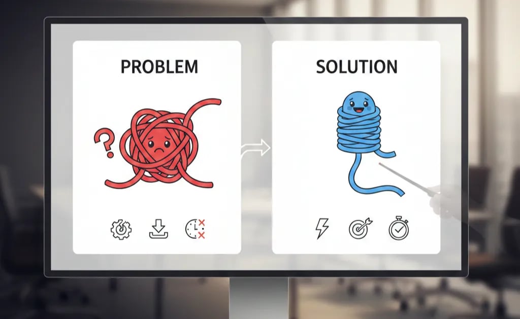
Step 2: Replace Bullets with a Before/After Visual Flow. The most effective Problem-Solution visual structure in a Series A deck is a two-panel flow:
Left panel (Problem state): Current process with a visible friction point highlighted — ideally a single-step workflow with one step marked in red or isolated with a callout.
Right panel (Solution state): Same workflow with the friction point removed or replaced — and a metric attached to the outcome.
Weak Version: A bullet-pointed list reading: "Current process is slow, error-prone, expensive, and lacks real-time visibility across teams."
VC-Ready Version: A two-step workflow diagram. Step 3 is highlighted in amber with the label "14-hour manual delay." An arrow points right. The same diagram with Step 3 replaced by your product, labelled "Automated in 4 minutes." Metric underneath: "87% reduction in processing time — 3 current customers, average contract size $84K ARR."
The second version takes the same amount of time to build. It takes three seconds to read. That is the differential.
Step 3: Apply the "Investor Relay Test." After building your slide, close the deck. Without looking at it, write down in one sentence what a VC would tell their partner the slide said. If you cannot reconstruct your own argument from memory after a single viewing, neither can they. Rebuild until you can.
Step 4: Anchor Every Visual to a Metric. A visual without a number is an illustration. A visual with a specific number attached to the friction point or the outcome is evidence. "23% of revenue lost to this step annually" transforms a diagram from aesthetics into an investment thesis.
The equation: Specific Claim (Headline) + Visual Proof (Diagram) + Quantified Outcome (Metric) = 11-Second Slide.
Three Ways Founders Break Their Slides While Trying to Fix Them
1. Replacing text walls with icon grids. Four icons with one-word labels ("Speed," "Scale," "Trust," "Efficiency") is not a visual argument — it is a mood board. Icons without quantified context carry zero evidentiary weight with a Series A investor.
2. Over-designing the visual at the expense of the claim. A beautiful diagram with a generic headline ("Our Platform Solves the Problem") fails the same test as a text wall. The headline is load-bearing. Do not sacrifice it to make room for visual complexity.
3. Using visuals on the Solution Slide but not the Problem Slide. Problem-Solution alignment requires visual consistency across both slides. If your Problem Slide is a diagram and your Solution Slide reverts to bullets, the cognitive continuity breaks and the logical chain the VC was following collapses.
The Valuation Argument for Getting Visual Alignment Right
A deck that communicates Problem-Solution alignment in under 25 seconds — across both slides, without supplementary explanation — shortens your diligence conversation and changes its character. The VC stops interrogating your clarity and starts interrogating your market. That is a materially better conversation to be in. In a fundraising environment where top-tier US funds are averaging 90–120 days from first deck to term sheet, anything that accelerates the VC's confidence formation compresses that timeline in your favour.
The full system for engineering this discipline across every slide in your deck is in the Problem and Solution Slides framework for Series A founders.
The 16 VC-Quality AI Prompts inside the $5K Consultant Replacement Kit include specific prompts engineered to generate VC-ready visual arguments for your Problem and Solution Slides — structured to the 3-Element Rule and tested against what analyst pre-screens are actually checking in 2025–2026 decks. The full Kit is $497. Access it at the pitch deck system built to replace $5K in consultant fees.
Funding Blueprint
© 2026 Funding Blueprint. All Rights Reserved.