Template Customization & Personalization: The Forensic Audit of "Frankenstein Design"
Pitch Deck Templates: A "Frankenstein Deck" (mismatched slides) signals operational chaos. Investors buy Consistency, not creativity. The forensic guide to safe customization without breaking the narrative.
PILLAR 12: TOOLS, TEMPLATES & EXAMPLES
1/13/20269 min read
Template Customization & Personalization: The Forensic Audit of "Frankenstein Design"
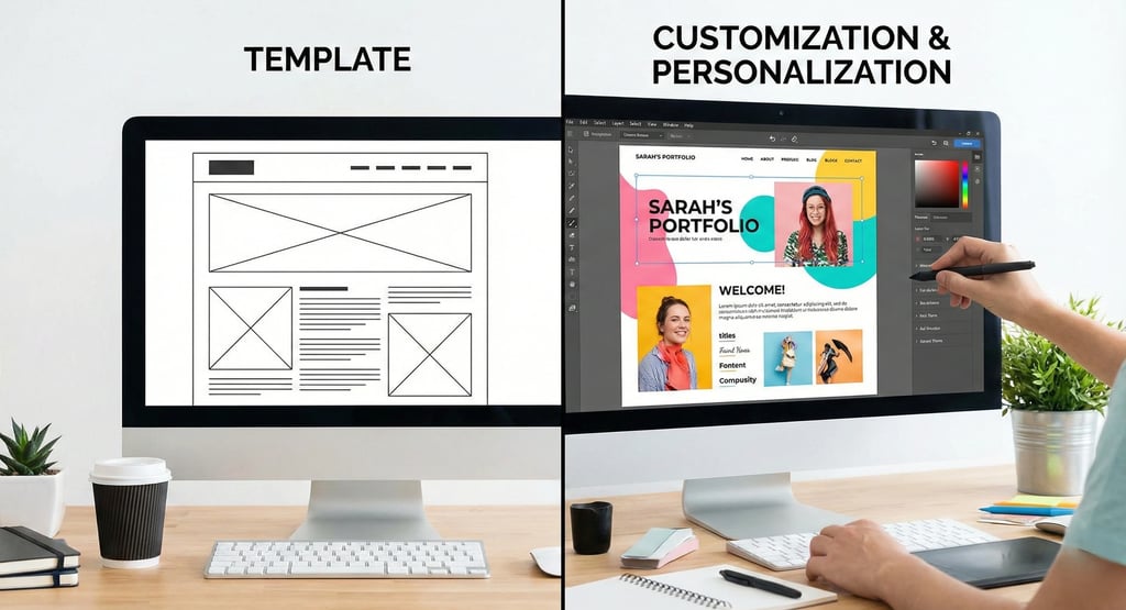
A template is a skeleton, not a skin. If you wear someone else’s skin, you look like a monster. If you build your own skin on a proven skeleton, you look like a Unicorn.
Investors have developed "Template Radar." If a Partner opens your deck and recognizes the standard "Canva Startup Teal" or the "Envato Geometric Shapes," they subconsciously categorize you as "Generic Inventory." It signals that you lack a unique identity and are simply filling in the blanks of someone else's business model.
However, building a deck from scratch is a waste of operational time. The forensic solution is the "Frankenstein Method": taking a proven structural template (like Sequoia’s logic) and customizing the visual layer so aggressively that the original source is undetectable. You want the Speed of a template with the Soul of a bespoke brand.
This analysis is a surgical guide to Template Customization. We will move beyond basic "Logo Swapping" and explore the deep mechanics of "Master Slide Injection," "Typography Psychology," and the "1:1 Personalization" hacks that trigger an investor’s reciprocity bias.
This sub pillar is part of our main Pillar 12 — Tools, Templates & Examples
The Trench Report: The "Luxury SaaS" Dissonance
In Q1 2025, I audited a FashionTech founder in Milan who was building a B2B platform for luxury brands (Gucci, Prada). She used a standard "SaaS Tech" template (Blue/Grey color scheme, Roboto font) because it was the "safe" choice.
The Structural Error:
The Vibe: The deck looked like an accounting software pitch or a mid-market CRM. It screamed "Utility" and "Boredom."
The Dissonance: She was claiming to understand "High Fashion" and "Aesthetics," but her deck looked like "Low Tech." The medium contradicted the message, causing a cognitive disconnect for investors who expected taste.
The Result: Investors passed. They said, "The product lacks the 'Taste' required for this specific market. If you can't design a deck that looks like Vogue, you can't build a UI that Gucci will use."
The Technical Pivot: We kept the logic of the SaaS template but performed a "Brand Transplant."
The Fix: We changed the font to a High-Contrast Serif (e.g., Playfair Display) to match the editorial aesthetic of Vogue. We changed the background to a "Bone White" (#F9F9F9) and the accent color to "Deep Onyx" to signal luxury minimalism.
The Personalization: On the title slide for each fund, we added their logo in monochrome, blending it into the "Partnership" section to visually align the brands before the pitch started.
The Outcome: She raised €2M. The lead investor noted, "The deck felt like reading a luxury magazine, which proved you understand the customer's psychology better than the other tech founders we saw."
The 3 Layers of Customization
Technical Depth: Amateurs edit slides one by one. Pros edit the DNA. You must customize at the System Level to ensure consistency and prevent "Design Drift" later in the deck.
1. The Master Slide Layer (The DNA)
The Mistake: Manually changing the font on every single text box on Slide 4. This ensures that when you add Slide 5, it reverts to the ugly default, forcing you to redo the work.
The Forensic Fix: Go to View > Slide Master (in PowerPoint/Keynote).
Action: Delete the template’s default "decorative shapes" (the random triangles and dots). These are "Cognitive Noise" that distract from your data and bloat the file size, causing rendering lag on mobile devices.
Action: Set your Brand Fonts here. This guarantees that every new text box you create automatically spawns in your brand voice, saving 10 hours of formatting time over the life of the fundraising process.
Action: Place your Logo and Confidentiality Footer here. By locking them into the Master, you prevent accidental misalignments where the logo "jumps" 5 pixels between slides (a subtle sign of low attention to detail).
2. The Typography Layer (The Voice)
The Mistake: Using the template’s default "Open Sans" or "Calibri." These fonts are "invisible" and signal that you accepted the default settings rather than making a conscious choice.
The Forensic Fix: Choose a font that signals your Category Physics. Typography is the "Body Language" of your document.
Hard Tech / DevTools: Use Monospace fonts (e.g., JetBrains Mono, Courier). This signals "Code," "Engineering," and "Raw Utility." It subconsciously tells the investor you are spending your time shipping product, not polishing slides.
Consumer / Gen Z: Use Brutalist or Retro Serif fonts. This signals "Culture," "Trend," and "Differentiation." It proves you are plugged into the current zeitgeist.
Enterprise / Fintech: Use Clean Swiss Sans (e.g., Inter, Helvetica Now). This signals "Trust," "Scale," and "Global Infrastructure." It feels like a bank statement, which is exactly what you want when asking for $10M.
3. The "Pseudo-Personalization" Layer (The Hook)
The Mistake: Sending the exact same PDF to Sequoia and Benchmark. This treats capital as a commodity and signals that you haven't done your homework on the partner's specific thesis.
The Forensic Fix: The "Variable Header" Strategy.
Action: On the Title Slide, add a subtitle: "Prepared exclusively for the Partners at [Fund Name]." It forces them to pause and acknowledge that this document was generated specifically for them.
Action: In the "Why Now" slide, reference a trend that specific partner wrote about in their blog. "As [Partner Name] wrote in 2024, the API economy is shifting..." This transforms the pitch from a "Sales Pitch" to a "Response to their Thesis."
The Psychology: This triggers the Reciprocity Bias. They feel obligated to read it carefully because you invested time tailoring it to their worldview.
Regional Calibration
Regional Calibration Protocol: Customization norms vary by geography. What looks "Polished" in SF looks "Suspicious" in London.
San Francisco (The "Vibe" Customization)
The Standard: High Fidelity.
The Expectation: Your deck should look like your website. If your website is "Dark Mode Cyberpunk," your deck must be "Dark Mode Cyberpunk." A disconnect between the deck and the site signals a fragmented brand identity.
The Signal: Brand consistency = Product quality. In the Valley, design is considered a function of code. If you can't control the pixels in a PDF, they assume you can't control the pixels in the app.
London / New York (The "Data" Customization)
The Standard: Functionality and Auditability.
The Expectation: Do not let the design obscure the data. Avoid "Dark Mode" if it makes the Excel charts hard to read or impossible to print. Bankers-turned-VCs often print decks to markup with a pen.
The Signal: Clarity = Operational maturity. A boring white deck with crystal-clear data tables beats a beautiful neon deck with unreadable charts every time.
Customization Red Flags
Metric Logic Protocol: Avoid these "Frankenstein" errors that reveal you used a cheap template and tried to patch it together poorly.
Red Flag 1: The "Color Vibration"
The Error: Using your brand's "Neon Orange" text on the template's "Bright Blue" background.
The Forensic Reality: It causes Chromostereopsis (visual vibration/eye strain) where the text appears to float or blur. It physically hurts to read and forces the investor to close the file to save their eyes.
The Fix: Use a tool like Coolors.co to check contrast ratios. Text should always be legible (Ratio > 4.5:1). If it’s hard to read, it’s hard to fund.
Red Flag 2: The "Ghost Link"
The Error: The template has social media icons in the footer (Twitter, LinkedIn). You forget to link them, or worse, they link to the template creator’s Envato profile page.
The Forensic Reality: It shows a lack of "Attention to Detail." If you can't check your own links, how will you check your code before deployment? It destroys trust in your operational rigor.
The Fix: Delete them. Nobody clicks social icons in a PDF anyway. They will Google you if they are interested. Remove the clutter.
Red Flag 3: The "Stock Photo" Remnant
The Error: You customized the text, but left the stock photo of "Generic Men Shaking Hands" on the Partnership slide because you didn't have a real photo.
The Forensic Reality: It signals "Fake Traction." Investors assume if you had real partners, you would show their logos or a photo of the signing ceremony. Generic art implies generic progress.
The Fix: Replace all stock photos with Screenshots of your product or Logos of your partners. If you don't have a photo, use a solid color block with text. Blank space is better than fake space.
Earned Secrets
Earned Secrets Protocol: How to customize for speed and impact using 0.01% operator tactics.
Secret 1: The "Website Mirror" Hack
The Secret: Investors often open your deck and your website in two tabs side-by-side to cross-reference your claims.
The Hack: Take a screenshot of your website's landing page. Use the Eyedropper Tool (in PowerPoint) to pick the exact Hex Code of your website's background and buttons. Apply these to your deck.
The Result: Seamless cognitive transition. The deck feels like an extension of the company. It subconsciously reinforces that the company is "Real" because the branding is consistent across mediums.
Secret 2: The "Loom" Personalization
The Secret: Text personalization is good; Video is better. Most founders hide behind the PDF.
The Hack: Record a 30-second Loom video for the specific partner. "Hey [Partner], I know you like marketplaces, so I highlighted our take rate on Slide 8. I'd love your feedback on that metric specifically."
The Move: Paste a screenshot of the video (with a "Play" button) on the first slide with a link.
The Result: It forces them to engage with a human, not a file. It breaks the "Fourth Wall" and makes it much harder for them to ghost you because they have seen your face and heard your voice.
Secret 3: The "Hidden Slide" Customization
The Secret: You can have one master file with 50 slides, but only show 12. Maintaining 5 different deck versions (one for Seed, one for Series A, one for Partners) creates version control hell.
The Hack: Create "Appendix Modules" for specific investor types in the same file, but keep them hidden.
For Fintech VCs: Unhide the "Regulatory Roadmap" slide before exporting.
For Growth VCs: Unhide the "CAC/LTV" deep dive.
The Result: You send a "Custom" deck to each investor without maintaining 5 different files. It ensures everyone sees the core narrative, plus the specific detail they care about.
Expert FAQ: The Unasked Questions
Q: How much of the template should I change? A: Forensic Answer: The "20/80 Rule."
Logic: Change 20% of the elements (Fonts, Colors, Images) to get 80% of the visual impact. Do not change the grid/layout (where the text boxes are). That takes too long and breaks the design structure. The value of a template is the Spacing, not the Styling.
Q: Should I put the VC's logo on the cover? A: Forensic Answer: Yes, but do it elegantly.
Logic: Don't make it huge. Put it small in the corner: "Prepared for [VC Logo]." It implies this is a private conversation, not a broadcast. If you make it huge, it looks like you are pitching to them as a customer, which changes the power dynamic weirdly.
Q: Can I mix slides from different templates? A: Forensic Answer: Only if you normalize the "Master."
Logic: If you paste a slide from Template A into Template B, it will bring its own messy fonts and colors ("Theme Pollution"). You must use "Paste > Keep Text Only" or manually apply the "Destination Theme" to ensure the new slide obeys the host deck's rules.
Forensic Audit Checklist
Before you hit send, run the "Identity Diagnostic":
The "Squint Test": Scroll through the deck quickly (grid view). Does the color palette stay consistent, or does it jump from "Template Blue" to "Brand Orange"? It should look like one cohesive movie, not a collection of shorts.
The "Font Audit": Check the file properties. Are there more than 2 font families? (e.g., Arial, Helvetica, AND Roboto). If so, fix it. You only need 2 (Header + Body) to maintain visual hierarchy.
The "Placeholder Hunt": Search the document (Ctrl+F) for "Lorem," "Name Here," and "202X." Delete any ghosts. Finding "Insert Text Here" on Slide 9 is an instant credibility killer.
The "Link Check": Click the "Contact Me" button. Does it actually open an email to you? Often, templates link to mailto:name@example.com. Test it.
The "Filename": Rename the file [Company] Deck_for_[FundName].pdf. It shows you customized the file itself, not just the slides inside. It’s the digital equivalent of a handwritten envelope.
Narrative Breadcrumb
You have successfully disguised the template. You have injected your brand DNA, aligned the typography to your industry physics, and personalized the asset for the specific partner. The deck now looks like a bespoke $10k agency project.
But a great deck is useless if you don't know who to send it to. You need to identify the investors who actually buy what you are selling. This leads us to "Investor Targeting & Market Mapping"—the science of finding the right capital before you burn your runway.
0.01% Insider Insight: The "Metadata" Personalization
Sophisticated investors use automated CRM tools (like Affinity) that scrape the metadata of PDF attachments.
The Secret: You can edit the "Title" and "Subject" fields in the PDF metadata (File > Properties). Most founders leave this as "Presentation1."
The Hack: Change the PDF Title to: [Company] Series A - Exclusive for [Fund Name].
The Result: When the deck is ingested into their CRM, it shows up with that title. Even if the Partner doesn't open the file, the Associate scrolling the CRM sees "Exclusive for [Fund Name]." It creates a subconscious "High Priority" tag in their internal system, differentiating you from the spam.
(Note: The Funding Blueprint Kit includes Founder-Proofed Frameworks built on real-world investor reactions and the Slide-By-Slide VC Instruction Guide. These resources decode the specific VC psychology behind every potential objection, ensuring you don't just memorize a script, but internalize the logic required to survive the audit. Access the full forensic suite at the home page.)
Funding Blueprint
© 2026 Funding Blueprint. All Rights Reserved.