Pitch Deck Slide Redesign: Before and After Examples for Founders
Stop paying for cosmetic pitch deck redesigns. If your Problem slide explains rather than asserts, VCs will pass in 4 seconds. See the before/after fixes.
2.7 TACTICAL DESIGN RULES FOR PROBLEM & SOLUTION SLIDES VCS ACTUALLY RESPECT
2/27/20267 min read
Pitch Deck Slide Redesign: Before and After Examples for Founders
You will not get a second meeting. The decision was made on slide 3, by an associate who spent six seconds on your Problem slide before tagging the deck "pass — unclear thesis" and moving to the next one in the queue.
The painful part is not the rejection. It is that the underlying business was fundable. The market was real. The numbers were there. The slide just did not show it — and in a Series A process, the slide is the business until proven otherwise. Telling a founder their deck "needs work" is the most useless feedback in venture. This post does something different: it shows you exactly what a broken slide looks like, exactly what a VC-ready version looks like, and the specific structural decisions that separate them. This redesign framework sits inside the broader discipline covered in the tactical design ruleset for Problem and Solution slides built to clear partner-level screens.
Why Most Pitch Deck Redesigns Fix the Aesthetics and Leave the Thesis Broken
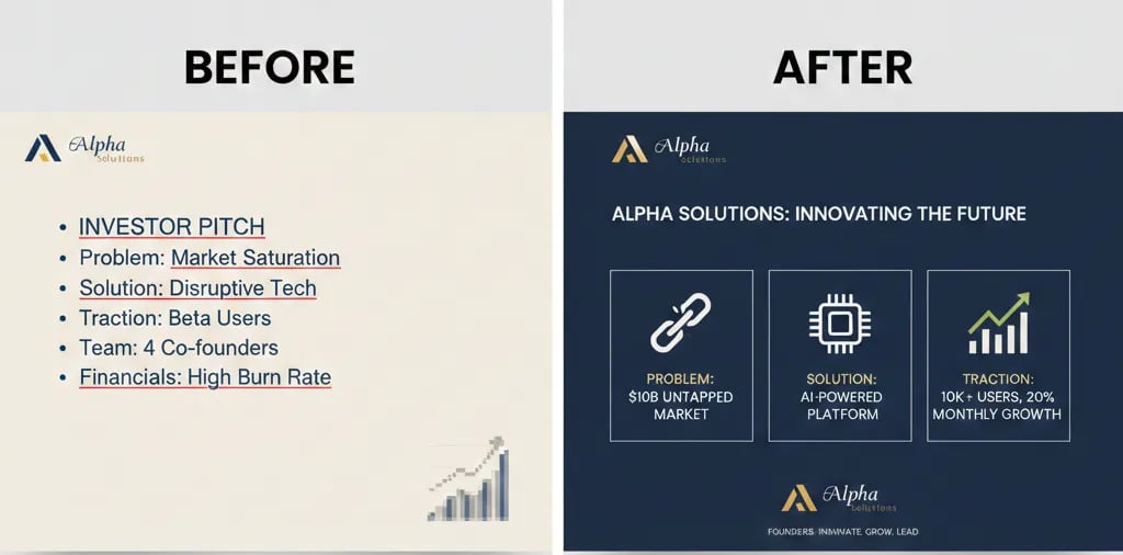
The most common mistake founders make when they decide to "redesign" a deck is treating it as a visual problem. They hire a Figma-literate designer, upgrade the font stack, apply a consistent colour system, and resubmit. The deck looks significantly better. It still does not get a second meeting.
Visual polish is not the variable that drives pass/advance decisions at the screening stage. Thesis clarity is. A beautifully designed slide with an ambiguous Problem statement is still an ambiguous Problem statement — it is just easier to read while the VC forms a negative opinion. The redesign work that actually moves a deal forward happens at the structural level: what claim is the slide making, how is that claim supported, and how quickly can a VC absorb both pieces of information without conscious effort.
The forensic failure mode is almost always the same: the founder has structured the slide to explain the problem rather than to assert it. Explanation requires reading. Assertion requires recognition. VCs do not have time to read — they pattern-match against thesis statements they have already seen work. Your slide either fits that pattern in three seconds or it does not fit at all. I have reviewed this precise failure — a well-designed slide that explains rather than asserts — in nine decks this year across B2B SaaS and marketplace categories; seven did not advance past first-round screening.
The psychological driver is consistent: founders believe that more context reduces risk in the VC's mind. It increases it. A founder who needs three sentences to establish a problem has not yet decided what the problem actually is. That is the read. And it is usually correct.
The Cognitive Cost of a Broken Slide, Measured in Seconds and Dollars
Before the redesign examples, the math needs to be clear — because this is not a subjective creative exercise.
As of early 2026, US-based top-tier funds are conducting initial deck screens in compressed windows: most associates have a 90-second first-pass protocol before flagging for deeper review or routing to pass. In that window, a 20-slide deck gets approximately 4–5 seconds per slide on average. A slide that requires 12 seconds to parse is not getting 12 seconds — it is getting skipped or tagged unclear.
The cost structure of a broken slide sequence:
Slide Failure Modes and Results
Over-explained Problem (3+ sentences)
VC Time Consumed: 15–20 seconds
Information Transferred: Market context, no thesis
Net Result: Pass — no clear bet
Underdefined Solution (feature list format)
VC Time Consumed: 10–15 seconds
Information Transferred: Product description, no value claim
Net Result: Pass — no differentiation signal
Disconnected Problem-to-Solution flow
VC Time Consumed: Cumulative confusion
Information Transferred: Cognitive dissonance
Net Result: Pass — founder doesn't understand their own market
Single-claim Problem + quantified Solution
VC Time Consumed: 3–4 seconds
Information Transferred: Thesis, market, value
Net Result: Advance — schedules exploratory call
The redesign is not cosmetic surgery. It is reconstructive. The objective is to collapse time-to-thesis to under four seconds per slide across the Problem and Solution sequence.
The two-variable test for any slide:
Can a VC state your core claim in one sentence after three seconds of exposure?
Does your Solution slide answer the Problem slide's implicit question without requiring a verbal explanation?
If either answer is no, the slide needs a structural rebuild — not a design refresh.
Four Before-and-After Redesigns: The Exact Structural Moves That Change Pass to Advance
These are composite reconstructions based on recurring structural patterns. Each one represents a category of failure that appears across industries and funding stages.
Redesign #1: The Over-Explained Problem Slide
Before — Weak Version:
Title: "Challenges Facing the Modern HR Technology Stack"
Body: "HR teams at mid-market companies are struggling to manage an increasingly complex technology environment. With an average of 11 disconnected tools across recruiting, onboarding, payroll, and performance management, teams spend significant time on manual data reconciliation. This creates downstream errors in payroll compliance, delays in onboarding completion, and reduced visibility for CHROs trying to make data-driven decisions."
What the VC reads: A market overview. A category description. No specific, financial, falsifiable claim about a problem. The slide could belong to any of forty companies in the HR tech space.
After — VC-Ready Version:
Headline: "Mid-market HR teams lose 14 hours per employee onboarding cycle to manual data reconciliation across disconnected systems — at $3,200 per mis-hire in downstream compliance cost."
Supporting element: One horizontal bar chart showing reconciliation hours by company size (50–500 employees). Single data source cited in 8pt footer.
Nothing else.
Why it works: The claim is specific, financial, and falsifiable. The VC knows the segment (mid-market), the mechanism (disconnected systems), the cost (time + dollars), and the consequence (compliance exposure). That is a complete thesis in one sentence. The chart validates the scale. The VC is now evaluating the bet — not doing reading comprehension.
Redesign #2: The Feature-List Solution Slide
Before — Weak Version:
Title: "Our Platform"
Bullets:
Automated data sync across HR tools
Real-time compliance monitoring dashboard
AI-powered onboarding workflow builder
HRIS integrations with 40+ platforms
Role-based access and audit trail
What the VC reads: A product sheet. Five features with no hierarchy and no value claim. The VC cannot determine which feature is the core mechanism, what the primary outcome is, or how this is structurally different from the incumbent.
After — VC-Ready Version:
Headline: "One sync layer eliminates the 14-hour reconciliation cycle and closes the compliance gap — without replacing a single existing HR tool."
Visual: A single-flow diagram showing: [Existing HR Stack] → [Sync Layer] → [Compliance Output]. Three boxes. Four arrows. No icons.
Sub-line (optional, max 12 words): "Deployed in 4 hours. No data migration. No IT dependency."
Why it works: The Solution slide answers the Problem slide's exact question. The Problem said "14-hour reconciliation cycle and compliance cost." The Solution says "eliminates the 14-hour cycle." That is a direct logical chain. The VC does not need to construct the connection — it is built into the slide architecture.
Redesign #3: The Disconnected Problem-to-Solution Sequence
This failure mode is structural rather than contained in a single slide. The Problem slide establishes one pain point; the Solution slide describes a different (or broader) outcome. The VC experiences this as cognitive dissonance — and interprets it as a founder who has not stress-tested their own thesis.
Before — Broken Sequence:
Problem Slide Claim: "Supply chain managers lack real-time visibility into supplier inventory levels."
Solution Slide Claim: "An AI-powered procurement intelligence platform that optimises sourcing decisions and reduces cost."
The gap: The Problem is about visibility. The Solution is about cost optimisation. These are related but not the same problem. The VC now has a question they need to ask — which means the slide failed. Every question a slide generates about your thesis is a second you are not building conviction.
After — Reconnected Sequence:
Problem Slide: "When supplier inventory drops below threshold, procurement managers have a 48-hour blind spot — long enough for a $200K+ expedite order."
Solution Slide: "Live supplier inventory feeds eliminate the 48-hour blind spot. Average expedite cost reduction: $180K in year one."
The fix: The Solution slide uses the exact language, the exact timeframe, and the exact financial consequence from the Problem slide. The VC reads them as a single logical unit. No questions generated. Conviction builds.
Redesign #4: The Buried Headline Problem Slide
Before — Weak Version:
Title: "The Problem"
Body: "Despite advances in financial technology, small business owners still face significant challenges when trying to access working capital. Traditional lenders require 60–90 days for approval, demand 3 years of financial history, and reject 82% of applications. This creates a critical funding gap for businesses with strong revenue but limited credit history."
The structural failure: The headline is a category label, not a claim. All the actual information is buried in the paragraph. A VC scanning at speed sees "The Problem" and receives nothing. The data — 82% rejection rate, 60–90 day approval window — is credible and specific, but it is performing reading comprehension duty instead of conviction duty.
After — VC-Ready Version:
Headline: "82% of SMB working capital applications are rejected by traditional lenders — average approval delay: 74 days. Revenue-positive businesses are dying waiting."
Visual: None required. The headline is complete.
Source: Single citation, footer.
The fix: The headline now carries all the weight. The number, the mechanism, the consequence, and the urgency are all present in one sentence. The VC does not need to read anything else to form a view. That is the structural objective of every Problem slide.
Three Redesign Traps That Produce a Different Kind of Broken Slide
1. Compressing three bullet points into one run-on sentence. A 40-word headline is not a single insight — it is a paragraph in disguise. If your headline requires a comma and two conjunctions, it is carrying more than one idea. Split the claims and choose the one that matters most.
2. Redesigning the slide but keeping the original title. "The Problem" and "Our Solution" as slide titles are VC-screening death flags regardless of what follows. The title is the first signal the VC processes. If it is a category label, you have already lost one second of credibility before they read anything else.
3. Using the Before/After framework as a template rather than a diagnostic. The examples above are not fill-in-the-blank replacements. They are demonstrations of a decision-making process. If you copy the structure without applying the underlying logic — single claim, quantified consequence, direct Problem-to-Solution chain — you will produce a slide that looks VC-ready and still fails on substance.
What Structural Redesign Is Worth at the Pre-Money Negotiation
A deck that communicates thesis-level clarity across the Problem and Solution sequence does not just improve meeting rate — it changes the quality of the meeting itself. A VC who arrived at your Solution slide already holding your Problem thesis does not need to spend the first fifteen minutes of the call establishing context. They spend it evaluating defensibility, team, and market timing. That is the conversation where pre-money is set. In a US Series A market where median pre-money sits at $22M–$28M, the difference between a context-building meeting and a conviction-testing meeting is not a small variable. It is frequently the difference between a Term Sheet and a "keep us updated" email. The full system governing how your Problem and Solution slides work as an integrated fundraising instrument is documented inside the complete structural architecture for Series A Problem and Solution slides.
You can build these redesigns manually — working backwards from VC feedback, iterating across forty hours of internal review cycles, and hoping the next version clears the screen. Or you can use the Slide-By-Slide VC Instruction Guide inside the $5K Consultant Replacement Kit to run a structured rebuild in one focused session, against the exact criteria a fund analyst applies at the screening stage. The full Kit is $497. Start the redesign process with the benchmark already in hand at the Series A pitch resource that replaces the $5K deck consultant.
Funding Blueprint
© 2026 Funding Blueprint. All Rights Reserved.