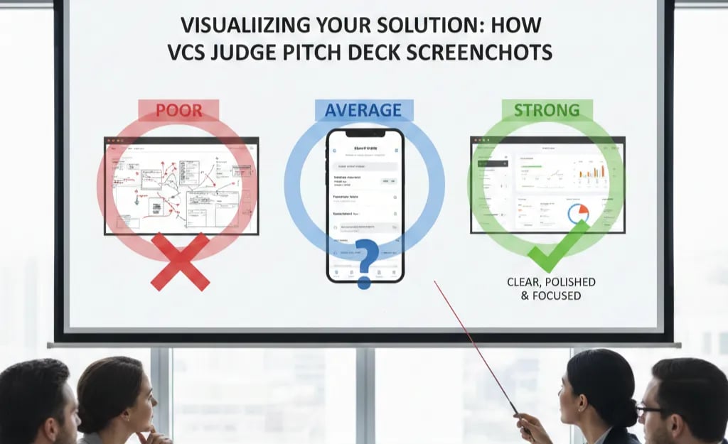
Visualizing Your Solution: How VCs Judge Pitch Deck Screenshots
Stop dropping raw UI screenshots into your deck. Full-screen images are a Series A credibility tax. Learn how to build a fundable visual argument.
2.3 HOW TO FRAME THE SOLUTION SLIDE (WITHOUT OVERCLAIMING)
2/19/20267 min read
Visualizing Your Solution: How VCs Judge Pitch Deck Screenshots
Most founders think a product screenshot makes their Solution Slide more credible. In the majority of decks reviewed at the Series A stage, it does the opposite. A raw UI screenshot — unframed, unlabelled, and dropped into a slide like a product demo still — does not communicate solution value. It communicates that the founder does not understand what a VC is trying to evaluate. The investor is not your customer. They are not clicking through a trial. They are running a 45-second pattern recognition exercise, and a busy, context-free interface image fails that exercise every time. The technical discipline behind framing the Solution Slide without overclaiming applies directly to how visual evidence is selected, annotated, and positioned — and most founders skip it entirely.
Why Raw Product Screenshots Are a Series A Credibility Tax, Not a Credibility Signal
There is a specific cognitive event that happens when a VC lands on a slide containing an unframed product screenshot. They spend three to five seconds trying to orient themselves — identifying what part of the interface they are looking at, what the user is supposed to be doing, and what outcome is being demonstrated. Then, having failed to extract a clear answer in that window, they move to the next slide. The visual has consumed attention without producing information. That is not a neutral outcome. It is a net negative, because the VC has now spent cognitive budget on a slide that delivered no return.
The root cause is a category error that is almost universal among technical founders. A screenshot communicates product existence. It does not communicate product value, user outcome, or competitive differentiation — which are the three variables a Series A investor is actually trying to assess from a Solution Slide visual. In a deck reviewed last quarter, a DevOps SaaS founder included four full-screen screenshots across two slides, each showing a different dashboard view with no annotations, no callouts, and no stated outcome — the fund passed at the screening stage and cited "unclear product-market fit signal" despite the company having $1.1M ARR. The product worked. The visuals made it invisible.
The psychological driver is the same as the assertion language problem in differentiation slides: founders experience the product interface as self-evident because they have lived inside it for eighteen months. A VC seeing it for the first time has no map. Showing an uncontextualised screenshot to an investor is the visual equivalent of saying "trust us, the product is good" — it is assertion in image format.
As of early 2026, leading US and UK Series A funds increasingly circulate pitch decks internally before the first partner meeting, with junior analysts completing a pre-screening pass. That analyst has no product context, no customer conversation history, and no domain expertise in your vertical. If your screenshot does not explain itself within five seconds of landing on the slide, it will not survive the pre-screening pass.
The Attention Economics of a Pitch Deck Visual: What a Screenshot Costs vs. What It Returns
The financial logic here operates through time — specifically, the 2.7-minute average first-pass review window that DocSend's pitch engagement data consistently surfaces across investor cohorts.
Within that window, each slide is allocated roughly 15–20 seconds. A Solution Slide visual has one job: convert those seconds into investable signal. Here is how different screenshot approaches perform against that constraint:
Raw full-screen UI dump
Time to Decode: 8–12 seconds orientation
Signal Delivered: None — VC still does not know what they are looking at
Investor Outcome: Slide dismissed; attention deficit carried to next slide
Annotated screenshot with one callout
Time to Decode: 3–4 seconds
Signal Delivered: Single proof point identified
Investor Outcome: Partial engagement; VC may re-examine
Outcome-framed screenshot with before/after state
Time to Decode: 4–6 seconds
Signal Delivered: Clear value demonstration with quantified result
Investor Outcome: Active engagement; due diligence question triggered
Annotated UI extract (not full screen) with labelled workflow step
Time to Decode: 2–3 seconds
Signal Delivered: Specific mechanism visualised
Investor Outcome: Mechanism question answered; ICP validated visually
The bottom two rows are not design preferences. They are attentional return calculations. Every second a VC spends decoding your visual without extracting signal is a second deducted from the time available to build conviction.
Apply the Screenshot ROI Test before any visual enters the deck:
Visual ROI = (Investable Signal Delivered) ÷ (Seconds Required to Decode)
A full-screen raw screenshot scores near zero on both variables of that ratio. An annotated UI extract with a labelled outcome scores high on signal and low on decode time. That ratio difference is not aesthetic. It is the difference between a slide that advances the investment thesis and one that stalls it.
The Visual Evidence Protocol: How to Build a Screenshot That Survives Partner Meeting Scrutiny
This is the operational fix — not a design guide, but a strategic framework for selecting and framing visual evidence at the Series A stage.
Weak Version (What Most Decks Show):
A 1920×1080 full-screen capture of a populated dashboard — multiple navigation panels, data tables, dropdown menus, notification badges, and a sidebar that the founder has never mentioned in the pitch. No callouts. No labels. A caption underneath that reads: "Our intuitive platform interface."
The VC sees complexity, not capability. The word "intuitive" has done the opposite of its job. This is the visual equivalent of the assertion language problem — the image is claiming a quality it is not demonstrating.
VC-Ready Version (What Survives the Analyst Pre-Screen):
A cropped extract of one specific workflow step — the exact moment in the user journey where the core value mechanism activates. A single callout arrow pointing to the specific element that eliminates the pain identified in the Problem Slide. A two-line annotation: the before-state (manual process, time cost, error rate) and the after-state (automated, quantified outcome). The image is contained within 60% of the slide frame, leaving space for the annotation layer to breathe.
That is not a better screenshot. That is a visual argument.
The Visual Evidence Protocol — five build steps:
Select one workflow moment, not one product overview. The screenshot must capture the specific instant where your solution eliminates the pain your Problem Slide quantified. Not the homepage. Not the analytics dashboard. The exact interaction point where value is created. If you cannot identify that moment in under thirty seconds, your solution's value mechanism is not yet clear enough to pitch.
Crop to the mechanism, not the interface. Extract the relevant UI component from the full screen. Remove navigation bars, unrelated panels, and ambient interface elements that do not contribute to the proof point. The VC should see a product, not a SaaS dashboard genre.
Add one callout, not five. A single annotation pointing to the specific element that delivers the outcome. More than two callouts creates the cognitive load problem you are trying to solve. The discipline of choosing one callout is itself a signal — it tells the VC that you understand which part of your product matters most to the customer.
Label the outcome in numbers, not adjectives. The callout annotation must contain a metric. "Reduces reconciliation time from 4 hours to 11 minutes" is a proof point. "Dramatically simplifies workflow" is marketing copy that has no place in a Series A Solution Slide.
Frame the visual within the Problem Slide's stated constraint. The screenshot must visually answer the specific question the Problem Slide raised. If your Problem Slide showed that manual data entry costs finance teams 6.2 hours per week, the screenshot must show the moment that 6.2 hours disappears. Any other visual is technically interesting and strategically irrelevant.
The Before vs. After applied to visual architecture:
Weak structure: Full-screen UI drop → generic caption → implicit hope that the VC will infer value
VC-ready structure: Cropped mechanism extract → single numbered callout → quantified outcome annotation → explicit connection to Problem Slide constraint
One additional structural note for pre-revenue or early-revenue founders: if your product is not yet built to a screenshotable state, a high-fidelity wireframe with the same annotation discipline outperforms a half-built UI screenshot every time. A clear wireframe with a labelled outcome is more credible than a cluttered live product with no framing. The VC is not evaluating your design system. They are evaluating whether you understand what your product is supposed to do and for whom.
Three Screenshot Death Traps That Surface After Founders Try to Fix This
1. Over-annotating to compensate for a weak proof point. Adding five callouts, two text boxes, and a colour-coded legend to a screenshot that does not contain a clear value moment does not create clarity — it creates a visual argument that has no thesis. If the screenshot requires extensive annotation to make sense, the screenshot is wrong, not the annotation layer. Find a different workflow moment.
2. Using a demo environment with fake or sparse data. A CRM screenshot with three contacts, a revenue dashboard showing $12,400 in pipeline, or an analytics view with placeholder charts signals that the product has no real usage data. Investors notice immediately. If your live environment is not populated enough to screenshot credibly, use a sanitised but realistic customer environment with permission, or build a seeded demo environment that reflects actual usage patterns.
3. Matching the visual to the product, not to the pitch narrative. Founders often select the screenshot that shows their most impressive engineering achievement — the most complex view, the most data-dense dashboard, the most technically sophisticated component. That is the wrong selection criterion. The correct criterion is: which single image most directly proves that the Problem Slide's stated constraint is eliminated? Those two questions produce different answers in almost every deck.
What a Correctly Framed Screenshot Does to Your Due Diligence Timeline
A Solution Slide visual that functions as a structured proof point — not a product tour — shortens the due diligence cycle at the Series A stage. When the VC's analyst can extract the value mechanism from the visual in under five seconds, the pre-meeting memo writes itself more favourably. When the partner can point to the screenshot during the partner meeting and say "this is how they eliminate the pain," the investment thesis has already been partially constructed for them. That compression has a valuation implication. The full framework for building a Problem and Solution narrative where every element — visual and written — closes the logical loop from pain to mechanism to fundable outcome is documented in the Problem and Solution Slide architecture built for Series A conversion.
You can spend 40 hours iterating on screenshot selection, annotation placement, and outcome framing across multiple deck versions, or you can use the Slide-By-Slide VC Instruction Guide inside the $5K Consultant Replacement Kit to deploy the Visual Evidence Protocol in one working session — it specifies exactly which workflow moment to capture, how to structure the annotation layer, and what metric format triggers due diligence rather than a polite pass. The full Kit is $497, available at the Series A pitch deck system designed to eliminate the guesswork from visual proof points.
A screenshot shows that your product exists. A framed, annotated, outcome-labelled visual extract proves that it solves something worth funding. Only one of those belongs in a Series A deck.
Funding Blueprint
© 2026 Funding Blueprint. All Rights Reserved.