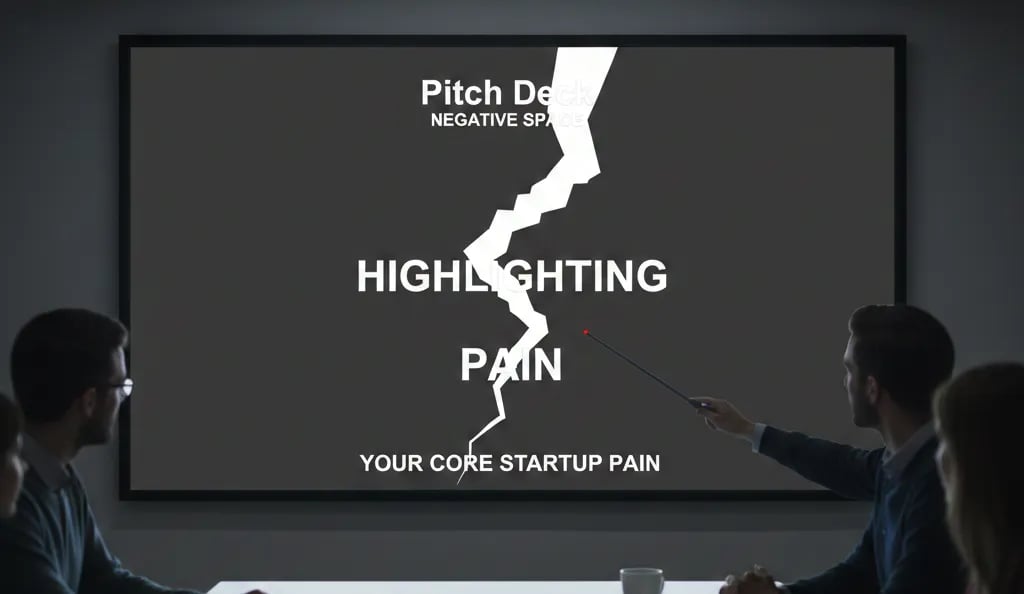
Pitch Deck Negative Space: Highlighting Your Core Startup Pain
A crowded Problem slide kills your Series A pitch in 4 seconds. Learn why VCs in the US, UK, and Canada demand negative space to fund your startup.
2.7 TACTICAL DESIGN RULES FOR PROBLEM & SOLUTION SLIDES VCS ACTUALLY RESPECT
2/26/20266 min read
Pitch Deck Negative Space: How Empty Slides Close More Series A Rounds Than Crowded Ones
You will not get a second meeting. Not because your numbers were wrong, not because your market was too small — but because the VC's analyst could not isolate your core pain point from the visual noise surrounding it. The slide had everything on it: a headline, three sub-points, a supporting statistic, a background graphic, and a callout box. The analyst saw all of it and retained none of it. If you are building Problem and Solution slides right now, this is part of the Tactical Design Rules for Problem & Solution Slides VCs Actually Respect — a foundational layer that determines whether your core argument lands or dissolves.
Why Founders Who Ignore Negative Space Bury Their Own Pain Point
Negative space — the intentional absence of content around your primary visual or text element — is not a design luxury. On a Problem slide, it is the mechanism by which you force the VC's attention to the one thing they need to believe before they will advance you to the next stage: that the pain is real, specific, and currently unsolved at scale.
The failure pattern is consistent. A founder identifies a genuine, fundable problem. Then, afraid the slide looks "too empty" or "not professional enough," they fill the surrounding space with supporting context, secondary statistics, and explanatory sub-bullets. The result is a slide that communicates everything and proves nothing. The VC's eye has no anchor point. The analytical brain defaults to skim mode, which means your core pain framing — the one sentence that should stop a partner mid-scroll — is processed at the same cognitive weight as your third bullet point.
The psychological driver here is founder insecurity about perceived thoroughness. There is a persistent belief, often reinforced by bad accelerator advice, that a "full" slide signals preparation. In a board presentation, that may hold. In a pitch deck reviewed in under four seconds per slide, density is the enemy of conviction. I have reviewed decks where the Problem slide contained six discrete elements; in every case, the VC feedback noted the problem was "unclear" — not because the founder had not done the work, but because the slide architecture prevented the insight from surfacing.
The deeper audit: founders conflate white space with absence of argument. They are not the same. White space is an argument. It tells the VC: this one thing is so important I built an entire slide around it.
The Attention Economics of an Empty Slide: A Mathematical Case for Restraint
What Cognitive Load Research Tells You About Your Problem Slide Layout
Eye-tracking studies of investor pitch reviews — consistent with attention research across high-stakes single-pass documents — show that the eye requires a visual anchor within 1.5 seconds or it begins scanning in a Z-pattern, distributing attention across the slide rather than concentrating it. When a slide has one primary element with significant negative space surrounding it, fixation occurs in under 0.8 seconds. When a slide has five or more competing elements, fixation never stabilises — the viewer processes the slide as a whole rather than engaging with any single component.
Applied to your Problem slide, the math is direct:
Crowded Problem Slide — Attention Distribution:
Headline: 22% of available attention
Sub-bullets (×3): 18% each
Supporting stat callout: 14%
Background visual element: 10%
Result: Your core pain point receives less than one-quarter of the VC's cognitive bandwidth
Negative Space Problem Slide — Attention Distribution:
Single pain statement (large, isolated): 74% of available attention
Supporting data anchor (one line, subordinate position): 18%
Slide label / context: 8%
Result: Your core pain point is the slide
As of early 2026, top-tier US funds — particularly 2025-vintage funds operating under tighter deployment timelines — are running analyst pre-screening at higher volume than at any point since 2021. The average partner sees a pre-screened deck summary before they ever open the full file. That summary is built from first impressions on two slides: the Problem and the Solution. A crowded Problem slide does not make the summary. A single, isolated, well-evidenced pain statement does.
Engineering Negative Space on a Problem Slide That Forces a VC to Stop
The objective is surgical: one pain point, maximum isolation, one data anchor. Everything else is removed.
Weak Version (what gets skipped):
A slide titled "The Problem" with a background gradient, a headline reading "Healthcare Data Is Fragmented and Inefficient," three bullet points explaining why, a statistic embedded inside bullet two, and a small icon cluster in the bottom-right corner. The VC reads the headline, skims the bullets, retains nothing specific, and advances. No anchor. No conviction. No follow-up question generated.
VC-Ready Version (what generates a partner conversation):
White or near-white background. No decorative elements. Centre-weighted single statement in large type: "A hospital loses $1.2M annually reconciling records that should never conflict." Below it, in noticeably smaller type, a single source attribution and year. Nothing else on the slide. The VC stops. They either believe it or they want to challenge it — both outcomes are better than the alternative, which is being ignored.
The Negative Space Protocol — Step by Step:
State your single core pain in one sentence, fourteen words or fewer. If you cannot compress it, your problem definition is not yet sharp enough for Series A. Do not design around a vague problem statement — diagnose the statement first.
Apply the 60% rule. At least 60% of the slide's total area must be unoccupied. Measure this. If your content fills more than 40% of the slide canvas, you have overcrowded it.
Position your pain statement at optical centre, not geometric centre. Optical centre sits approximately 10% above the true midpoint of the slide. Content placed here reads as intentional and commanding. Content centred mathematically reads as default.
Allow one supporting data point, placed subordinately. It must be smaller in type size, lower in position, and visually secondary. Its function is to validate the statement above it, not to compete with it. One source. One number. No elaboration.
Remove your slide title. "The Problem" as a header is redundant — the pain statement is the title. Removing it recovers vertical space and eliminates the visual hierarchy conflict between header and primary content.
Use background colour as a negative space tool. A slide does not need to be white to use negative space effectively. A deep single-colour background with a white pain statement in isolation achieves the same result — provided no secondary elements crowd the composition.
The Three Ways Founders Destroy Negative Space While Trying to Use It
Trap 1 — Applying Negative Space to the Wrong Slide. Negative space discipline belongs on your Problem and Solution slides. Applying the same minimalism to your financial model slide or traction slide removes necessary data. These rules are context-specific. A revenue chart with 60% white space is not restrained — it is incomplete.
Trap 2 — Compensating with Oversized Typography. When founders remove content to create space, they sometimes scale up the remaining text to fill the void. A 96pt headline on a Problem slide is not negative space — it is visual shouting. The statement should be large relative to other slide elements, not large relative to the slide itself. The space around it does the work; the type does not need to.
Trap 3 — Using 2021 Design Benchmarks in a 2026 Fundraising Environment. Pitch deck templates from the 2020–2022 cycle were built for a market where decks were reviewed in longer in-person sessions. The current pre-screening environment is faster, more remote, and more analyst-driven. Dense layouts that "worked" in 2021 are now filtered out before they reach a partner. Your design assumptions need to match the current review process, not the one you read about in a funded founder's blog post from three years ago.
What a Single Slide Re-Architecture Is Worth in Pre-Money Credibility
A Problem slide that isolates its core pain point does one thing that a crowded slide cannot: it generates a specific question from the VC. "Where does that $1.2M figure come from?" is a meeting. "Interesting overview, we'll be in touch" is a pass. The financial impact of negative space is not metaphorical — it is the difference between a first call and a partner meeting, which in a compressed Series A market represents millions of dollars in potential pre-money negotiating position. For the complete system that governs how Problem and Solution slides interact to build that position, the Problem and Solution Slides framework is where this architecture is laid out in full.
Every day your Problem slide competes with itself for attention, you are giving the analyst permission to pass without a conversation. The Slide-By-Slide VC Instruction Guide inside the $497 Consultant Replacement Kit includes the exact layout specifications for negative space application across every core deck slide — matched to how 2025–2026 vintage fund analysts are pre-screening decks before they reach a partner. Founders who build from this guide go into partner meetings with a Problem slide that has already done its job before anyone opens their mouth.
Funding Blueprint
© 2026 Funding Blueprint. All Rights Reserved.