Pitch Deck Layout Mistakes: Why Great Content Fails Bad Design
Is your slide layout burying your best arguments? A 2x2 grid creates a comprehension tax that kills deals at top US and UK funds. Learn how to fix it.
2.7 TACTICAL DESIGN RULES FOR PROBLEM & SOLUTION SLIDES VCS ACTUALLY RESPECT
2/26/20266 min read
Pitch Deck Layout Mistakes: Why Fundable Content Dies on a Badly Structured Slide
Most founders believe that if the content is strong enough, the design will not matter. This is the single most expensive assumption in early-stage fundraising. A VC analyst does not separate what a slide says from how it is structured — because in a pre-screening environment where the full deck receives under four minutes of total attention, layout is comprehension. If the structure fails, the content never registers. This post is part of the Tactical Design Rules for Problem & Solution Slides VCs Actually Respect — the foundational design layer that determines whether your argument survives first contact with an analyst or gets summarised as "unclear" before it reaches a partner.
Why a Fundable Problem Statement Fails When the Layout Works Against It
The error is structural, not editorial. A founder can have a precise, well-evidenced pain statement — one sentence, correct framing, strong data anchor — and still lose the slide if the layout distributes it incorrectly across the canvas. Layout governs reading sequence, cognitive grouping, and perceived relationship between elements. When layout is broken, the VC does not read your content in the order you intended. They read it in the order the slide's spatial logic dictates — and that order is usually wrong.
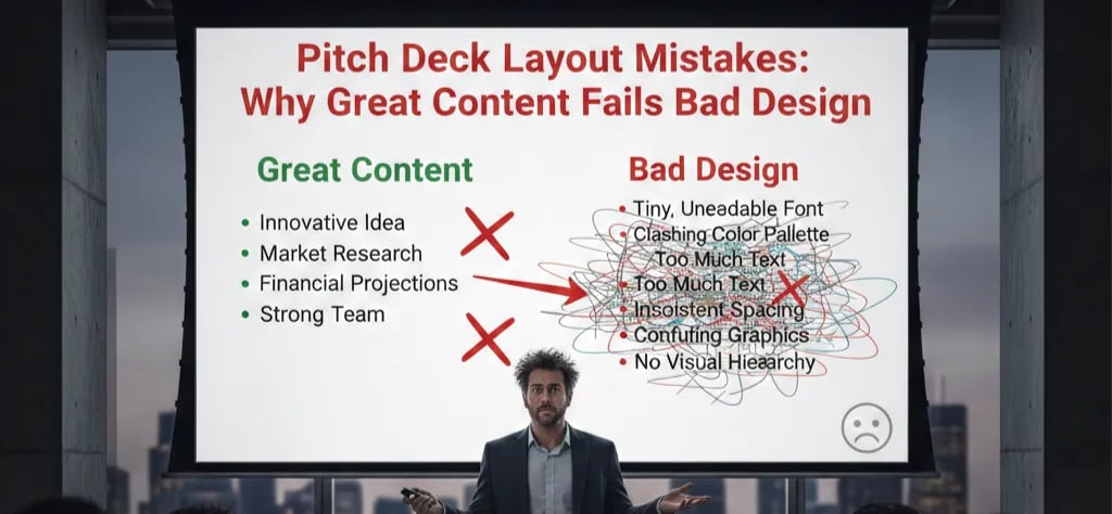
The most common layout failure on a Problem slide is false equivalence through equidistant spacing. A founder places their pain statement, a supporting statistic, a customer quote, and a market context note — all separated by identical margins, all in a 2x2 grid. The layout signals that all four elements carry equal weight. The VC processes them as a list, not as an argument. There is no primary claim. There is no logical sequence. There is a collection of related facts that the VC must personally assemble into a thesis — and they will not do that work for you.
The psychological driver is a misapplication of design principles the founder has absorbed from SaaS product UI. Grid systems and equal spacing work in product interfaces because users have time and motivation to explore. A VC analyst in pre-screening has neither. The layout rules for a pitch deck are closer to the rules for a legal brief than a product dashboard: hierarchy first, sequence second, supporting evidence third.
I have reviewed pitch decks where the founder's core pain statement was genuinely differentiated and fundable — and the VC's analyst note still read "problem unclear" because the layout placed it in the bottom-left quadrant of a 2x2 grid, where it received the least visual weight of any element on the slide. The content was correct. The structure buried it.
The Spatial Logic Failure: Calculating What Bad Layout Costs You Per Slide
Why Layout Errors Compound Across the Deck and Accelerate the Pass Decision
Layout mistakes do not operate in isolation. A single poorly structured slide introduces a comprehension tax — the cognitive effort the VC must spend reconstructing your intended argument from a disordered layout. That tax is small on one slide. Across eight to twelve slides, it accumulates into what analysts describe as a deck that "feels hard to follow" — which is the pre-screening language for a pass.
Here is the compounding effect broken down per layout error type:
Error Type 1 — Content Overflow (too many elements per slide):
Comprehension tax per slide: High
VC interpretation: "Founder cannot prioritise"
Downstream signal: Operational decision-making concerns
Frequency in decks reviewed: Highest — present in approximately 70% of first-draft Problem slides
Error Type 2 — Misaligned Grid (elements not anchored to a consistent column or margin structure):
Comprehension tax per slide: Medium
VC interpretation: "Deck was assembled, not designed"
Downstream signal: Execution rigour concerns
Frequency: Present in approximately 55% of decks without professional design input
Error Type 3 — Spatial Contradiction (visual weight and logical weight are misaligned — the most important element is the smallest or most peripheral):
Comprehension tax per slide: Highest
VC interpretation: "Founder does not know what their core argument is"
Downstream signal: Pitch readiness concerns — leads directly to a pass
Frequency: Present in approximately 40% of founder-built decks
As of early 2026, the median Series A pre-money in the US has stabilised in the $20M–$26M range following the 2023–2024 valuation correction, and top-tier funds are running leaner analyst teams against higher inbound volume than at any point since 2020. The practical consequence is that analyst pre-screening is now faster and less forgiving — a layout that produces a comprehension tax does not get a second look. It gets a category flag and a pass.
Rebuilding a Problem Slide Layout That Forces Correct Reading Sequence
The objective is a spatial structure where the logical argument and the visual argument are identical — where the most important content occupies the most spatially dominant position, and every supporting element is positioned to serve it, not compete with it.
Weak Version (what produces a comprehension tax):
A Problem slide built on a 2x2 grid. Top-left: pain statement headline. Top-right: market context note. Bottom-left: supporting statistic. Bottom-right: customer quote in a styled callout box. All four quadrants have equal dimensions and equal internal padding. The callout box has a coloured border that makes it visually dominant despite being the least logically important element. The VC's eye enters at the callout box, moves to the headline, skips the statistic, reads the context note, and exits the slide with no coherent argument retained.
VC-Ready Version (what eliminates the comprehension tax):
A single-column layout. Full-width pain statement occupies the top 45% of the slide canvas — dominant position, dominant size, nothing competing horizontally. Directly beneath it, full-width and visually subordinate: a single evidence line with source. Below that, in a lighter weight and reduced contrast, a one-line context qualifier. The spatial logic mirrors the argumentative logic: claim, proof, context. The VC reads top to bottom and arrives at the bottom of the slide having accepted the argument in sequence.
The Framework — The Spatial Argument Audit:
Use this five-step audit on every Problem and Solution slide before submission:
Map your logical argument sequence first, before touching the layout. Write out: (1) the claim the VC must accept, (2) the evidence that proves it, (3) the context that makes it timely. This sequence becomes your spatial sequence. Top to bottom. Primary to tertiary. Non-negotiable.
Assign spatial dominance to logical priority. The most important element must occupy the most spatially commanding position — typically the top-centre or full-width upper third of the slide. If your evidence tag is larger, bolder, or more centrally positioned than your pain statement, the spatial dominance is inverted and the argument collapses.
Apply the single-axis layout rule for Problem slides. Problem slides should almost always use a single column or a strongly weighted two-column layout where one column carries 70% or more of the content. Equal-weight multi-column grids are for comparison slides — financial models, competitive landscapes. They signal "here are equivalent options." Your Problem slide must signal "here is a single, dominant truth."
Audit every margin and padding value for consistency. Inconsistent internal spacing — where one element has 16px of padding and the adjacent element has 32px — creates visual instability that reads as carelessness. Set one internal padding value and apply it universally. The grid must be felt, even if it is not seen.
Run the inversion test. Remove all text from the slide and look at the layout as pure spatial geometry. The shapes and positions of your content blocks should, on their own, communicate a clear hierarchy — one dominant region, one secondary region, supporting peripheral elements. If the geometry looks balanced and equal, the layout is not doing argumentative work.
Three Layout Corrections That Create New Problems
Trap 1 — Converting to Single Column and Losing the Evidence Layer. Founders who audit their 2x2 grid and switch to a single column sometimes strip the slide to only the pain statement, believing simplicity solves the layout problem. A single column without a structured evidence layer is not a corrected layout — it is an assertion without proof. The fix is single-column with correct vertical sequencing of all three layers, not single-column as a synonym for empty.
Trap 2 — Fixing the Problem Slide Layout Without Auditing the Solution Slide. Layout consistency between the Problem and Solution slides is a due diligence signal in itself. A VC who sees a clean, spatially disciplined Problem slide followed by an overcrowded Solution slide interprets the inconsistency as a thinking inconsistency — strong on diagnosis, weak on prescription. Both slides must be built from the same spatial logic system.
Trap 3 — Using a Template Grid That Was Built for a Different Slide Type. Many founders apply a traction slide or team slide template to their Problem slide because it "looks professional." Traction slide templates are built to display multiple data points at equivalent weight — exactly the wrong architecture for a Problem slide. Never import a layout designed for data comparison into a slide whose function is singular argument delivery.
What Correcting Your Layout Architecture Is Worth in Partner Meeting Conversion
A Problem slide with correct spatial logic does not just communicate more clearly — it communicates faster. And in a pre-screening environment where the difference between an advance and a pass is measured in seconds, speed of comprehension is a direct conversion lever. Founders who align their spatial structure with their logical argument sequence stop losing meetings to "unclear problem framing" — a category that, in a normalised Series A market, accounts for a d visproportionate share of first-pass rejections that never provide specific feedback. The complete system for building Problem and Solution slides that survive both analyst pre-screening and partner scrutiny is inside the Problem and Solution Slides framework.
Every week your Problem slide runs a layout that works against your content, you are paying a comprehension tax you will never see itemised — just a pass with no explanation and a calendar that stays empty. The Slide-By-Slide VC Instruction Guide inside the $497 Consultant Replacement Kit is built around the exact spatial logic rules that 2025–2026 vintage fund analysts use to pre-screen decks — including the layout specifications for Problem and Solution slides that eliminate comprehension tax before the deck reaches a partner. Every week this layout structure is wrong costs you a meeting you will not get back. The Kit is built to close that gap before your next submission.
Funding Blueprint
© 2026 Funding Blueprint. All Rights Reserved.