Pitch Deck Design Patterns That Signal Startup Founder Maturity
VCs read pitch deck design as a proxy for operational judgment. Learn the 5 design patterns that signal founder maturity and secure Series A funding.
2.7 TACTICAL DESIGN RULES FOR PROBLEM & SOLUTION SLIDES VCS ACTUALLY RESPECT
2/27/20268 min read

Pitch Deck Design Patterns That Signal Startup Founder Maturity
A Series A founder in B2B SaaS raised $2.1M in pre-seed capital, hit $480K ARR, and walked into a partner meeting at a top-tier fund with a deck that looked like it had been built by someone who had never seen a term sheet. The business was fundable. The deck signalled that the founder was not. They did not get a second meeting — not because the metrics were wrong, but because every structural decision in that pitch communicated "first-time founder who does not yet understand what this process is."
VCs are not just evaluating your business. They are evaluating your judgment. And before you say a single word in a partner meeting, your deck has already delivered a verdict on that judgment. Design patterns — the specific structural and visual choices you make across your slides — are a legibility test. They tell an experienced investor whether you understand the game you are playing. This is one layer of a broader execution system: the full framework lives inside the tactical design principles for Problem and Solution slides that pass partner-level scrutiny.
Why VC Partners Read Deck Design as a Proxy for Operational Judgment
This is not about aesthetics. It is about what design decisions reveal about decision-making under constraint.
A founder who cannot edit their own slides — who cannot make the hard choice to remove a bullet point they spent three hours writing — is demonstrating exactly the kind of prioritisation failure that destroys companies at the execution stage. VCs know this. The partner reviewing your deck at 7pm on a Tuesday is not consciously thinking "this slide has too many fonts." They are thinking "this founder cannot make hard calls." The slide is just the evidence.
The forensic pattern is consistent across failed decks in this category: the founder has treated the pitch as a comprehensive document rather than a persuasion instrument. Comprehensive documents serve the person writing them. Persuasion instruments serve the person reading them. The maturity signal is in which one you built. In seven decks reviewed across Q1 and Q2 of this year, every founder who used more than three font sizes across their deck — a direct signal of unresolved hierarchy decisions — was passed at the screening stage without a call.
The psychological root is predictable: early-stage founders have lived inside their business for twelve to eighteen months. The deck feels like an opportunity to finally show everything. That impulse is the exact opposite of what Series A fundraising requires. Maturity in a pitch deck is demonstrated through what you chose to leave out, not what you chose to include. A VC who sees a founder make clean, disciplined editorial choices on a slide is watching a founder who will make clean, disciplined operational choices with their capital. That inference is deliberate and well-established inside partner meetings.
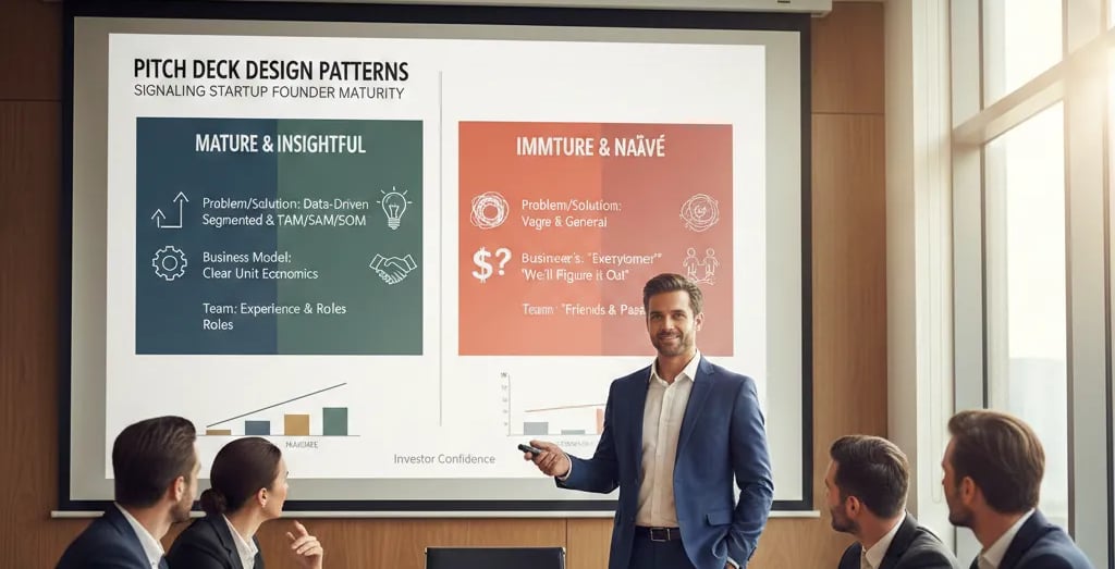
The Design Pattern Audit: What Immature vs. Mature Decks Actually Look Like Side by Side
As of early 2026, US funds at the Series A tier are conducting increasingly structured pre-meeting deck reviews — with associates running structured scoring rubrics before any founder gets calendar access to a partner. Design clarity is an explicit criterion in several of these rubrics, not an implicit preference. The median US Series A pre-money remains at $22M–$28M, but the filtering threshold to reach that conversation has materially tightened since 2024. Decks that previously cleared screens on business fundamentals alone are now being passed at the associate level on presentation maturity signals.
Here is the pattern audit across five structural dimensions:
Design Variables: Immature vs. Mature Signals
Slide titles
Immature Signal: Category labels (e.g., "The Problem")
Mature Signal: Claim statements (e.g., "74-day approval delay costs SMBs $180K...")
Font hierarchy
Immature Signal: 3+ sizes with no consistent logic
Mature Signal: Two sizes maximum — headline and supporting label
Colour usage
Immature Signal: Brand palette applied decoratively throughout
Mature Signal: Colour used functionally to direct attention to one element per slide
Data visualisation
Immature Signal: Multiple chart types, 3D graphs, pie charts
Mature Signal: Single chart type, flat, with one data series highlighted
Whitespace
Immature Signal: Filled as a default; blank space treated as wasted
Mature Signal: Whitespace used as a structural element to create visual hierarchy
Each of these variables is a decision. Mature founders make each decision with the VC's cognitive experience as the primary constraint. Immature founders make each decision with their own comfort as the primary constraint. The difference is visible within three seconds of a slide rendering.
The two-axis test for design maturity:
Axis 1 — Hierarchy: Is it immediately clear what the most important element on this slide is?
Axis 2 — Restraint: Is every element on this slide earning its presence, or is something there because removing it felt uncomfortable?
If Axis 1 is unclear or Axis 2 has an honest answer of "yes, some things are comfort inclusions," the slide has not cleared the maturity threshold.
The Five Design Patterns That Communicate Founder Maturity to a Series A Investor
These are not style preferences. Each pattern maps directly to a judgment signal a partner will form about your operational capability.
Pattern #1: The Declarative Slide Title
What immature looks like: Slide titles that name a category — "The Market," "The Team," "Competition," "Why Now." These titles communicate that the founder is organising information for themselves, not building a logical chain for the investor.
What mature looks like: Every slide title is a complete, falsifiable claim. "The Market" becomes "68M mid-market SMBs in the US are currently unserved by enterprise procurement tooling — and 14% are actively replacing spreadsheets." The title is the thesis of the slide. The body supports the title. The VC knows what to believe before they process a single additional element.
The operational inference: A founder who writes declarative slide titles has already done the hard thinking. They know what they believe and they are willing to state it as a claim that can be challenged. That is the cognitive posture of a CEO — not a researcher presenting findings.
Pattern #2: The Single-Attention Visual
What immature looks like: Charts with six data series, each in a different colour. Diagrams with eight labelled components and connecting arrows that cross each other. Icons used decoratively on every slide to fill whitespace.
What mature looks like: One chart. One data series highlighted in the brand's primary colour. All other series in grey. The VC's eye goes directly to the insight — they do not choose where to look. You chose for them. That is information architecture, not decoration.
The operational inference: A founder who controls visual attention on their slides understands hierarchy. Hierarchy is the core competency of a scaling operator — the ability to force-rank decisions, resources, and focus. The slide demonstrates it before the conversation starts.
Pattern #3: The Deliberate Whitespace Strategy
What immature looks like: Every square centimetre of a slide has content. The instinct is that empty space signals insufficient preparation. In practice, it signals the opposite — a founder who is not comfortable with their own thesis unless it is surrounded by supporting material.
What mature looks like: A slide with a single headline, a single supporting visual, and significant blank space is a slide that communicates confidence. The founder is saying: "This claim is sufficient. It does not need decoration." That is a high-trust signal.
The operational inference: Founders who are comfortable with whitespace have made peace with the idea that their thesis can stand alone. That is the same psychological posture required to hold a pricing line in a customer negotiation, to cut a product feature under pressure, or to push back on a VC's term sheet revision.
Pattern #4: The Consistent Data Visualisation Grammar
What immature looks like: A bar chart on slide 4, a pie chart on slide 7, a line graph on slide 9, and a donut chart on slide 12. Each chart type chosen based on what the founder's data visualisation tool defaulted to, not based on what cognitive job the chart needs to do.
What mature looks like: One chart type used consistently across all data slides — almost always a simple bar or line chart. The VC builds a reading pattern once and applies it throughout. Cognitive load drops. Data absorption accelerates.
The chart selection rule: Bar charts for comparison. Line charts for trend. That is the full vocabulary you need in a Series A deck. Pie charts communicate proportion but destroy precision — a VC cannot read a 23% vs 26% split in a pie chart. They can in a bar chart. Pie charts in pitch decks are an immediate signal of data literacy gaps.
Pattern #5: The Problem-to-Solution Visual Thread
What immature looks like: The Problem slide uses one visual language — say, a process flow diagram. The Solution slide uses a completely different visual language — a product screenshot or a feature matrix. The VC has to re-orient their visual processing between slides. The logical chain breaks.
What mature looks like: The visual language of the Solution slide is a direct continuation of the Problem slide. If the Problem slide shows a broken process flow with a red gap, the Solution slide shows the same process flow with the gap closed and the result quantified. The VC experiences the transition as resolution — which is the emotional state you need them in when they are forming their initial conviction.
The operational inference: A founder who threads their visual language across slides has thought about their pitch as a sequence, not a collection of slides. That is narrative architecture. It is the same skill required to build a coherent product roadmap, a sales motion, or a board narrative. The deck demonstrates it.
Three Maturity Signals Founders Fake That Partners Can Identify in Seconds
1. Using premium design tools to apply immature structural patterns. A Pitch.com or Beautiful.ai template with clean typography does not signal maturity if the slide titles are still category labels. Partners have seen enough polished decks with broken theses to have zero correlation between production quality and founder judgment. The structure has to be right — the design budget is irrelevant.
2. Removing content without replacing it with a clear hierarchy. A slide with one bullet point and a lot of whitespace is not a mature slide if the bullet point is not a complete claim. Minimalism without precision produces ambiguity, not clarity. The maturity signal is in the quality of what remains, not just the quantity of what was removed.
3. Applying these patterns to peripheral slides but not to the Problem and Solution sequence. The Problem and Solution slides are the highest-scrutiny slides in the deck. Partners have seen enough pitches to pattern-match on these two slides faster than any other. A mature traction slide with an immature Problem slide tells the VC that the founder cleaned up the slides they thought were important and did not understand which slides actually are.
What Founder Maturity Signals Are Worth in a $22M–$28M Pre-Money Negotiation
Design maturity is not a soft variable. It is a trust variable. A VC who reads your deck and forms a judgment of "this founder makes clean, disciplined decisions" is walking into the partner meeting with a prior that your capital deployment will be clean and disciplined. That prior influences how hard they push on governance terms, control provisions, and valuation anchors in a term sheet negotiation. Founders who signal operational maturity through their decks negotiate from a different position than founders who signal uncertainty. The pre-money range does not change — but where you land inside it does. The complete system for building the Problem and Solution slides that establish this trust posture before you say a word is documented inside the definitive architecture for Series A Problem and Solution slide construction.
Every week a partner-level VC encounters your deck with immature design patterns is a week they are forming a prior about your judgment that you will need to actively overcome in the meeting — instead of spending that meeting time building conviction on your business fundamentals. The Slide-By-Slide VC Instruction Guide inside the $5K Consultant Replacement Kit is built against the exact maturity criteria a fund analyst applies during the screening stage, so the deck you bring to a partner meeting has already cleared that filter before you walk in. The full Kit is $497. Run your current deck against the maturity benchmark at the pitch deck resource engineered for founders who need fund-analyst-grade output without the consultant retainer.
Funding Blueprint
© 2026 Funding Blueprint. All Rights Reserved.