Minimalist Pitch Deck Evidence Slide: Layouts That Convert VCs
Is your Evidence Slide destroying your credibility? Learn why dense layouts trigger a cognitive load penalty and how to build slides that convert VCs.
2.2 HOW TO PROVE YOUR PROBLEM IS REAL (EVIDENCE, SIGNALS & PROOF)
2/17/20265 min read
The Minimalist Evidence Slide: Why Less Data Closes More Series A Rounds
43 seconds. That is the average time a VC partner spends on your Evidence Slide before deciding whether your traction is real or theatrical. If your slide has twelve data points, a cluttered graph, and three logos they don't recognise, you have burned that window before they reach your growth rate.
Founders building toward Series A consistently misread what "evidence" means to an investor. They treat the Evidence Slide as a trophy case — every metric, every customer name, every press mention crammed into a single frame. The instinct is understandable. You worked for this data. But the slide architecture that converts partners is not the one that shows the most; it is the one that forces a single, undeniable conclusion. This is a core structural principle covered in depth in what investors are actually evaluating when they read your Problem Slide, and it applies with equal force here.
Why a Dense Evidence Slide Signals Founder Immaturity, Not Traction
The VC is not slow. When they see a cluttered Evidence Slide, they do not work harder to find the signal. They conclude the founder cannot separate signal from noise — and if a founder cannot do that on a single slide, they are unlikely to do it when allocating $3M in runway.
Here is what a bad Evidence Slide looks like: a 6-column table with MRR, DAU, NPS, logo count, media mentions, and pilot conversion rate, all at the same visual weight, accompanied by a bar chart that requires a legend to decode. The VC's analyst opens the deck, screenshots this slide, and writes one word in their notes: "Unclear."
In a deck reviewed last quarter, a B2B SaaS founder presenting $1.1M ARR buried the number inside a metrics table on row four — the partner passed before the next slide loaded. The psychological reason founders do this is a mix of insecurity and bad accelerator advice. They have been told to "show traction," and they interpret volume as proof. It is the opposite. Volume without hierarchy reads as a founder who does not know which number wins the argument.
The forensic issue: every additional metric on that slide reduces the weight of your strongest metric. You are diluting your own case.
How Visual Noise Destroys Credibility in Real Time
There is a measurable cost to complexity. Cognitive load research puts the upper limit of working memory at four discrete chunks of information simultaneously. An Evidence Slide with eight metrics does not allow the VC to hold your story — it forces them to triage, and they will triage toward the number that concerns them most, not the number that impresses them.
Run this against real 2025 benchmarks:
As of early 2026, top-tier US funds are stress-testing a minimum 18-month runway and a burn multiple under 1.5x before a partner meeting is approved. Your Evidence Slide must surface whichever of your metrics speaks directly to capital efficiency — everything else is noise at this stage.
A slide with one primary metric, one supporting proof point, and one third-party validation clears a partner's working memory for the question you want them to ask: "How do we get more of this?"
A slide with six metrics at equal weight produces the question: "Which of these actually matters?" That question is fatal. You have just made the VC do your job.
The Cognitive Load Formula for an Evidence Slide:
1 Lead Metric + 1 Validation Layer + 1 Visual Anchor = Conversion Architecture
The lead metric is your sharpest proof of demand. The validation layer is either a named customer, a retention rate, or a third-party benchmark comparison. The visual anchor is one chart — a single trend line, not a dashboard.
The Evidence Slide Protocol: From Cluttered to VC-Ready
Weak Version (What Gets Filed and Forgotten)
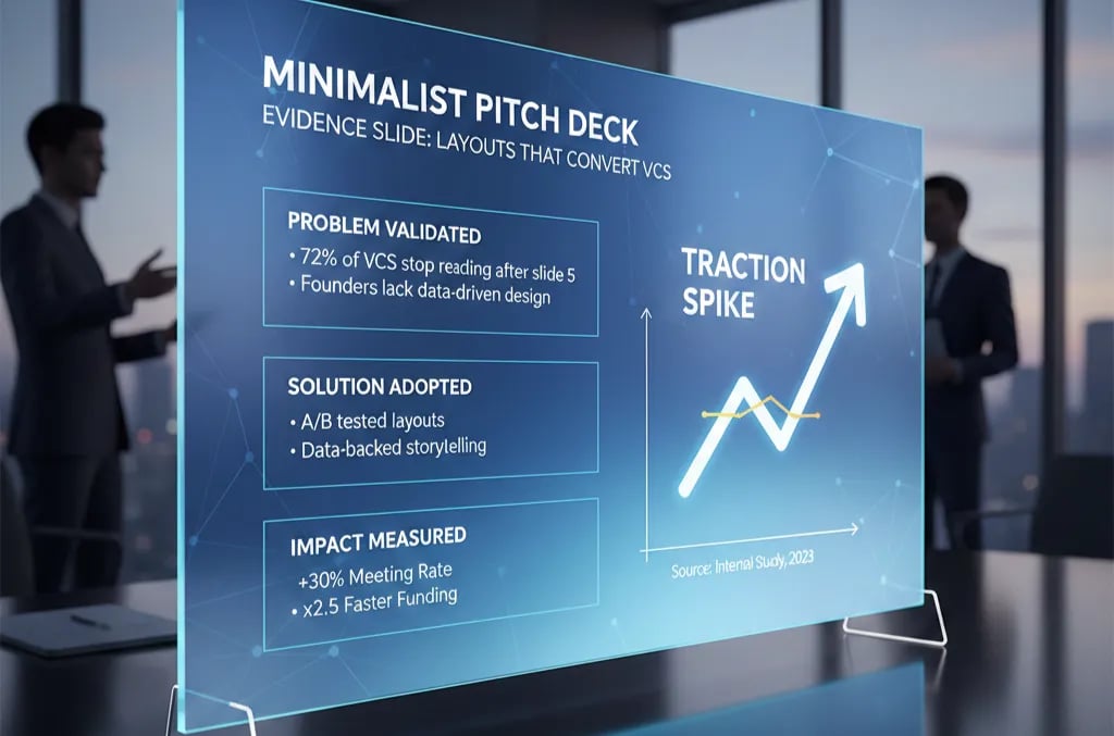
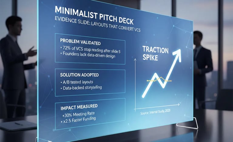
A slide titled "Traction" containing: MRR ($340K), YoY growth (180%), NPS (72), customer count (47), churn (2.1%), CAC ($1,200), LTV ($14,400), four customer logos, one press mention, and a pipeline figure. Every number is the same font size. There is a bar chart and a pie chart. The background is dark with white text in three different weights.
This slide does not communicate strength. It communicates anxiety.
VC-Ready Version (What Gets a Second Meeting)
Slide Title: "$340K MRR | 180% YoY | 2.1% Monthly Churn"
That is the entire headline. Three numbers. One sentence. No punctuation games.
Body — Left Column:
Single trend line: MRR from Month 1 to Month 18. Nothing else on the chart. No annotations beyond the start and end values.
Body — Right Column:
LTV:CAC ratio stated as a single line: "LTV:CAC = 12:1"
One customer quote — one sentence, attributed to title and company type only (no name required)
One benchmark comparison: "Median Series A SaaS LTV:CAC at this stage: 3:1 (Bessemer, 2024)"
Footer: "Full metrics available in data room."
That footer line does critical work. It signals you have more, you are not hiding anything, and you respect the partner's time. It reframes restraint as confidence, not scarcity.
The framework:
Evidence Slide = Lead Metric (Undeniable) + Efficiency Proof (LTV:CAC or Burn Multiple) + External Calibration (Named Benchmark)
Remove anything that does not serve one of these three roles. If your NPS score does not benchmark against a named industry standard, it is not evidence — it is self-report.
Three Evidence Slide Death Traps to Avoid After You Simplify
1. Stripping to the point of vagueness. Minimalism is not emptiness. "$340K MRR" without a time reference or growth rate is not a lead metric — it is a number with no context. Always anchor your lead metric to a rate of change.
2. Using 2021-era growth multiples as your benchmark. Citing a 2021 Bessemer report in a 2026 partner meeting signals you have not updated your competitive intelligence. Post-correction SaaS revenue multiples are running 4x–6x ARR at Series A, not the 15x–20x of the zero-rate era. Calibrate accordingly.
3. Confusing a logo slide with an evidence slide. Four customer logos are social proof, not traction evidence. If you cannot attach a revenue or retention figure to each logo, they do not belong on the Evidence Slide. Move them to a separate Customer Slide or cut them entirely.
The Pre-Money Impact of Getting This Slide Right
A clean, correctly architected Evidence Slide does not just improve readability — it compresses due diligence timelines. When a VC's analyst can extract your key metrics in under 60 seconds, the internal memo gets written faster, the partner meeting gets scheduled faster, and the term sheet conversation starts from a position of clarity rather than suspicion. In real terms, founders who present evidence with precision arrive at valuation conversations with less negotiating erosion. Ambiguity in traction is always discounted. Clarity is always priced up.
The Evidence Slide is not one component in isolation — it sits within a full slide-by-slide architecture. The complete framework is mapped in the Series A Problem and Solution Slide system for founders raising in 2025–2026.
Every week your Evidence Slide carries excess data is a week a VC analyst flags your deck as "needs clarification" and moves to the next file. The Slide-By-Slide VC Instruction Guide inside the $5K Consultant Replacement Kit is built to close this specific gap — it tells you exactly what goes on each slide, in what order, at what visual weight, so your Evidence Slide enters a partner meeting already matching what the analyst is checking against. The full Kit is $497. Get the pitch deck system built for Series A precision here.
Funding Blueprint
© 2026 Funding Blueprint. All Rights Reserved.