Pitch Deck Design Mistakes & Red Flags That Hurt Funding
Discover pitch deck design mistakes that quietly kill investor trust, trigger red flags, and cost founders funding. Fix yours before investors walk away.
PILLAR 6: DESIGN PRINCIPLES
12/26/20251 min read
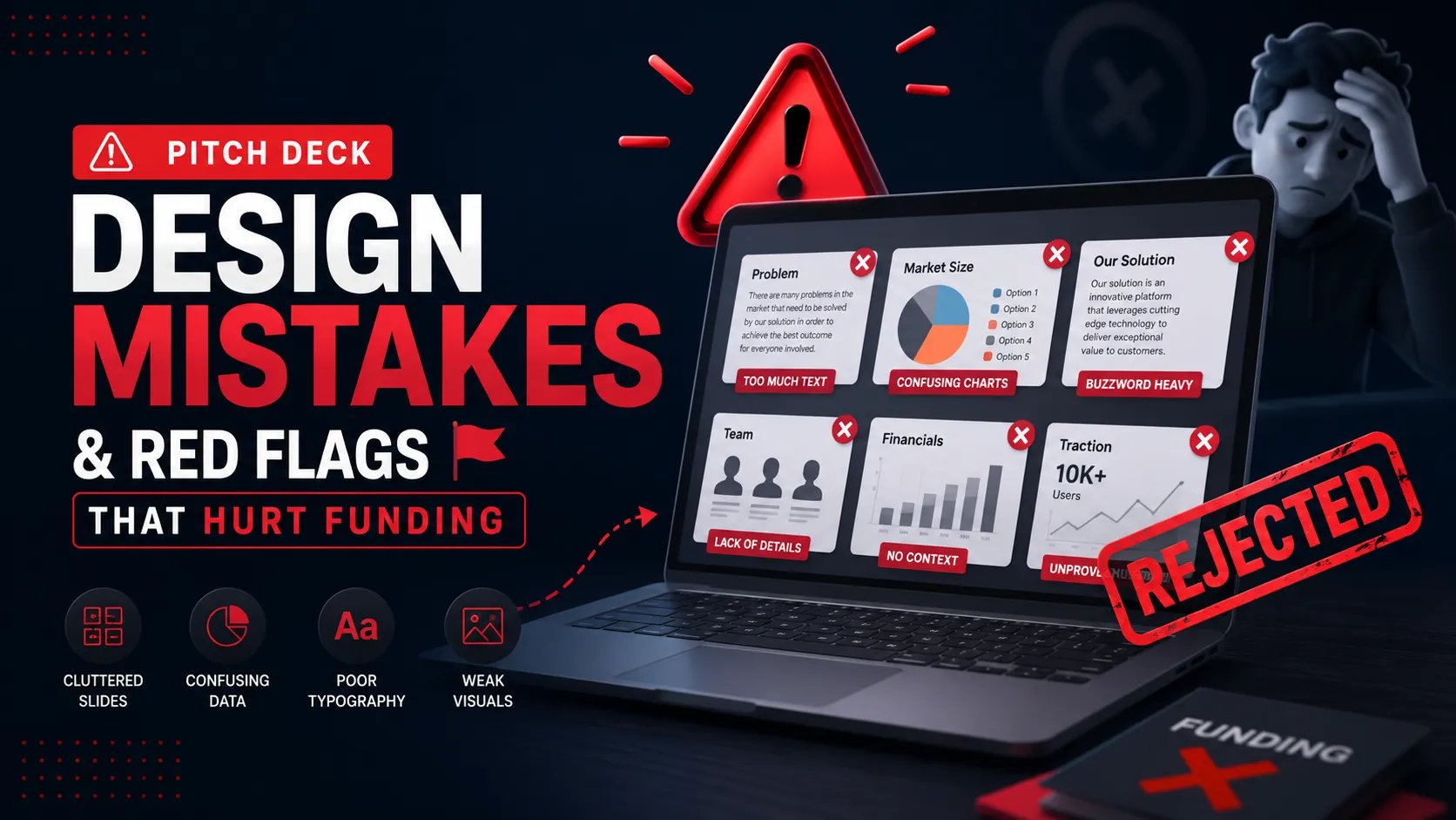
Forensic Deep Dives: Pitch Deck Design Mistakes & Red Flags That Hurt Funding
Funding Blueprint
© 2026 Funding Blueprint. All Rights Reserved.