Minimalist Pitch Deck Layouts: Maximizing VC Comprehension
Dense pitch decks kill Series A deals. Learn the 5 structural rules for minimalist layouts that force VC comprehension in under 4 seconds.
2.7 TACTICAL DESIGN RULES FOR PROBLEM & SOLUTION SLIDES VCS ACTUALLY RESPECT
2/27/20269 min read
Minimalist Pitch Deck Layouts: Maximising VC Comprehension at Series A
Most founders believe that a minimalist pitch deck is a risk — that stripping the slide down signals a thin business, an underprepared founder, or a thesis that cannot withstand scrutiny. The opposite is true, and the funds writing the largest Series A cheques in 2025 and 2026 are proving it with every partner meeting they do and do not schedule.
Minimalism in a pitch deck is not an aesthetic posture. It is a compression test. The question a minimalist layout answers — before the VC asks it — is whether the founder has done the hard cognitive work of distillation or whether they are outsourcing that work to the investor. VCs do not want to do that work. The founders who make them do it get passed. This is one execution layer inside a complete system: the full structural framework is documented in the tactical design rules for Problem and Solution slides that pass partner-level review.
Why Dense Slide Layouts Fail the Series A Comprehension Test Before the Room Even Speaks
The failure mode is architectural, not cosmetic. A dense layout does not just slow a VC down — it changes the cognitive task they are performing. The moment a slide requires active reading rather than instant recognition, the VC has shifted from investor mode to student mode. That shift is fatal to conviction-building, and it happens in under two seconds.
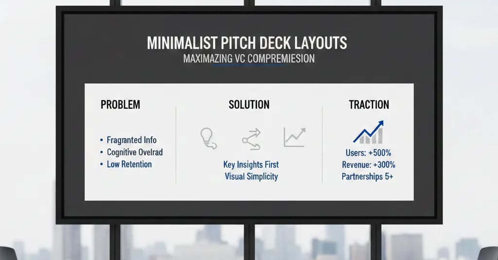
Here is what a comprehension-breaking layout looks like in the wild: a Problem slide with a headline in 28pt, three sub-bullets in 16pt, a supporting statistic embedded mid-paragraph in the same font weight as the surrounding text, a process diagram in the bottom-left quadrant, and a source attribution line that runs across the footer in 10pt italics. Every element has a defensible reason to exist. Collectively, they have destroyed the slide's single job: to transfer one belief from the founder's mind to the VC's mind in under four seconds.
The psychological driver is the same one that has appeared across every blog in this series — founders conflate comprehensiveness with credibility. A dense slide feels safer because it feels complete. In a partner meeting, it reads as a founder who has not yet developed the conviction to let a single claim stand without scaffolding. I have seen this specific layout pattern — the multi-element Problem slide with embedded statistics — in twelve decks reviewed this year across SaaS and marketplace verticals; nine were passed at the associate screen before reaching a partner.
The surgical diagnosis is this: density is the visual form of uncertainty. Every additional element on a slide is a founder hedging against the possibility that the primary claim is not strong enough. If the primary claim is not strong enough, the fix is a better claim — not more supporting material around a weak one.
The Comprehension Economics of a Minimalist Layout: What the Math Actually Shows
The efficiency argument for minimalist layouts is quantifiable, and founders who understand it stop treating whitespace as wasted real estate.
As of early 2026, US-based Series A funds — particularly the 2024–2026 vintage funds operating post-SVB with tightened deployment timelines — have standardised associate screening protocols that apply a 90-second initial pass to most inbound decks. At 20 slides, that is an average of 4.5 seconds per slide before an advance or pass recommendation is made. A dense slide does not receive more time because it contains more information. It receives the same time and transfers less of it.
The comprehension rate comparison across layout types:
High Density (4+ elements)
Time to Core Message: 12–18 seconds
Info Transferred (4.5s): Partial; headline only
Cognitive Mode: Comprehension work
Medium Density (2–3 elements)
Time to Core Message: 6–9 seconds
Info Transferred (4.5s): Headline + one supporting data point
Cognitive Mode: Mixed; some evaluation
Minimalist (1 headline + 1 element)
Time to Core Message: 2–3 seconds
Info Transferred (4.5s): Complete thesis transfer
Cognitive Mode: Full evaluation mode
Extreme Minimalism (headline only)
Time to Core Message: 1–2 seconds
Info Transferred (4.5s): Complete thesis transfer
Cognitive Mode: Full evaluation mode
The conclusion the math produces is counterintuitive to most founders: a slide with less on it transfers more information per second of VC attention. The reason is signal-to-noise ratio. Every non-essential element on a slide is noise. Noise does not add to the signal — it competes with it. Minimalist layouts eliminate the competition and route 100% of the VC's 4.5-second attention budget to the one thing that needs to land.
The comprehension formula for a minimalist slide:
(1 Claim) + (1 Supporting Element) + (Maximum Whitespace) = Maximum Information Transfer Per Second
This is not aesthetic theory. It is information architecture with a direct line to your meeting conversion rate.
The Minimalist Layout Protocol: Five Structural Rules for Maximum VC Comprehension
These are not design guidelines — they are structural constraints. Apply them as rules, not suggestions, and apply them in sequence.
Rule #1: The Headline Carries the Full Thesis - Or It Gets Rewritten
The minimalist layout lives or dies on the quality of the headline. If the headline is a category label, a topic descriptor, or a question, the slide has no foundation to be minimal — it is just empty.
Weak headline (cannot support minimalist layout): "The Growing Demand for Automated Compliance Solutions"
VC-ready headline (minimalist layout can operate around this): "Mid-market CFOs face $340K in average annual compliance penalties from manual audit processes — 73% of which are preventable with real-time monitoring."
The second headline is complete. It contains the segment, the mechanism, the financial consequence, and the implied urgency. A VC can form a full prior from this headline alone. That means the rest of the slide — the single supporting element — is doing amplification work, not load-bearing work. That is the correct structural relationship between a headline and its supporting visual.
The rewrite test: Remove everything on the slide except the headline. Ask a colleague unfamiliar with your business to state the problem, who it affects, and why it matters. If they cannot answer all three from the headline alone, the headline is not ready to anchor a minimalist layout.
Rule #2: One Visual Element Per Slide - Chosen by Function, Not by Habit
The single supporting element on a minimalist slide must be selected based on what cognitive job it needs to do — not based on what the data visualisation tool suggested or what looked good in the template.
The functional hierarchy for visual element selection:
A number in large type — when the scale of the problem or solution is the primary insight ("$2.3M average annual loss per mid-market client")
A single-series bar or line chart — when trend or comparison is the primary insight
A two-state diagram — when a before/after mechanism is the primary insight (current broken flow → fixed flow)
A single product screenshot with one highlighted UI element — when proof of solution specificity is the primary insight
What never earns a place as the single supporting element: pie charts (precision is destroyed at similar values), multi-series charts with a legend, ecosystem maps with more than four nodes, or stock photography used decoratively. Each of these increases cognitive load without increasing information transfer. They are noise in visual form.
Rule #3: Whitespace Is a Structural Element - Budget It Before Adding Content
The most common minimalism failure is a founder who removes content but does not allocate the resulting whitespace deliberately. The slide ends up with one bullet point marooned in the top-left corner and a blank void below it. That is not minimalism — it is an unfinished dense slide.
The whitespace budget rule:
Divide the slide into a 3×3 grid before placing any content. The headline occupies the top third, spanning the full width. The supporting element occupies the centre third. The bottom third is empty — except for a single-line source attribution in 8pt if required. Left and right margins are never less than 12% of the slide width.
This grid is not a design rule. It is a cognitive routing rule. The VC's eye enters at the top-left, reads the headline across, drops to the centre for the supporting element, and has nowhere else to go. There is no visual competition. The thesis lands cleanly and the slide is done.
Before applying the grid: Content is placed where it fits. The slide feels full. The VC's eye moves unpredictably across the slide, sampling elements in an order the founder did not control. The primary claim may not be the first thing processed.
After applying the grid: Content is placed where it directs attention. The slide feels deliberate. The VC's eye follows the predetermined route. The primary claim is always the first thing processed. Comprehension is forced into the correct sequence.
Rule #4: Two Font Sizes Maximum - Hierarchy Through Scale, Not Decoration
Font proliferation is one of the clearest immaturity signals in a pitch deck, and it directly undermines the comprehension efficiency of a minimalist layout. Three or more font sizes on a slide do not create hierarchy — they create noise with a hierarchy problem layered on top of it.
The two-size rule:
Size 1 — Headline: 36–44pt, bold weight, full width. This is the claim.
Size 2 — Supporting label or data annotation: 16–20pt, regular weight. This is the context for the visual element only.
No body text. No sub-bullets. No explanatory paragraphs. If the supporting element requires more than a 12-word annotation to be understood, it is the wrong supporting element — replace it with one that is self-explanatory at a glance.
The colour constraint that compounds the two-size rule: One primary colour for the headline and the highlighted element in the visual. One neutral (grey or off-white) for everything else. The VC's attention is routed by colour contrast — if everything is in the primary colour, nothing is. Minimalist layouts use colour as a spotlight, not a palette.
Rule #5: The Problem-to-Solution Minimalist Thread
A minimalist layout applied to the Problem slide in isolation creates a comprehension gap if the Solution slide reverts to density. The VC experiences the contrast as a loss of confidence — the founder was disciplined for one slide and then defaulted to their original instincts. That regression reads as a founder who applied surface-level advice without internalising the underlying principle.
The thread rule: The visual grammar of the Problem slide must continue through the Solution slide. If the Problem slide uses a single-series bar chart showing the cost of the problem at scale, the Solution slide uses the same visual format showing the elimination of that cost. The VC reads the two slides as a single unit — question and answer — rather than as two separate arguments.
The practical checkpoint: Place your Problem and Solution slides side by side. Ask whether the Solution slide is a direct visual answer to the Problem slide or a separate argument about your product. If it is the latter, the thread is broken and the comprehension chain collapses.
Three Minimalist Layout Traps That Produce the Wrong Kind of Sparse
1. Minimising the slide without maximising the headline. A sparse layout with a weak headline is not a minimalist deck — it is an empty deck. The constraint is non-negotiable: the headline must be strong enough to carry the full thesis before whitespace earns its place. Founders who strip content without first strengthening the core claim produce slides that look clean and communicate nothing.
2. Applying minimalist layouts to the deck but not the narrative flow. A slide can be visually minimal and structurally redundant. If your Problem slide and your Market slide are both making the same argument from different angles, you have two minimal slides doing one slide's job. Minimalism applies to the architecture of the deck, not just the visual density of individual slides. Redundant slides are density in disguise.
3. Treating minimalism as a permanent constraint rather than a quality filter. The purpose of these layout rules is not to produce the sparest possible deck — it is to force every element to earn its place. If a third element genuinely adds a non-redundant insight to a slide, the rule is not violated by including it. The violation is including elements that exist for comfort rather than for the VC's comprehension. The filter is "does this element accelerate the VC's path to belief?" — not "does this element exist?"
What Minimalist Layout Discipline Is Worth Inside a Partner Meeting
A deck built on minimalist layout principles does not just improve your screening conversion rate — it changes the quality of the conversation you have when you get into the room. A partner who absorbed your full thesis from your slides before you spoke a word is not spending the first fifteen minutes of the meeting building context. They are stress-testing your defensibility, your market timing, and your team's ability to execute against the thesis they already hold. That is the conversation where pre-money is negotiated — and in a US Series A environment where median pre-money sits at $22M–$28M, the difference between a context-building meeting and a conviction-testing meeting is not a marginal variable. It is the term sheet itself. The full system for building the Problem and Solution slides that deliver this outcome is inside the complete structural architecture for Series A Problem and Solution slide construction.
Founders who have run their deck through the Slide-By-Slide VC Instruction Guide inside the $5K Consultant Replacement Kit go into partner meetings with a minimalist layout that already matches the comprehension criteria a fund analyst will score against during the screening stage. That is not a cosmetic advantage — it is a filtering advantage before you have said a single word. The full Kit is $497. Access the layout benchmark your deck will be measured against at the Series A pitch resource built for founders who need fund-analyst-standard output without the $5K consulting engagement.
Funding Blueprint
© 2026 Funding Blueprint. All Rights Reserved.