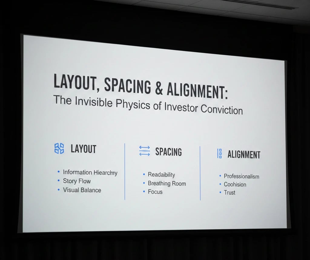
Layout, Spacing & Alignment: The Invisible Physics of Investor Conviction
Master the invisible physics of pitch deck design. Learn how layout, spacing, and alignment reduce cognitive friction to drive faster investor conviction in 2025.
PILLAR 6: DESIGN PRINCIPLES
12/25/20255 min read


Layout, Spacing & Alignment: The Invisible Physics of Investor Conviction
In the high-velocity venture capital corridors of London, New York, and San Francisco, an investor’s attention is a diminishing resource. While your content provides the "Logic," the Layout, Spacing, and Alignment of your deck provide the Spatial Logic—the silent scaffolding that allows a partner to "get" your business in under 120 seconds.
To win in 2025, your layout must be a bespoke reflection of your strategic advantage, moving beyond generic templates to demonstrate a founder’s superior Operational Grip.
This sub pillar is part of our main PILLAR 6 — DESIGN PRINCIPLES
Key Takeaways: The Spatial Power-Law
The Rule of "Proximity as Logic": Items placed close together are perceived as a single unit. Use spacing to group your Unit Economics so they tell a story, not just a list.
Negative Space is an Asset, Not a Void: In London and Toronto, "Whitespace" is a proxy for confidence. Clutter signals panic; space signals precision.
The "F-Pattern" vs. The "Z-Pattern": Optimize your UX/UI Design for the digital scan. VCs read data-heavy slides in an F-pattern and vision slides in a Z-pattern.
Mathematical Alignment: A 2-pixel misalignment triggers "Subconscious Friction," signaling a lack of attention to detail that VCs extrapolate to your product’s code.
Information Gain via Hierarchy: Use layout to force the investor to see your "Earned Secret" first, rather than burying it in a sea of bullet points.
1. The Physics of Negative Space (Whitespace)
In 2025, the most common "Red Flag" in a deck is Information Density. Founders in NYC and SF often try to "prove" their value by cramming every metric onto one slide. This creates Cognitive Strain, which VC associates and screening tools both reject.
The "Premium" Signal
Whitespace—the intentional empty space around your content—is the "Quiet Luxury" of pitch deck design. It creates Cognitive Fluency.
The Strategic Fix: Every slide should have a "Primary Focal Point" that occupies no more than 40% of the visual real estate. The remaining 60% should be negative space.
The VC Thought: "This founder is confident enough to let their best metric stand on its own. They aren't trying to hide a weak business behind a wall of text."
2. Alignment as a Proxy for "Operational Grip"
Investors are professional pattern-matchers. If your icons are poorly aligned or your text boxes vary in their margins, you are triggering a "Sloppiness Signal."
The Grid System
World-class decks are built on a 12-Column Grid. This ensures that every element—from your Series A funding ask to your GTM Strategy—is anchored to a consistent mathematical line.
Horizontal Alignment: Align all headers to the same Y-axis across every slide. This creates a "Visual Anchor" that allows the investor to flip through 15 slides without their eyes needing to re-adjust.
Vertical Alignment: Use "Middle Alignment" for icons and text to create a sense of balance.
The Pattern Interrupt: Unique layouts that break the grid intentionally to highlight a outlier metric (like a 120% NRR) create a psychological "stop" that forces the investor to focus.
3. Proximity and the "Logic of Grouping"
According to the Gestalt Principles of Design, the human brain automatically assumes that objects placed near each other share a relationship. Most founders ignore this, scattering their Traction and Market Size metrics across the page.
Engineering the Relationship
The "Traction Triad": Group your MRR, Churn, and LTV/CAC in a single visual cluster. By placing them in close proximity, you are telling the investor: "These numbers aren't random; they are the gears of our machine."
Padding and Gutters: Ensure the space between groups (the gutter) is at least 2x the space within a group (the padding). This creates a clear "Visual Map" of your business.
4. The "F-Pattern" of Data Forensics
Since most VCs in the UK, US, and Canada will view your deck on a high-resolution laptop or tablet, you must design for the Digital Eye-Track.
Layout Optimization for Scanning:
The Header (The Assertion): The eye starts at the top left. This is where your Assertion-Evidence Header must live.
The Left Column (The Proof): As the eye moves down the left side, it should hit your "Primary Metric."
The Middle Scan (The Context): The eye then moves across to find the "How" or the "Why."
The Mistake: Placing your "Ask" or your "Valuation" in the bottom-right corner where the eye rarely lingers.
The Fix: Place your most "Infectious" data where the F-pattern peaks.
5. Layout Architectures by Stage (Seed vs. Series A)
The layout required by an investor changes as you move from Seed to Series A and B funding. Your layout must reflect this evolution.
The Seed Layout: "The Visionary Canvas"
At the Seed stage, you are selling Potential. Use "Open" layouts with large, high-resolution imagery and minimal text. The layout should feel like a "Window into the Future."
Focal Point: The Founder or the "Earned Secret."
The Series A Layout: "The Industrial Blueprints"
At Series A, you are selling Predictability. The layout should be more structured and "Modular." Use tables, side-by-side comparisons, and "Metric Blocks" that signal Capital Efficiency.
Focal Point: The Unit Economics and the Scalability of the GTM (Go-To-Market) engine.
6. The "Trench" Report: The $10M "Alignment" Audit
I once worked with a DeepTech founder in London whose business was objectively incredible. However, his deck felt "unprofessional." During an audit, we realized he was using "Center Alignment" for his body text and "Left Alignment" for his headers.
The consequence? The "Return Saccade"—the jump the eye makes from the end of one line to the beginning of the next—was inconsistent. The investors were getting physically tired reading his slides.
The Fix: We moved to a strict Left-Aligned Hierarchy. We increased the Leading (line spacing) to 1.6x. The Result: The "Cognitive Load" dropped. The investors spent the meeting talking about the science rather than struggling with the slides. He closed a $10M round three weeks later. Layout is the lubricant for information transfer.
7. Regional Calibration: Spatial Dialects
San Francisco (The "Spacious" Look): SF investors value "High-Concept" simplicity. If you have more than 30 words on a slide, you’ve lost. They want a layout that feels like a high-end consumer app.
New York (The "Dense" Look): NYC investors have a higher tolerance for data density, provided it is perfectly aligned. They value "Throughput." A layout that shows LTV/CAC next to Payback Period in a tight, professional grid signals a "Wall Street" level of rigor.
London & Toronto (The "Conservative" Look): These regions value "Balanced Architecture." They dislike "flashy" layouts. A centered, symmetrical layout that emphasizes Stability and Traction builds the most trust.
8. Semantic Innovation: The "Diagonal" Pitch Flow (New Information)
A technique emerging among top-tier founders is the Diagonal Narrative Flow. Unlike traditional vertical or horizontal layouts, this uses a diagonal visual anchor from top-left to bottom-right to lead the eye through a "Path of Discovery."
Top-Left: The Insight (The Seed).
Center: The Execution (The Growth).
Bottom-Right: The Outcome (The Harvest).
Why it works: By breaking the 90-degree grid, you create an "Active Reading" state. The investor cannot passively scan; they must consciously follow the story, increasing retention of your unique metrics.
Expert FAQ: The Mechanics of Layout
Should I use "Full-Bleed" images?
Only for the Vision slide or the Origin Story. For data slides, full-bleed images create "Visual Noise" that makes your Unit Economics harder to read. Clarity beats "Vibe" when discussing numbers.
How do I handle "Complex" products in a simple layout?
Use Progressive Disclosure. Don't show the whole machine on one slide. Use a layout that shows the "High-Level Value" on Slide 4 and the "Technical Architecture" on Slide 5. This allows the investor to "Opt-in" to the complexity.
What is the "Golden Ratio" in deck design?
The Golden Ratio (1.618) can be used to determine the proportion between your "Content Area" and your "Sidebar/Whitespace." A layout that follows these natural proportions is subconsciously perceived as more "Beautiful" and "Organized" by the human brain.
Summary Checklist: The Layout Audit
The F-Pattern: Is the "Assertion" in the top-left and the "Proof" in the middle-scan?
12-Column Grid: Do all your elements "Snap" to a consistent mathematical line?
Whitespace: Is at least 50% of the slide "Negative Space"?
Proximity: Are related metrics (like Churn and LTV) grouped together?
Alignment: Is your body text Left-Aligned to reduce the "Return Saccade" effort?
Information Gain: Does the layout emphasize a Unique Insight rather than a generic template?
Funding Blueprint
© 2026 Funding Blueprint. All Rights Reserved.
