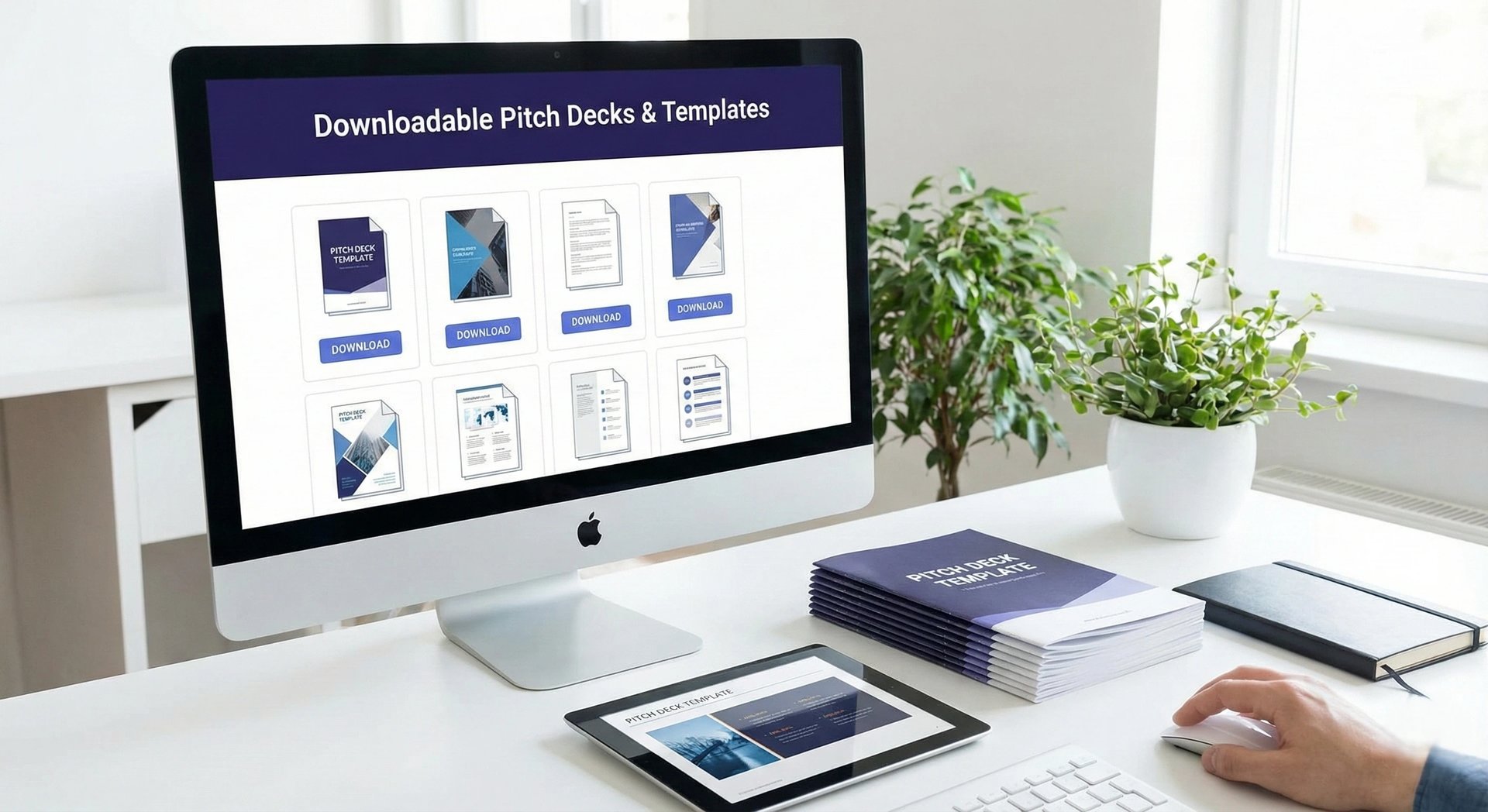
Downloadable Pitch Decks & Templates: The Forensic Audit of "Ready-Made" Success
Downloadable Templates: "Fill-in-the-blanks" decks signal laziness. VCs reject generic layouts instantly. Master the Forensic Template Audit to ensure structural integrity and avoid the "Clone" label in 2026.
PILLAR 12: TOOLS, TEMPLATES & EXAMPLES
1/12/20267 min read


Downloadable Pitch Decks & Templates: The Forensic Audit of "Ready-Made" Success
A template is a container. If you pour toxic waste into a crystal glass, it is still toxic waste. Most founders obsess over the glass and ignore the liquid.
In the fundraising ecosystem, "Downloadable Templates" are a double-edged sword. On one side, they provide Structural Velocity—saving you 20 hours of formatting time so you can focus on strategy. On the other side, they create "Clone Risk." If an investor sees the same "Teal and Orange" Canva startup template for the fifth time this week, they subconsciously categorize you as "Generic Inventory."
Forensic analysis of Series A data rooms shows a clear bifurcation:
The Amateurs: Use rigid, over-designed templates from graphic design marketplaces that force their content into arbitrary text boxes.
The Pros: Use "Logic-First" frameworks (like YC or Sequoia) to build the narrative, then apply a "Light Design Layer" for polish.
This analysis is a surgical review of the Downloadable Pitch Deck Landscape. We will filter the noise, identifying the "Gold Standard" templates that actual VCs respect, the "Design Traps" to avoid, and the "Frankenstein Protocol" for building a bespoke asset from open-source parts.
This sub pillar is part of our main Pillar 12 — Tools, Templates & Examples
The Trench Report: The "Envato" Bloat (A Seed Stage Rescue)
In Q2 2025, I audited a HealthTech founder in Boston. He was raising $3M. He had purchased a "Premium Pitch Deck Bundle" for $45 from a popular design marketplace.
The Structural Error:
The template was 80 slides long.
The Weight: The file size was 65MB because of high-res stock photos of "Scientists in Labs" embedded in the master slides.
The Logic: The template prioritized "Visual Balance" over "Data Density." The "Financials" slide allowed for only three big numbers (Revenue, Users, Growth) but had no room for a P&L table or Unit Economics calculation.
The Result: Investors were bouncing. The file was too heavy to open on mobile, and the content was "Fluff."
The Technical Pivot:
We scrapped the premium template entirely.
The Fix: We downloaded the Y Combinator Seed Deck Template (Google Slides). It is ugly, brutalist, and text-heavy.
The Action: We forced the founder to fill out the 10 slides in plain text. No photos. Just logic.
The Polish: Once the logic held water, we exported it to PowerPoint and applied a simple "Master Style" (Navy Blue headers, Arial font).
The Outcome: The file size dropped to 2MB. The narrative clarity increased 10x. He secured a lead investor within 3 weeks because the deck respected the investor's need for information, not decoration.
The Forensic Formula: The Template Efficiency Ratio Te
Te = Customizable Data Fields
Static Graphic Elements
Forensic Logic:
High Te (Good): The template is mostly charts, tables, and text boxes you can edit. (e.g., Sequoia Template).
Low Te (Bad): The template is mostly uneditable shapes, stock photos, and "lorem ipsum." (e.g., Creative Market "Vibe" decks).
The Repository (Where to Download What)
Do not Google "Free Pitch Deck Template." You will land on SEO spam farms. Use these specific, forensic-grade sources.
1. The Logic Layer (The Skeletons)
These are ugly but structurally perfect. Download these to build your narrative.
The Y Combinator Seed Deck:
Source: Y Combinator Library
The Vibe: Brutalist. White background. Black text.
The Signal: "I care about growth, not art."
Best For: Early-stage SaaS, DevTools, Hard Tech.
The Sequoia Capital Deck:
Source: Sequoia Capital Website
The Vibe: The classic 10-slide arc.
The Signal: "I respect the tradition of Venture Capital."
Best For: Series A, Generalist Tech.
2. The Visual Layer (The Skin)
These are for "Vibe Control." Use them only AFTER your logic is solid.
Canva "Minimalist" Series:
Source: Canva Templates
Forensic Warning: Filter by "Minimalist" or "Clean." Avoid "Creative" or "Colorful."
The Hack: Use the Layouts (where the photo goes, where the text goes) but delete their stock photos and vectors immediately.
Envato Elements / GraphicRiver:
Source: Envato
Best For: Consumer Social, D2C, Luxury.
The Protocol: Buy it for the Icon Pack and the Typography pairings. Do not use their "Team Slide" (usually just photos with no text space for bio).
3. The Specialist Layer (Industry Specific)
SaaS Financial Model Template (Christoph Janz):
Source: Point Nine Capital
The Asset: This is an Excel model, not a slide. But you must screenshot these outputs into your deck.
The Signal: "I understand SaaS Metrics (MRR, Churn, CAC)."
Deep Tech / BioTech (Life Science):
Source: Search for "Flagship Pioneering" style decks.
The Asset: Dense, data-heavy slides.
The Signal: "Science First."
The "Frankenstein" Protocol
The top 1% of founders do not use one template. They build a "Frankenstein" asset using the best components of three different sources.
Step 1: The Skeleton (Logic)
Download the Sequoia Template.
Write your entire script in this file. No images. Just bullet points.
Result: A boring but logically sound argument.
Step 2: The Skin (Design)
Download a Canva/Envato template that matches your brand colors.
Export the "Backgrounds" (Master Slides) as images.
Import these backgrounds into your PowerPoint/Keynote.
Result: You have "Professional Polish" without the restrictive text boxes of the design template.
Step 3: The Brain (Data)
Build your charts in Excel or Google Sheets.
Copy/Paste them as "Editable Charts" into the deck.
Result: Live data that you can update when your revenue changes next week, without needing a designer to redraw a bar.
Regional Calibration (SF vs. London)
Your template choice signals your geographic IQ.
San Francisco (The "Memo" Culture)
The Trend: Moving away from slides entirely toward Notion Memos or Loom Videos.
The Template: A 2-page Notion document.
Section 1: The Insight.
Section 2: The Traction.
Section 3: The Team.
The Signal: "I am too busy building to make slides." (High Status).
London / New York (The "Deck" Culture)
The Trend: Still firmly rooted in PowerPoint / PDF.
The Template: Must be standard 16:9 aspect ratio.
The Signal: "I am professional. I am audit-ready." Sending a Notion link to a London banker-turned-VC often results in "Can you send a PDF?"
Template Red Flags
Investors can spot a lazy template user from a mile away.
Red Flag 1: The "Lorem Ipsum" Ghost
The Error: Leaving a small text box with Latin filler text in the footer or a forgotten "Terms & Conditions" slide.
The Forensic Meaning: "Lack of Attention to Detail." If you miss this in the deck, you will miss a clause in the Term Sheet.
Red Flag 2: The "Stock Photo" Team
The Error: Using the template's default photos of "Happy People in Suits" for your "Customer Testimonials."
The Forensic Meaning: Fraud. It looks like you are faking traction.
The Fix: Use real screenshots of real emails from real customers. Even if they are ugly. Authenticity > Polish.
Red Flag 3: The "Skill Bar" Chart
The Error: A slide showing team skills as percentage bars (e.g., "Coding: 90%", "Marketing: 80%").
The Forensic Meaning: This is a resume filler, not a business metric. What does "90% Marketing" mean? It is nonsense.
The Fix: Delete it. Replace with "Key Achievements" (e.g., "Scaled revenue to $1M").
Earned Secrets
Hidden levers of deck construction.
Secret 1: The "Slide Master" Hack
The Secret: Amateurs edit slides one by one. Pros edit the Slide Master.
The Hack: In PowerPoint, go to View > Slide Master. Set your font (e.g., Inter) and your Logo placement there.
The Result: It updates every slide instantly. This saves you 5 hours of formatting time when you inevitably decide to change your font size later.
Secret 2: The "PDF Hyperlink" Trap
The Secret: Many fancy design templates use "Shapes" that look like buttons but aren't clickable.
The Hack: When you export to PDF, you must manually draw a clear "Transparent Box" over your "Click for Demo" button and hyperlink that box.
The Why: If an investor clicks "Watch Video" and nothing happens, they assume the tech is broken.
Secret 3: The "Aspect Ratio" Standard
The Secret: Old templates are 4:3 (Square). Modern screens are 16:9 (Wide).
The Hack: Never use a 4:3 template. It puts black bars on the side of the investor's screen and screams "I haven't pitched since 2012."
Expert FAQ: The Unasked Questions
Q: Should I pay $2,000 for a "Custom Deck Design" agency?
A: Forensic Answer: Series A: Maybe. Seed: No.
Logic: At Seed, your story changes every week. If you pay an agency, you are locked into a static asset. You need to be able to edit the deck yourself at 2 AM. Use a clean template you control. At Series A, the story is stable, and brand polish matters more.
Q: Can I use Google Slides?
A: Forensic Answer: For Building: Yes. For Sending: No.
Logic: Build in Google Slides for collaboration. But always download as PDF before sending. Sending a Google Slides link feels like a "Draft" and allows them to see your Version History (e.g., "Deleted Slide: Lawsuit Risk").
Q: What is the best font?
A: Forensic Answer: San Serif (Arial, Inter, Helvetica, Roboto).
Logic: Never use Serif fonts (Times New Roman) unless you are a luxury fashion brand. They are harder to read on screens.
Forensic Audit Checklist
Before you use any downloaded template, run the "Sanity Diagnostic":
The "Mobile Test": Export one slide to PDF and view it on your phone. Is the font size > 20pt? If the template uses 12pt, delete it.
The "Chart Test": Try to edit a chart. Is it a real chart (linked to data) or just a "drawing" of a chart? If it's a drawing, delete the template. You need real data.
The "Color Test": Does it use High Contrast? (e.g., White text on Black background). Avoid "Light Grey on White." It is unreadable on projectors.
The "Orphan" Check: Delete any slides you aren't using. Do not leave "Hidden Slides" in the file; sometimes PDF converters un-hide them.
The "Scrub": Check the Metadata.
0.01% Insider Insight: The "Metadata" Scrub
Most founders don't realize that "Downloadable Templates" carry digital DNA.
The Secret: If you download a template from a cheap site, the "Author" field in the PowerPoint metadata often says "Envato_User_77" or "Free_Slides_Co."
The Trap: If a VC checks the file properties (which Associates do), they see you used a generic freebie. It signals "Low Budget."
The Fix: Go to File > Info > Properties > Advanced Properties. Change the "Author" to Your Name and the "Company" to Your Startup. It takes 10 seconds but adds a layer of professionalism that 99% of founders miss.
(Note: The Funding Blueprint Kit includes Founder-Proofed Frameworks built on real-world investor reactions and the Slide-By-Slide VC Instruction Guide. These resources decode the specific VC psychology behind every potential objection, ensuring you don't just memorize a script, but internalize the logic required to survive the audit. Access the full forensic suite at the home page.)
Funding Blueprint
© 2026 Funding Blueprint. All Rights Reserved.
