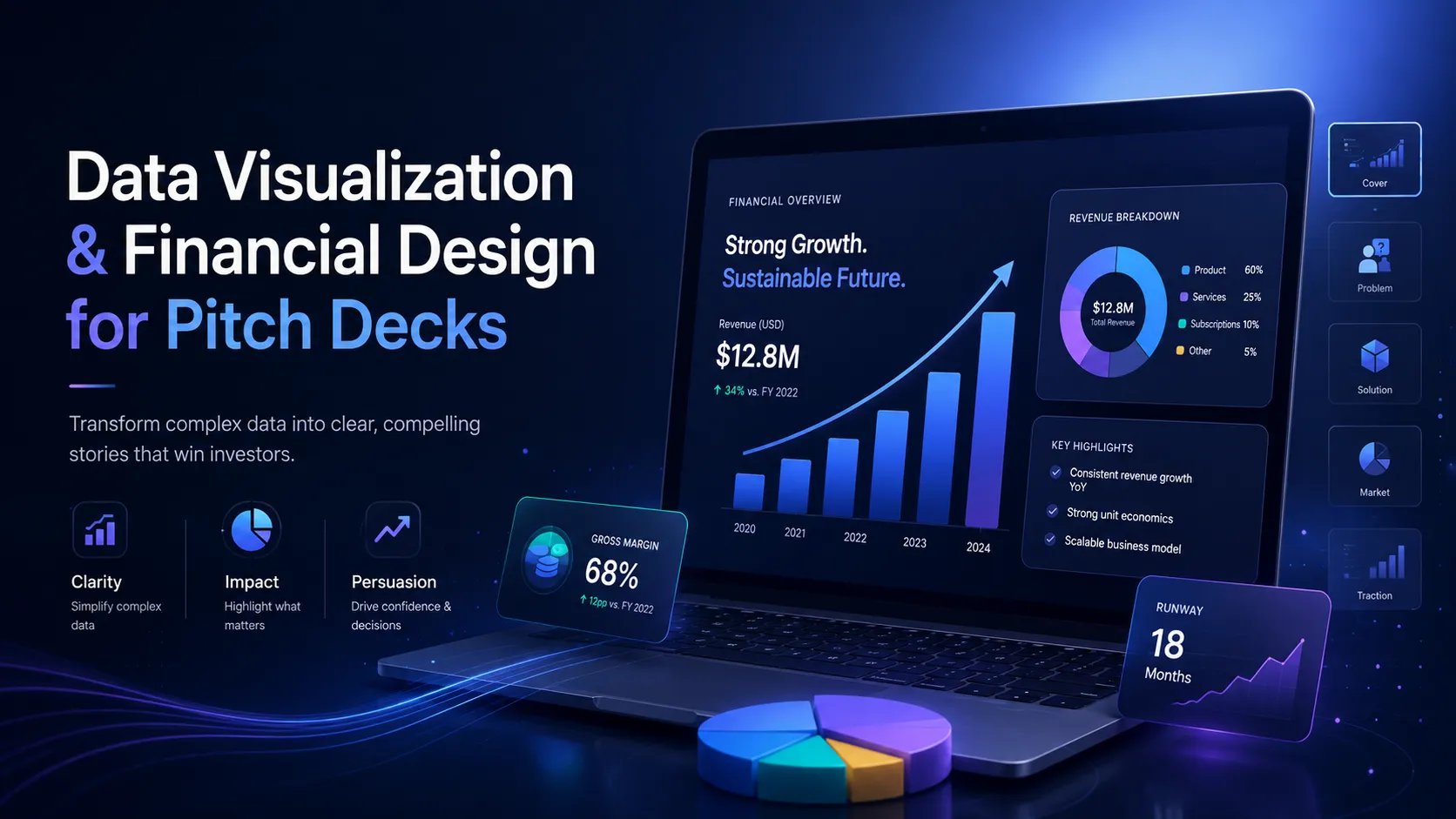
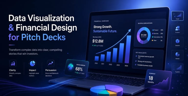
Data Visualization & Financial Design: The Forensic Alpha of Fundability

Aesthetics are a commodity; Metric Integrity is a rarity. Master the forensic design of startup financial slides for 2025. Learn the 'Squint Test' and regional calibration secrets elite VCs in SF, NYC, and London demand.

PILLAR 7: TRACTION & METRICS

12/29/20256 min read

Futuristic financial dashboard featuring data visualization and forensic alpha investigation tools t

Data Visualization & Financial Design: The Forensic Alpha of Fundability

Why Your "Beautiful" Deck is Costing You Millions

In the elite venture ecosystem of 2025, aesthetics are a commodity, but Metric Integrity is a rarity. Most founders treat their financial slides like a graphic design project. This is a fatal error. High-tier investors—the ones in Mayfair, Sand Hill Road, and Bay Street—don't look at your charts to see growth; they look at them to find the "lie."

If your data visualization is purely "aspirational," you aren't showing vision; you are showing a lack of Operational Grip. A world-class deck doesn't just present data; it weaponizes it to reduce the investor's Cognitive Load, moving them from suspicion to conviction in under three seconds.

This sub pillar is part of our main Pillar 7: Traction & Metrics

The Trench Report: The $18.5M "Cumulative Trap" Pivot

In early 2025, I consulted for a Series B Cybersecurity firm based in Toronto looking to raise $18.5M from a syndicate of NYC and London investors. On paper, their growth was stellar. Their primary chart was a beautiful, upward-sloping "Cumulative Revenue" mountain.

The Forensic Failure: During the first deep-dive with a London-based GP, the "Audit-focused" mindset took over. The GP noticed that while the cumulative line was rising, the gradient (the slope) was subtly flattening. By choosing a cumulative view, the founder was inadvertently trying to hide a 14% month-over-month decline in new bookings. The London investor viewed this as a breach of Trustworthiness. The deal, which was at the Term Sheet stage, went cold in 48 hours.

The Pivot: We performed a "Data Exorcism." We scrapped the cumulative mountain and replaced it with a "Layer Cake" Cohort Analysis. We used Narrative Breadcrumbs—small, bold annotations on the chart—to explain that the decline was a deliberate "Churn Cleanse" where they offboarded low-margin legacy clients to focus on high-LTV enterprise accounts.

By visualizing the Net Revenue Retention (NRR) instead of just "Total Cash In," we proved Metric Integrity. We showed the NYC investors the "Upside Potential" and the London investors the "Unit Economic Floor." The round was eventually oversubscribed at $22M.

The 3-Second Logic: Solving for Cognitive Load

An investor's brain operates on two speeds, a concept known in behavioral economics as System 1 vs. System 2 thinking.

  1. System 1 (Fast/Intuitive): This is the "gut feel." If your chart is cluttered, uses too many colors, or has tiny axis labels, System 1 flags it as "Complex = Dangerous."

  2. System 2 (Slow/Analytical): This is where the actual math happens.

Your goal in financial design is to satisfy System 1 so quickly that the investor has the mental bandwidth to engage System 2 on your terms. If they spend 60 seconds just trying to figure out what the X-axis represents, you have already lost the "Mental Real Estate" required for a "Yes."

The Squint Test

If you cannot understand the "Primary Assertion" of a slide by squinting your eyes until the text is unreadable, the slide is a failure. Bold the trend. Lighten the gridlines. * Make the assertion the title. (e.g., Don't title a slide "Revenue"; title it "Revenue Scaled 3x with 0% Headcount Increase.")

Regional Calibration (SF vs. London vs. Toronto)

Fundraising is a cultural exercise. A visual that wins in San Francisco will often be laughed out of a boardroom in London.

1. San Francisco (The Aspirational/Story-Heavy Lens)

Silicon Valley investors prioritize The North Star. They want to see "The Big Mo" (Momentum).

  • Design Strategy: Use "Extension Lines." Show where the data is going, not just where it has been.

  • Focus: Top-line growth, TAM expansion, and "Market Capture" speed.

2. London (The Audit-Focused/Integrity-Heavy Lens)

The UK investment scene is historically more conservative and focuses on Capital Efficiency.

  • Design Strategy: Use "Forensic Footnotes." Every spike in a chart should have a tiny, gray-text explanation of the operational driver.

  • Focus: Burn multiples, EBITDA pathways, and the "Death Valley" escape plan.

3. Toronto/Canada (The Hybrid/Pragmatic Lens)

Canadian VCs look for "American Growth with European Fundamentals."

  • Design Strategy: The "Stability Overlay." Show your growth bars, but overlay a line showing "Cash Runway" or "Operating Leverage."

  • Focus: Sustainable scaling and R&D-to-Revenue ratios.

Preventing Red Flags in Due Diligence

Data visualization is the first stage of Due Diligence. If your "Teaser Deck" visuals don't match the "Data Room" spreadsheets, the deal dies.

Red Flag 1: The Truncated Y-Axis. Starting your Y-axis at $5M instead of $0 to make a $1M growth spurt look like a vertical line is the fastest way to lose a NYC Tier-1 fund. It signals that you are "selling" rather than "managing."

Red Flag 2: The "Cherry-Picked" Window. Showing a 6-month window because months 7 and 8 were bad is a "Cognitive Load" trap. Investors will ask for the full 24-month view anyway.

The Metric Logic Fix: Always display a Trailing Twelve Months (TTM) average line over monthly volatility. This proves you have Operational Grip—you understand that month-to-month noise is secondary to the structural trend.

3 "Earned Secrets" for 2025 Founders

These insights are not found in standard "How to Pitch" blogs; they are derived from high-stakes boardroom negotiations.

Secret 1: The "Decay Rate" Transparency

In 2025, everyone is obsessed with AI. If you are a SaaS or AI-wrapper startup, show your Model Decay or Feature Commodity rate visually. By showing a chart that acknowledges your current tech will be 20% less valuable in 18 months—and then overlaying your "Product Innovation" roadmap—you prove a level of Expertise that 99% of founders lack. You aren't just a builder; you are a strategist.

Secret 2: The "Liquidity Cascade" Visual

Instead of a boring "Use of Funds" pie chart (which is useless), use a Waterfall Chart. Show how $1 of investment cascades through your "Growth Engine."

  • $0.40 goes to CAC.

  • That CAC generates $3.00 of LTV over 18 months.

  • $0.20 of that LTV is reinvested into R&D. This proves Metric Integrity and shows exactly how you will turn their capital into a "Money Machine."

Secret 3: The "Continuing Conversation" Technique (Semantic Innovation)

Never give away the whole story on the slide. Use a Narrative Breadcrumb that forces a question.

  • Example: On your "Customer Acquisition" slide, leave one bar a different color and label it "Experimental Channel - See Appendix/Deep Dive." This creates a psychological "loop" that the investor needs to close, ensuring they move from the email teaser to a live meeting. It shifts the power dynamic from "I am pitching you" to "We are solving a puzzle together."

The Forensic Glossary

To speak the language of the elite, you must master these terms:

  • Metric Integrity: The mathematical certainty that your visuals are a 1:1 representation of your raw CSV files.

  • Operational Grip: The ability to explain the variance in a chart without looking at your notes.

  • Cognitive Load: The amount of mental effort required to process your slide. Your goal is "Cognitive Ease."

  • Narrative Breadcrumb: A visual or textual cue that links the current data point to a future strategic milestone.

  • Forensic Design: A design style that prioritizes data clarity and audit-ability over brand colors and icons.

Expert FAQ: The Unasked Questions of the 1%

"Is it okay to use 'Projected' data in the same chart as 'Actuals'?"

Only if the "Actuals" are solid colors and "Projected" are patterned or semi-transparent. Mixing the two without visual distinction is a "Trustworthiness" violation.

"What is the optimal number of data points per slide?"

The "Rule of 7." The human brain struggles to hold more than seven distinct pieces of information in short-term memory. If your chart has 15 bars, group them or use a "Highlight" filter to focus on the top 3.

"Should I mention my competitors in my financial charts?"

Yes, but not as a "Feature Checkbox." Use a Relative Efficiency Frontier chart. Show your "Revenue per Employee" vs. the industry average. That is a forensic metric that VCs love because it shows Operational Grip.

Summary Audit Checklist for Founders

Before you hit "Send" to that GP in London or NYC, run this audit:

  1. The Squint Test: Can I see the "Growth Vector" without my glasses?

  2. The Axis Integrity Check: Does the Y-axis start at zero? Are the intervals consistent?

  3. The Regional Calibration: If I’m sending this to the UK, did I include the Unit Economics? If to the US, is the "Scale" obvious?

  4. The Narrative Breadcrumb: Does this slide "tease" the next logical question to secure a meeting?

  5. The System 1 Filter: Are there more than 3 primary colors? (If yes, simplify).

  6. The Forensic Footnote: Is the data source and date range clearly marked?

Final Thoughts: The Automation of Excellence

The difference between a $1M seed and a $10M Series A is often just the Perceived Sophistication of the management team. When your data visualization looks "Forensic," you are telling the investor: "I have absolute control over this business. I am not guessing; I am executing."

Mastering the balance of System 1 appeal and System 2 depth is what separates "Founders" from "CEOs."

Building these standards from scratch is an exhaustive process that requires years of "Trench Experience." This is precisely why we developed the $497 Funding Blueprint Kit. It isn't just a set of templates; it is a "Financial Operating System" designed to automate Metric Integrity and Regional Calibration. It handles the Cognitive Load math for you, ensuring your visuals pass the Squint Test of the world’s most skeptical investors.

If you’re ready to stop "making slides" and start "designing deals," visit our home page to see how the Blueprint Kit can transform your fundraising trajectory.