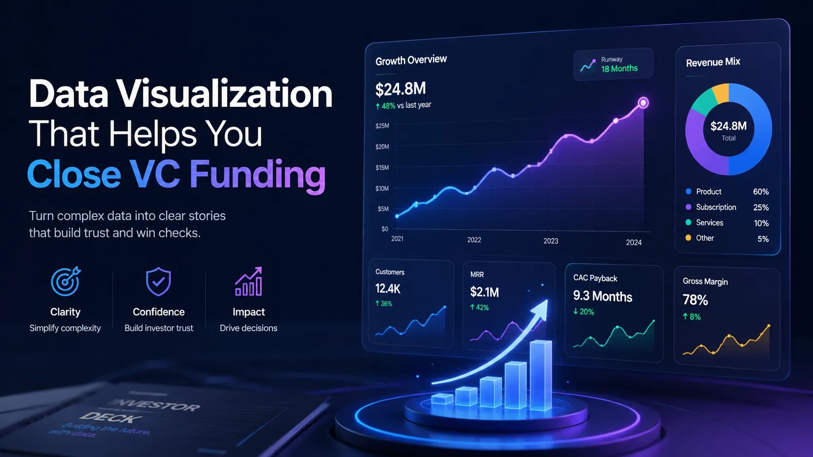
Data Visualization & Charts: The Forensic Language of Conviction

Master the forensic language of conviction. Learn how to design pitch deck charts and data visualizations that build trust and survive VC scrutiny in 2025.

PILLAR 6: DESIGN PRINCIPLES

12/25/20256 min read

Data Visualization & Charts: The Forensic Language of Conviction

In the high-stakes venture capital ecosystems of London, New York, and San Francisco, your Unit Economics and Traction are the heartbeat of your pitch. However, data alone does not win rounds; the Visualization of that data does. In 2025, investors are not just looking for "up and to the right" curves; they are performing a psychological and mathematical audit of your Operational Grip.

The brutal truth? A poorly designed chart is a "Red Flag" for metric dishonesty or lack of rigor. If your axes are misleading or your data is cluttered, you trigger "System 2" skepticism—the analytical, "fault-finding" mode of the brain. To win a Series A funding round, your charts must move beyond "reporting" to "storytelling," proving that your growth is not just a fluke, but a predictable machine.

This sub pillar is part of our main PILLAR 6 — DESIGN PRINCIPLES

Key Takeaways: The Data Power-Law

  • Slope Over Scale: Investors care more about the velocity of your growth than the absolute numbers at early stages. Your charts must emphasize the Delta.

  • The "Assertion-Evidence" Chart: Every chart must have a declarative headline that tells the investor what to conclude before they even look at the data.

  • Metric Integrity: Avoid "Chart Crimes" like truncated Y-axes or cumulative growth curves that mask plateaus. These are terminal for trust.

  • Cognitive Fluency: Use color and layout to highlight the "Signal" (your North Star metric) and mute the "Noise" (secondary data).

  • Regional Calibration: NY/London VCs expect forensic, multi-variable charts; SF VCs prioritize high-impact, visionary "Hockey Sticks."

1. The Neurobiology of Data: From Vision to Conviction

The human brain is not evolved to read spreadsheets; it is evolved to detect patterns in a visual landscape. When an investor scans your Investor Pitch Deck, they are looking for Disruption and Inevitability.

The "Pattern Interrupt"

If every chart in your deck looks like a generic Excel export, the investor’s brain enters "Auto-Pilot." To create Information Gain, you must use visual "Pattern Interrupts"—such as callouts for major milestones—to force the brain to engage.

Reducing "Extraneous Load"

Every unnecessary gridline, legend, or 3D effect creates "Visual Noise." This forces the investor's brain to work harder to find the point, leading to Cognitive Strain.

  • The Strategic Fix: Use the "Data-Ink Ratio" principle. Maximize the ink dedicated to the data, and minimize the ink dedicated to non-data elements.

  • Getty Images

2. The "Anatomy" of a Venture-Scale Chart

A world-class chart in 2025 follows a specific structural hierarchy. It is designed to be read in under 10 seconds.

A. The Assertion Header

Instead of "Monthly Recurring Revenue (MRR)," use: "15% MoM Growth Driven by Direct Sales Efficiency." This primes the investor to see the growth you want them to see.

B. The "North Star" Highlight

Use your Accent Color to highlight the most recent month or the most significant trend. Leave the historical data in a muted grey.

  • The Signal: "We are focused on where the business is going, not just where it has been."

C. The Contextual Callout

Annotate your chart with "Why" markers. (e.g., "Launched v2.0," "Closed Pilot with Fortune 500").

  • Information Gain: This proves that you understand the causality of your growth, a key indicator of Founder-Market Fit.

3. Essential Charts for the Series A Gauntlet

To survive a deep-dive audit in NYC or Toronto, you must master these three visual formats.

I. The "Hockey Stick" (Traction)

This is the classic growth curve. However, in 2025, a simple line isn't enough.

  • The Advanced Layer: Overlay your Burn Multiple or CAC as a secondary axis (in a lighter color).

  • The Story: "We are growing fast, and we are doing it efficiently."

II. The "Cohort Heatmap" (Retention)

This is the "Truth Machine." A cohort analysis shows how groups of customers behave over time.

  • The Signal: If the "Heat" stays consistent as the cohorts age, you have Product-Market Fit. If the colors fade too quickly, you have a "Leaky Bucket" problem.

  • Human Tone: "We don't just acquire customers; we keep them. This is the foundation of our LTV/CAC logic."

III. The "Market Share" Bridge (TAM/SAM/SOM)

Avoid the "Nested Circles" cliché. Use a Waterfall Chart to show how you will move from your current niche to market dominance.

  • The Story: "We start in this defensible wedge (SOM) and use our unique Network Effects to capture the broader market."

4. Avoiding "Chart Crimes": The Integrity Red Flags

In the forensic cultures of the UK and Canada, your reputation is built on Metric Integrity. One misleading chart can "Blacklist" you from a fund.

  • The Truncated Axis: Starting your Y-axis at anything other than Zero to exaggerate a trend. This is considered deliberate deception.

  • The "Cumulative" Trap: Showing "Total Users" instead of "Active Users." Cumulative charts always go up, even if your business is dying.

  • The "Dual-Axis" Deception: Scaling two different axes to make it look like Revenue and Ad Spend are correlated when they aren't.

  • The Fix: Always provide the raw data in the Appendix or the Data Room. Use the chart to highlight the trend, but keep the scale honest.

5. Regional Calibration: The "Data Dialect"

How you visualize data should shift based on where the capital is located.

  • San Francisco (The "Momentum" Look): Use bold, high-contrast bar charts. Focus on Top-Line Growth. Use "Dark Mode" aesthetics with vibrant "Electric" colors for the data points.

  • New York (The "Rigor" Look): Use clean, "Wall Street" style line graphs. Focus on Unit Economics (LTV/CAC, Payback Period). High information density is acceptable if the Layout and Alignment are perfect.

  • London & Toronto (The "Efficiency" Look): Focus on Burn Multiples and Capital Efficiency. Use muted, "Institutional" colors. They want to see a chart that looks like it belongs in a high-quality financial audit.

6. The "Trench" Report: The $20M "Unit Economic" Pivot

I once worked with a founder in London who was raising a Series B. His deck was full of "Vanity Metrics"—total downloads, social media mentions, etc. He was being laughed out of rooms.

The Audit: We realized his Gross Margin was actually improving significantly, but it was buried in a boring table. The Fix: We created a Stacked Area Chart showing his "Cost of Goods Sold (COGS)" shrinking as a percentage of revenue over time. The Result: The chart visually proved Economies of Scale. The VCs stopped seeing a "consumer app" and started seeing a "high-margin platform." He closed his $20M round because we visualized the profitability of his growth.

7. Advanced Visualization: The "Magic" of Interaction

In 2025, many pitches happen via screen shares or interactive portals. This allows for Dynamic Data Visualization.

  • The "Scrubbable" Chart: Use tools like DocSend or specialized pitch software to allow investors to hover over data points.

  • The "Scenario" Visual: Have a slide in your Appendix where you can visually show how an extra $5M in capital (The Ask) accelerates the slope of your growth.

  • The Signal: This demonstrates a level of Operational Grip that a static PDF simply cannot match. It shows you are "Living in the Data."

8. Semantic Innovation: "Predictive" Charting (New Information)

A trend emerging among top-tier founders is the use of Dashed Projection Lines backed by Historical Accuracy.

  • How it works: Show your actual growth for the last 12 months, and then extend a "Dashed" line for the next 6. Alongside it, show your previous year's projections versus reality.

  • Why it works: It builds Oxytocin (Trust). By proving that you've hit your targets in the past, you make your future "Vision" feel like a mathematical certainty.

9. Expert FAQ: Masterclass in Data

Should I use Pie Charts?

Generally, no. The human brain is terrible at comparing the area of "slices." A Horizontal Bar Chart is almost always more effective for comparing categories.

What is the best font for charts?

Use a high-legibility sans-serif like Inter or Roboto. Ensure the font size is large enough to be read on a 13-inch laptop screen.

How many data points are too many?

If your chart has more than 12 points on the X-axis (e.g., 12 months), consider grouping older data into "Quarters" to keep the visual focus on recent Velocity.

Why does Google care about "Data Visualization"?

Google’s 2025 updates prioritize Information Gain. If you provide a unique, data-backed insight that isn't just a copy of an industry report, Google views this as "Primary Research." This significantly boosts the authority of your content.

Summary Checklist: The Data Audit

  • Assertion Header: Does the headline tell the investor what the "win" is?

  • Zero-Baseline: Do all your Y-axes start at zero?

  • Accent Color: Is the "Signal" (the most important data) the most colorful thing on the slide?

  • Contextual Callouts: Have you explained the "Why" behind the "Slope"?

  • Regional Tone: Is the "Vibe" of the chart calibrated for the specific fund?

  • Integrity: Would this chart pass a "Forensic Audit" by a skeptical associate?