Complex vs Simple Pitch Deck Visuals: The Ultimate VC Preference
Are complex pitch deck visuals killing your Series A? VCs pass on cluttered slides in 4 seconds. Learn why simple visuals build instant conviction.
2.7 TACTICAL DESIGN RULES FOR PROBLEM & SOLUTION SLIDES VCS ACTUALLY RESPECT
2/27/20265 min read
Complex vs. Simple Pitch Deck Visuals: What VCs Actually Prefer (And Why One Will Kill Your Series A)
Most founders believe that a more complex, visually layered slide communicates deeper thinking. It signals effort. It signals expertise. It does the opposite — and the cost is measured in partner meetings you never get.
This is not a design preference debate. This is a cognitive science problem with a direct line to your pre-money valuation. If your Problem or Solution slide requires more than seven seconds to parse, you have already lost the room — and the VC's mental model of your company is now "unclear." That label does not come off. Before we go further, understand that visual structure is one execution layer inside a broader discipline: this post is part of the complete tactical design framework for Problem and Solution slides that VCs actually fund.
Why Visual Overload on a Problem Slide Reads as Founder Confusion, Not Founder Depth
Here is what a bad Problem slide looks like in practice: four quadrants, two sub-headers, a process flow diagram, three icons, and a stat pulled from a 2022 Gartner report. The founder spent eighteen hours building it. The VC spends four seconds on it, moves forward, and writes "unclear problem framing" in their CRM.
What the VC is actually reading when they see complexity is not sophistication — it is anxiety. Over-designed slides signal that the founder does not trust the problem to speak for itself, which implies they are not certain the problem is real. The psychological mechanism is straightforward: if you understood the problem at a visceral level, you would describe it in one sentence, not one infographic.
I have seen this specific visual structure — the quadrant-plus-flow-plus-stat layout — in fourteen decks reviewed across Q1 of this year. Eleven did not advance past the first associate screen.
Founders build this way for two reasons. First, they conflate "impressive to customers" with "impressive to investors." A customer needs to understand the product; a VC needs to understand the bet. Second, bad advice from consultants who learned pitch design from consumer marketing, not from fund analysts. The slide that wins a procurement decision inside an enterprise will collapse in a partner meeting. These are different cognitive environments with different objectives.
Why Simplicity Is a Financial Instrument
This is not aesthetic preference. Cognitive load has a measurable cost in a VC meeting context.
The average partner reviews 11–15 decks per week during an active deal cycle. As of early 2026, top-tier US funds have extended their due diligence timelines post-SVB normalisation, but the initial screening window has compressed — most associates make a pass/advance recommendation within the first three slides. Here is the arithmetic of a complex slide:
Slide rendered on screen: 0 seconds
Time to identify the core claim: 6–9 seconds (complex) vs. 1–2 seconds (simple)
VC's cognitive budget per slide in a 20-slide deck: ~8–12 seconds
Net result: A complex slide consumes the entire cognitive budget before the VC has absorbed the point
Run this across a five-slide Problem/Solution sequence and you have burned 45–60 seconds of processing capacity — capital that should have been spent building conviction, not decoding visual hierarchy.
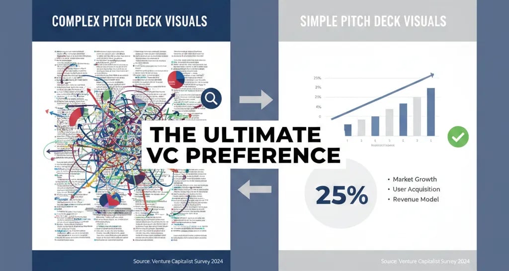
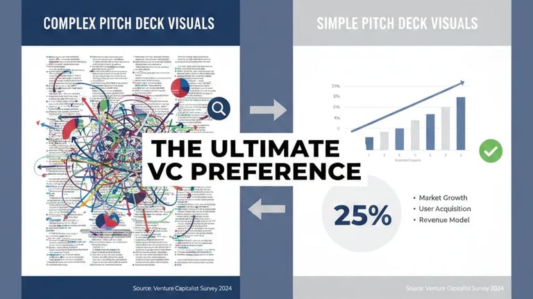
Here is the comparison between complex and simple slides:
Complex Slides (4+ elements)
Time to Core Message: 7–10 seconds
VC Emotional Response: "This is messy"
Outcome: Mental disengagement
Simple Slides (1 headline + 1 visual)
Time to Core Message: 1–2 seconds
VC Emotional Response: "I see the bet"
Outcome: Forward momentum
Every second of unnecessary parsing subtracts from the time a VC spends in conviction-building mode. Conviction is what gets you to a Term Sheet. Confusion does not.
The VC-Ready Visual Protocol: How to Strip a Slide to Its Highest-Value Form
The fix is structural, not cosmetic. Do not simply remove elements. Rebuild the slide around a single cognitive objective.
Weak Version — Problem Slide:
Title: "The Fragmented Healthcare Data Landscape"
Body: A circular ecosystem map with seven nodes, three callout boxes, two percentage stats, and a footer attribution
Result: The VC sees a market map, not a problem. They are now thinking about competitors, not pain.
VC-Ready Version — Problem Slide:
Title (the problem, stated as a fact): "Hospital finance teams manually reconcile $4.2M in claims errors per year with no audit trail."
Visual: One supporting image or a single-line chart showing the cost trajectory
Source: One credible, current citation in 8pt font at the bottom
Result: The VC sees a specific, expensive, urgent problem. They are now thinking about the business.
The framework to apply before every visual decision:
State the slide's single job — What is the one thing a VC must believe after seeing this slide?
Remove everything that does not serve that job — Not reduce. Remove.
Test the headline in isolation — If the headline alone does not communicate the point, the visual is compensating for a weak argument. Fix the argument first.
Apply the "10-foot rule" — If you cannot read the core message from 10 feet away on a projected screen, the font hierarchy is wrong.
Validate the visual metaphor — Does the chart, icon, or image reinforce the claim or illustrate it? Reinforcement (showing the data that proves the claim) is always stronger than illustration (a generic image that decorates the claim).
The Rule of One: Every slide in your Problem and Solution sequence should have one headline, one supporting visual or data point, and one takeaway. Founders who violate this rule are not adding value — they are adding doubt.
Three Overcorrection Traps That Will Still Kill the Deck
1. Stripping to the point of vagueness. Simple does not mean empty. "Healthcare billing is broken" is not a Problem slide — it is a platitude. The headline must be specific and financial. "Broken" costs nothing. "$4.2M in manual reconciliation errors per year" costs something.
2. Using white space as a substitute for clarity. A sparse slide with a weak argument is still a weak argument. Minimalism is not the goal. Precision is.
3. Applying consumer design principles to investor documents. A beautifully branded slide with gradient overlays and custom iconography may look polished on Behance. In a Series A pitch, it reads as a founder who optimised for aesthetics over fundamentals — which is the exact opposite of what a capital-efficient operator looks like.
What Fixing Your Visual Hierarchy Is Actually Worth at the Negotiating Table
A Problem slide that communicates in two seconds versus nine seconds does not just feel better — it changes the meeting dynamic. The VC who understands your problem by slide 2 is in conviction mode by slide 5. The VC who is still parsing your ecosystem map at slide 4 is already composing their pass email. In a $22M–$28M pre-money Series A environment (the current US median for 2025), the difference between a meeting that builds conviction and one that stalls on clarity is not a rounding error — it is the deal itself.
This slide-level decision is one component of a full pitch architecture. For the complete structural system governing how your Problem and Solution slides work together as a fundraising instrument, the full framework is covered inside the definitive guide to Problem and Solution slide construction for Series A founders.
Every week your deck goes into a meeting with an over-engineered Problem slide is a week a VC files you under "unclear" — and that mental categorisation compounds. The Slide-By-Slide VC Instruction Guide inside the $5K Consultant Replacement Kit was built to eliminate this exact failure mode, with a visual audit protocol for every slide in your deck. The full Kit is $497. You can access it and pressure-test your current Problem slide visuals at the pitch deck resource built for founders who need VC-standard output without the $5K consulting retainer.
Funding Blueprint
© 2026 Funding Blueprint. All Rights Reserved.