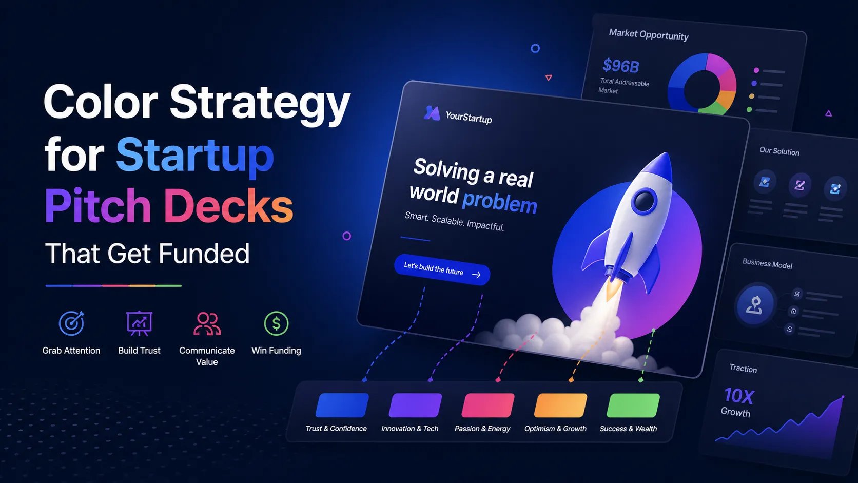
Color Theory & Visual Branding: The Subconscious Architecture of Trust

Master the subconscious architecture of trust. Learn how color theory and visual branding influence VC conviction and reduce cognitive friction in your 2025 pitch deck.

PILLAR 6: DESIGN PRINCIPLES

12/24/20256 min read

Strategic color theory and visual branding guide for venture capital pitch decks.

Color Theory & Visual Branding: The Subconscious Architecture of Trust

In the venture capital arenas of London, New York, and San Francisco, an investor makes a subconscious judgment about your startup’s "DNA" within the first seven seconds of opening your deck. While your metrics provide the logical proof, your Visual Branding—specifically your use of Color Theory—provides the emotional context.

The brutal truth? Color is a shortcut to credibility. If you use the wrong palette, you trigger a "Mismatched Signal." For example, using neon "Hype" colors for a high-security Fintech firm in London signals recklessness. Using muted, "Legacy" colors for a disruptive AI startup in San Francisco signals a lack of innovation. In 2025, with capital being more discerning than ever, your brand must "look" like the future you are describing.

This sub pillar is part of our main PILLAR 6 — DESIGN PRINCIPLES

Key Takeaways: The Branding Power-Law

  • Color as Cognitive Shortcut: Colors trigger immediate neurochemical responses (e.g., Blue for Trust, Red for Urgency).

  • The 60-30-10 Rule: Optimize your deck’s visual balance: 60% neutral background, 30% secondary brand color, and 10% high-contrast accent color.

  • The "Industry-Standard" Anchor: Align with your sector’s primary color expectations to reduce "Cognitive Friction," then use accents to differentiate.

  • High-Contrast Accessibility: Ensure your data is readable in any lighting—poor contrast signals a lack of professionalism.

  • Regional Calibration: SF favors bold, high-contrast palettes; London and Toronto respond to "Sophisticated Neutrals" that signal stability.

The Neuroscience of Color: How VCs "Feel" Your Data

When an investor looks at your deck, their brain isn't just reading text; it is reacting to wavelengths of light. Different colors activate specific parts of the brain involved in decision-making and risk assessment.

1. The Blue of "Institutional Trust"

Blue is the most common color in venture capital for a reason. It is a "Safe" color that lowers the heart rate and triggers feelings of stability and reliability.

  • Best For: B2B SaaS, Fintech, Healthcare, and Security.

  • The Signal: "We are a safe pair of hands for your $10M."

2. The Green of "Growth and Vitality"

Green is processed by the eye with the least amount of strain. It is naturally associated with health, money, and "Green-lighting" a project.

  • Best For: Sustainability, AgTech, and "Efficiency" tools.

  • The Signal: "This business is scalable and contributes to a healthier ecosystem."

3. The Black of "Authority and Premium"

A black-background deck (Dark Mode) signals high-tech, exclusivity, and authority.

  • Best For: DeepTech, AI, and High-End Consumer brands.

  • The Signal: "We are the 'Apple' of our category. We are sophisticated and expensive."

1. Building a "Venture-Scale" Palette: The 60-30-10 Rule

A common mistake founders make is "Color Overload"—using too many brand colors that compete for the investor’s attention. To maintain Cognitive Ease, you must follow a strict distribution:

  • 60% Neutral (Background): Usually White, Light Grey, or Deep Charcoal. This provides the "Whitespace" (Sub-pillar 14) that allows the eye to rest.

  • 30% Secondary (Hierarchy): Your primary brand color. Used for headers, icons, and secondary data bars.

  • 10% Accent (The "Aha!" Moment): A high-contrast color (like Orange, Bright Red, or Electric Lime). This is used only for your "North Star" metrics and the "Ask" on your final slide.

2. Sector-Specific Calibration: The "Category King" Palette

To build trust, your brand must first fit into the "Category" the investor expects, then demonstrate why it is the "King."

The Fintech/Security Palette (London/NYC)

  • Colors: Navy Blue, Slate Grey, and Gold accents.

  • Why: It mirrors the aesthetics of established banks but with a modern, cleaner execution. It suggests "Innovation built on a foundation of Safety."

The AI/DeepTech Palette (SF/New York)

  • Colors: Deep Purple, Electric Blue, and Black.

  • Why: These colors are associated with the "Future," intelligence, and mystery. It signals that you are working on the "Frontier" of technology.

The Consumer/Social Palette (Global)

  • Colors: Warm Oranges, Corals, and Soft Yellows.

  • Why: These trigger "Dopamine" and feelings of community and friendliness. It signals "High Adoption" and user-centricity.

3. Visual Branding as "Integrity": Consistency is Key

In 2025, branding is a proxy for Operational Grip. If your logo is a slightly different shade of blue on Slide 5 than it is on Slide 1, an investor’s subconscious flags it as "Unreliable."

  • The Style Guide: Create a simple 1-page "Deck Style Guide" with your Hex Codes (e.g., #0055FF). Ensure every chart, line, and icon uses these exact codes.

  • The Typography Link: Your color palette must work in tandem with your Typography (Sub-pillar 13). Ensure your accent color is used to highlight the "Assertion" in your headers.

  • The Signal: Total consistency across 15 slides tells the investor, "If they are this disciplined about their brand, they are this disciplined about their code and their margins."

4. The "Dark Mode" Debate: When to Use a Black Background

"Dark Mode" (White text on a Black/Charcoal background) has become the standard for high-growth tech pitches in San Francisco. However, it is a high-risk/high-reward strategy.

  • The Reward: It looks modern, premium, and helps vibrant data visualizations "pop." It is perfect for iPad and Laptop viewing.

  • The Risk: It can be difficult to read if the investor is in a brightly lit boardroom or if they print the deck (yes, some London VCs still print decks).

  • The Fix: If you go Dark Mode, ensure your contrast ratio is at least 7:1. Use "Off-Black" (e.g., #121212) rather than pure black to reduce eye strain.

5. Data Visualization and Color: The "Honesty" Filter

Color is often used (unintentionally or otherwise) to manipulate data perception. In the forensic cultures of the UK and Canada, "Color Crimes" can end a deal.

The "Neutrality" Rule

Don't use Red for your "Losses" and Green for your "Gains" if you are trying to hide a trend. Investors are trained to see through this.

  • The Best Practice: Use a single color for your traction bars, but use your Accent Color to highlight the most recent month of growth. This tells the story of "Forward Momentum" without looking like a "Stop/Go" light.

The "Competitive" Color Hack

On your competition slide, use a muted "Grey" for all competitors and your Primary Brand Color for your own logo.

  • The Result: Subconsciously, the investor begins to view the competitors as "The Past" (The Shadow) and your company as "The Present/Future" (The Light).

6. Regional Calibration: Cultural Color Cues

  • San Francisco: High tolerance for "Neon" and "Electric" colors. They want to feel the energy. Boldness is a signal of "Outsized Ambition."

  • London & Toronto: High preference for "Earth Tones" and "Institutional Neutrals." They value "Sophistication." Overly bright colors can be perceived as "Juvenile" or "Hype-driven."

  • New York: Prefers "High-Contrast Monochrome" (Black/White) with a single, sharp accent (like Red or Royal Blue). It signals "Efficiency" and "No-Nonsense" professionalism.

The "Trench" Report: The $10M "Color Reset"

I once worked with a Healthcare SaaS company in Toronto. Their deck was using a bright, aggressive "Fire-Engine Red" as their primary brand color. They were struggling to close their Series A.

The Audit: Red triggers "Threat" and "Danger" responses. In a Healthcare context, it reminded investors of "Emergency Rooms" and "Risk." The Fix: We pivoted their palette to a Deep Teal and Soft Sage. Teal combines the trust of Blue with the growth of Green. The Result: The "Feel" of the deck changed from "Panic" to "Precision." They didn't change a single metric, but they closed their round three months later. The investors finally "felt" that the business was stable enough to scale.

Expert FAQ: Masterclass in Branding

Does my deck have to match my website perfectly?

Yes. In the "Due Diligence" phase, an investor will move between your deck, your website, and your LinkedIn. If the branding is inconsistent, it creates Cognitive Dissonance. It makes the company feel "unfinished."

What is the best accent color for a "Call to Action"?

Orange or "Electric Blue." These colors have the highest "Click-through" rates in UI design because they stand out against neutral backgrounds without the "Stop" signal of Red.

Should I use gradients in my pitch deck?

Use them sparingly. Soft gradients can add "Semantic Depth" (Sub-pillar 11) to icons, making them look like a modern app. However, heavy gradients on text or backgrounds make a deck look like a 2005 PowerPoint. Keep it "Flat" and "Minimal."

How do I choose a palette if I'm colorblind-aware?

Use tools like Adobe Color or Coolors to check for "Colorblind Safe" palettes. This is not just a moral choice; it’s a strategic one. Statistically, roughly 8% of male VCs (the majority of the current partner demographic) have some form of colorblindness. If they can’t distinguish your "Growth" bar from your "Churn" bar, you lose the deal.

Summary Checklist: The Branding Audit

  • 60-30-10 Rule: Is your deck dominated by whitespace/neutral tones?

  • Consistency: Are the Hex codes identical on every single slide?

  • Contrast: Is your text easily readable on a small phone screen?

  • Industry Signal: Does your palette match the "Vibe" of your sector?

  • The "North Star" Accent: Is your most important metric the most colorful thing on the slide?