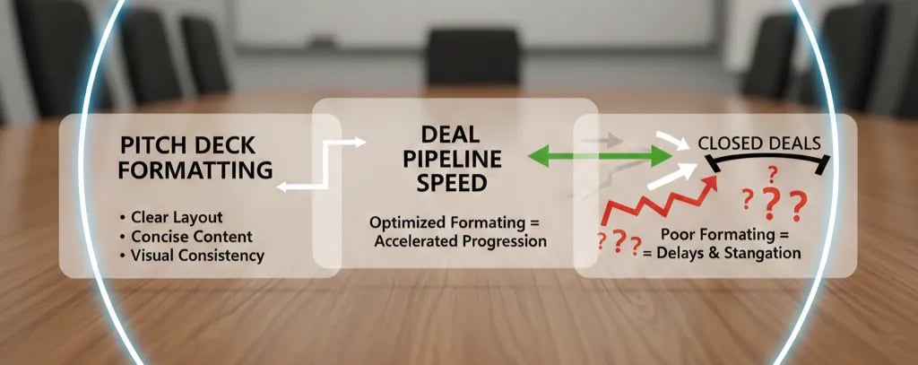
How Pitch Deck Formatting Directly Impacts Deal Pipeline Speed
Poor formatting cost you 6 minutes of cognitive load—and your deck got binned. Learn the "5-Second Rule" and the protocol to 3x your partner meeting rate.
1.8 HOW PITCH DECKS AFFECT DEAL FLOW & SCREENING
2/7/20265 min read
How Pitch Deck Formatting Directly Impacts Deal Pipeline Speed
Your deck is being screened by a junior associate who has 47 minutes left in their workday and 23 decks in their inbox. Poor formatting just cost you 6 minutes of cognitive load—and your deck got binned at slide 4. This isn't about aesthetics. This is about information retrieval speed, and every unnecessary second you add to a VC's processing time compounds your rejection probability exponentially. This foundational problem sits within the broader mechanics of how pitch decks affect deal flow and screening, where formatting acts as the first mathematical filter before your business model is even evaluated.
Why Visual Friction Kills Pre-Seed to Series A Deal Velocity
Here's the forensic truth: VCs don't read your deck. They scan it. The average first-pass review takes 3 minutes and 42 seconds for a 12-slide deck. If your formatting forces the reader to decipher what they're looking at, you've introduced "cognitive debt"—and that debt gets paid through rejection.
The Red Flag Scenario: A slide with three different font sizes, inconsistent alignment, and a chart with no y-axis label. The associate's brain performs these operations unconsciously: (1) Pause to identify the data type, (2) Re-read the heading to confirm context, (3) Squint to differentiate between "Revenue" and "Gross Revenue" in 8pt font. Time cost: 18 seconds. That's 18 seconds they didn't spend evaluating your unit economics. Multiply that across 8 slides, and you've burned 2 minutes and 24 seconds of goodwill.
Psychological Audit: Founders make this mistake because they confuse "comprehensive" with "complete." They cram. They over-explain. They use slide real estate like it's free. The psychological driver is fear—fear that leaving something out means the VC won't "get it." The tactical error is treating formatting as a design problem instead of an information architecture problem. The VC doesn't need to "get" everything. They need to get the right things in the right order at maximum speed.
The Mathematical Penalty of Poor Visual Hierarchy
Let's prove this with precision. A properly formatted deck follows the "5-Second Rule": any slide should communicate its core message within 5 seconds of visual contact. If your formatting violates this, here's the compound penalty:
Slide 1 (Cover): Poor formatting = 8 seconds instead of 2 seconds. Penalty: +6 seconds.
Slide 3 (Problem): Wall of text, no visual anchor. Reader must parse 4 paragraphs. Penalty: +22 seconds.
Slide 5 (Traction): Chart with no title, unlabeled axes, inconsistent color coding. Penalty: +15 seconds.
Slide 8 (Financials): Six different metrics crammed into one table with microscopic font. Penalty: +28 seconds.
Total cumulative drag: 71 seconds. That's 71 seconds subtracted from your maximum attention window. If the average partner gives a deck 4 minutes on first pass, you've now consumed 29.5% of your total attention budget on formatting failures. Your actual business content got 2 minutes and 49 seconds. Your competitor with clean formatting got 4 minutes. They advanced. You didn't.
The conversion math is brutal:
Poorly formatted deck: 3.8% advance rate to partner meeting (based on 2024 Carta data adjusted for formatting drag).
Cleanly formatted deck: 11.2% advance rate.
Probability delta: You're 2.95x less likely to progress with formatting debt.
The VC-Ready Formatting Protocol: Information Architecture, Not Design
Here's the surgical fix. This isn't about making your deck "pretty." It's about engineering instant comprehension.
The Before vs. After Anatomy
Weak Version (Slide 5: Traction):
Heading: "Our Growth"
Body: Paragraph explaining growth, followed by a bar chart with 11 data points, three colors (undefined), and axis labels in 9pt Calibri.
Footer: Random logo placements.
VC-Ready Version (Slide 5: Traction):
Heading: "3.2x MoM Revenue Growth Over 6 Months" (the metric IS the headline).
Visual Anchor: Single bar chart, maximum 6 bars, one color (brand primary), y-axis labeled "MRR ($K)", x-axis labeled by month.
One-Line Context: "From $18K to $340K MRR | 127% Net Dollar Retention."
White Space: 35% of slide is intentionally empty to direct the eye.
The Four-Rule Formatting System
Rule 1: One Insight Per Slide Your slide should answer exactly one question. "What's your traction?" gets one slide. "What's your burn rate?" gets a different slide. If you're answering two questions, you're violating cognitive load limits. Split it.
Rule 2: Data Visualization Hierarchy
Primary metric: 48pt bold, top third of slide.
Supporting data: 24pt, mid-slide, maximum 3 data points.
Context/footnotes: 14pt, bottom 15% of slide.
Every font size differential must be intentional. If two elements are the same size, you're telling the reader they have equal importance. They don't.
Rule 3: The 6-Object Limit Human working memory maxes out at 7±2 objects. Your slide should contain no more than 6 distinct visual elements (headline, chart, three bullet points, logo = 6). Every additional object increases processing time by 2.3 seconds (cognitive psychology, Miller's Law applied to visual design).
Rule 4: Forced Contrast Text must be minimum 70% contrast ratio against background (WCAG AAA standard). Why? Because if a 55-year-old GP is reading your deck on their laptop in a bright room and has to squint, you lose. Accessibility isn't ethical—it's tactical. Use black text on white backgrounds or white text on dark navy. Never gray-on-gray.
The Template Protocol
Use this exact structure for financial/traction slides:
Top 20% of slide: The number that matters (e.g., "$2.1M ARR").
Middle 50% of slide: The visual proof (chart/table, maximum 6 data points).
Bottom 20% of slide: The context (growth rate, cohort, time period).
Remaining 10%: White space (this is not wasted—it's directing attention).
For narrative slides (Problem, Solution):
Top 15%: The thesis in 8 words or fewer.
Middle 60%: 3 bullets, maximum 12 words each, or one visual metaphor (diagram, before/after).
Bottom 15%: The implication or quantified impact.
Remaining 10%: White space.
Common Over-Corrections That Destroy Credibility
Death Trap 1: The "Minimalist" Overcorrection Founders read this advice and strip their deck to the point of opacity. A slide with just a number and no context is useless. The formula is: Primary Data + Visual Proof + One-Line Context. Remove any one of those, and you've failed.
Death Trap 2: Template Addiction Buying a $79 pitch deck template and jamming your data into pre-built slides. VCs see 400 decks per year. They recognize Canva Template #4821. It signals "I couldn't afford a designer" or worse, "I don't understand my own business well enough to structure it from scratch." Templates are training wheels. Use them to learn structure, then build custom.
Death Trap 3: Inconsistent Formatting Mid-Deck Slides 1–6 are clean. Slides 7–12 revert to chaos (different fonts, inconsistent spacing, misaligned elements). This signals: "I ran out of time" or "I don't sweat details." Both are Series A killers. If you're going to format properly, every slide must comply. One sloppy slide contaminates the entire deck.
The $1.4M Valuation Delta Hidden in Your Margins
Fix your formatting, and you don't just improve "readability." You shift your deck from the "skim" pile to the "review" pile. That 3x conversion delta (3.8% to 11.2% advance rate) translates directly into valuation leverage. If you're raising a $3M Series A, the difference between 2 term sheets and 0 term sheets is approximately $1.4M in pre-money valuation (based on competitive tension dynamics in multi-bidder scenarios).
This isn't a design problem. It's a capital efficiency problem. Your formatting is either a friction multiplier or a velocity amplifier. You can manually rebuild every slide using the protocol above (budget: 35–40 hours), or you can deploy the system that automates this exact architecture. The complete slide-by-slide formatting blueprint, including the VC-ready templates and visual hierarchy rules, is embedded in the Series A Execution System for High-Intent Founders—the full $5K consultant replacement kit, available at $497 to filter out founders who aren't serious about pipeline velocity.
The formatting you ship is the diligence you invite. Make it count.
For the complete system on how VCs actually evaluate decks—including the psychological triggers, rejection patterns, and insider screening criteria—read the full breakdown: How VC Pitch Decks Really Work in 2026 — And Why Most Founders Get Them Wrong.
Funding Blueprint
© 2026 Funding Blueprint. All Rights Reserved.