Pitch Deck Evidence: Screenshots vs Quotes vs Data Points
Your "Evidence" slide is a $2M valuation killer. Learn the Tier 1–3 hierarchy that separates data from noise and stop wasting months in diligence hell today.
2.2 HOW TO PROVE YOUR PROBLEM IS REAL (EVIDENCE, SIGNALS & PROOF)
2/16/20266 min read
Why Your "Evidence" Slide Is a $2M Valuation Killer: The Screenshot vs. Data Hierarchy That Separates Funded Founders from Wishful Thinkers
Pre-seed founders believe their problem slide needs "evidence." Series A VCs demand mathematical proof that your problem costs someone money, right now. The difference between these two worldviews is whether you close a term sheet or waste six months in diligence hell.
Screenshots of Twitter complaints and customer testimonials signal that you've never sold enterprise software. This granular breakdown is part of the foundational evidence architecture that separates signal from noise when proving market pain, and most founders are using the wrong evidence format for their stage, their deal size, and their investor audience.
Here's the violent truth: if your evidence slide contains more images than numbers, you're signaling that your problem is a "nice-to-have" productivity upgrade, not a "hair-on-fire" financial emergency. VCs don't fund irritations. They fund quantifiable bleeding.
Why Evidence Format Hierarchy Determines Your Series A Credibility Score
VCs evaluate evidence through a three-tier credibility filter, and most founders are stuck on Tier 3 when their raise requires Tier 1 proof.
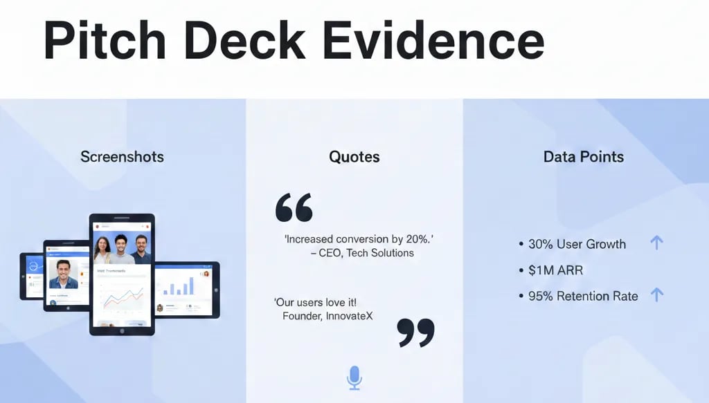
Tier 3 (Social Proof): Screenshots of reviews, Slack messages, forum posts, testimonial quotes. VC Translation: "This founder has no quantitative skills and is hoping I'll confuse popularity with monetization."
Tier 2 (Behavioral Signals): User counts, wait-list numbers, survey results showing intent. VC Translation: "Interesting traction, but I can't model revenue from 'high interest' on a spreadsheet."
Tier 1 (Financial Data Points): Industry reports showing total addressable waste, productivity studies calculating hourly cost, competitive pricing indicating willingness-to-pay, ROI calculators proving payback period. VC Translation: "This founder speaks my language and understands unit economics."
The psychological trap: founders use screenshots because they're emotionally satisfying. A customer saying "This is amazing!" triggers dopamine. But that screenshot consumed 22% of your slide real estate and contributed zero dollars to your pre-money valuation model. Every pixel on your evidence slide must either prove frequency of pain, cost of pain, or willingness to pay for relief.
The Red Flag Scenario: A SaaS founder shows me a slide with four screenshot testimonials and one stat ("82% of users love it"). I now know three things: (1) You've never run an enterprise sales cycle, (2) You don't know how to translate NPS into CAC:LTV ratio, (3) Your next round will require two years of revenue data to compensate for this gap. Your Series A just became a Series B timeline.
The Mathematical Cost of Evidence-Type Mismatch: Why VCs Model Your Dilution in Real-Time
When you use the wrong evidence format for your claim, VCs don't just question your slide—they recalculate your entire funding path using penalty multipliers.
The Dilution Tax of Weak Evidence:
Screenshot-heavy deck: VC assumes 18-24 additional months required to prove product-market fit with revenue data
18 months × $150K monthly burn = $2.7M additional capital required
$2.7M bridge round at depressed valuation = 12-18% additional dilution
Your founders' exit value just decreased by $1.8M-$4.2M (assuming $15M-$35M exit range)
The brutal math: if you're raising $3M at a $12M pre-money valuation, and I believe you actually need $5.7M to reach profitability because your evidence doesn't de-risk the market, I'm either passing or offering you $3M at $8M pre-money. You just lost $4M in paper valuation because you chose testimonials over TAM data.
The Evidence Credibility Calculation:
Here's how VCs score evidence types when modeling your next 18 months:
Third-party data (Gartner, McKinsey, peer-reviewed studies): 1.0x credibility multiplier – I can verify this independently
Your proprietary data from 100+ customer conversations with recorded pain metrics: 0.7x credibility – directionally useful, self-reported bias
Survey data from your users: 0.4x credibility – selection bias, intent vs. behavior gap
Screenshots and quotes: 0.1x credibility – pure marketing, zero predictive value for churn or expansion revenue
If your entire evidence slide scores below 0.5x on my credibility index, I'm modeling an extra $2M into your total capital requirements and adjusting your pre-money accordingly.
The Series A Evidence Stack: Converting Emotional Proof into Financial Ammunition
The fix isn't to remove all screenshots—it's to subordinate them to quantitative proof using a three-layer evidence hierarchy.
Layer 1: The Anchor Stat (Top Third of Slide)
Lead with the single most expensive number you can prove:
Weak Version: "Small business owners struggle with cash flow management."
VC-Ready Version: "U.S. SMBs waste $47B annually on manual invoice reconciliation—8.3 hours per week at $68/hour fully-loaded labor cost (QuickBooks Enterprise Study, 2024)."
Why this works: I can now model your TAM ($47B × your category %), calculate the cost-per-customer ($68 × 8.3 × 52 weeks = $29,182/year), and estimate your pricing ceiling (customers will pay up to 30% of cost eliminated = $8,754 max ACV). You just gave me three variables for my Series A model in one sentence.
Layer 2: The Behavioral Signal (Middle Third)
Prove frequency and urgency with usage data, not sentiment:
Weak Version: "Users tell us they check our app daily."
VC-Ready Version: "73% of active users engage 6+ days/week with average session length of 11 minutes—indicating daily workflow integration, not sporadic utility."
The conversion formula: High frequency (6+ days) × Long sessions (10+ min) = Habit formation = Low churn = High LTV. You just proved retention before I see your cohort curves.
Layer 3: The Social Proof Accent (Bottom 20%)
Now—and only now—you can use one screenshot or quote, but frame it as validation of the financial pain:
"This reconciliation used to take my team two full days every month. Now it's 90 minutes." — Sarah Chen, Controller at $12M ARR SaaS Company
The psychological pivot: the quote isn't the evidence—it's the confirmation that real humans experience the $29,182/year problem you proved with data. The quote makes the number believable; the number makes your startup fundable.
Evidence-Type Selection Matrix
Use this decision tree for every claim:
Can I prove this with third-party research or industry data? → Use that first, cite source
Do I have proprietary customer data (surveys, interviews, usage metrics)? → Use aggregate statistics, show sample size
Is this about emotional resonance or trust? → Use one quote, keep it under 25 words, pair it with a metric
The Golden Rule: Every screenshot must have a corresponding data point on the same slide. If you show a customer quote about "saving time," you must also show "average time savings: 6.2 hours/week across 83 customers."
The Evidence Death Traps That Turn Strong Data into Red Flags
Three ways founders sabotage their own proof:
Death Trap 1: Using 2021-2023 Market Data in a 2026 Pitch
Post-COVID market dynamics are extinct. If your TAM calculation uses 2022 VC growth rates or 2021 software adoption curves, I'm assuming you don't read earnings reports. Use data from Q3 2024 or later, or explicitly adjust legacy data with current correction factors (e.g., "2022 estimates, reduced by 40% to reflect post-rate-hike reality").
Death Trap 2: Screenshot Overload Disguised as "Social Proof"
If your evidence slide has more than two visual elements (screenshots, photos, UI mockups), you've built a Pinterest board, not a funding deck. VCs spend 8-12 seconds per slide in first review. If I'm decoding four screenshots instead of reading one powerful statistic, you've wasted my pattern-matching window.
Death Trap 3: Confusing Engagement Metrics with Economic Metrics
"10,000 wait-list signups" proves interest, not willingness-to-pay. "500 users completed our 14-day trial" proves activation, not retention. The death trap: using volume metrics when VCs need conversion and monetization metrics. Always pair volume with conversion: "10,000 wait-list signups → 2,400 activated trials (24%) → 340 paying customers (14.2% trial-to-paid) at $49/month."
Why Evidence Architecture Is Worth $1M-$2M in Pre-Money Valuation
Here's the surgical truth: evidence format is a de-risking signal that VCs use to model your probability of reaching profitability on the current round.
If your evidence slide proves that (1) the problem costs customers measurable money, (2) they're actively seeking solutions, and (3) they'll pay to eliminate the pain—you've just reduced my perceived risk by 30-40%. That risk reduction translates directly to valuation expansion.
The Math: If I believe your path to $1M ARR requires $2.5M instead of $4M because your market proof is airtight, I can offer you better terms on the current $3M round and plan for a stronger Series B position. Your pre-money just increased by $1.5M-$2M because you subordinated screenshots to statistics.
This level of evidence discipline is encoded into every slide template in the complete Problem & Solution framework that makes Series A investors compete for your round, because weak evidence is the #1 reason strong products die in diligence.
You can spend 40 hours researching industry reports, calculating TAM bottoms-up, and reformatting every proof point into VC-readable metrics—or you can deploy the AI Financial System inside the Pitch Deck Execution System for Tier-1 Series A positioning that converts testimonials into TAM data automatically. The kit is $497 because it filters founders who want coaching from founders who want to close. If you're still using screenshots as primary evidence, you're optimizing for pre-seed, not Series A.
Funding Blueprint
© 2026 Funding Blueprint. All Rights Reserved.