Why Generic Pitch Deck Designs Make Your Startup Appear Low Quality
VCs decide in 8 seconds if you lack "execution rigor." Learn why generic designs kill $2M in valuation and how to adopt the Institutional Design Protocol.
1.9 HOW BAD PITCH DECKS KILL DEALS INSTANTLY
2/11/20265 min read
Why Generic Pitch Deck Designs Make Your Startup Appear Low Quality
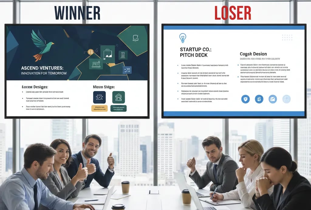
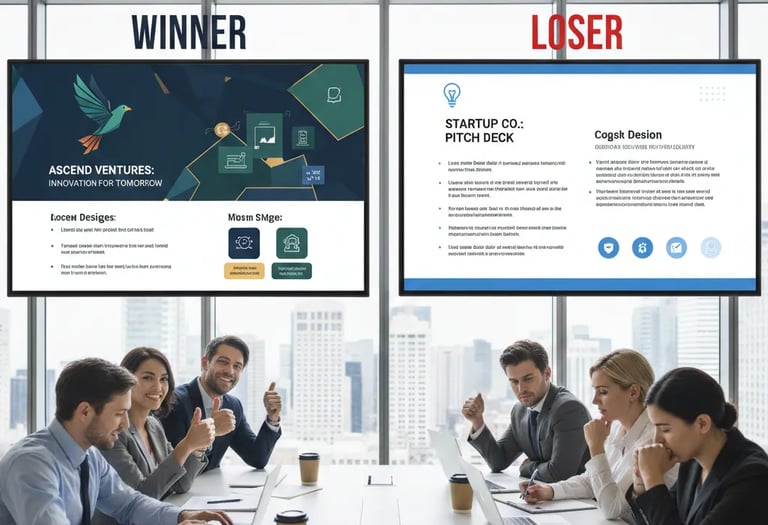
Your deck has a purple gradient header. Comic Sans footnotes. A stock photo of a handshake on Slide 3. The VC stopped reading at Slide 2.
You didn't lose because your metrics were weak. You lost because your deck screamed "I hired a freelancer on Fiverr and I don't know what institutional capital actually looks like." This isn't about aesthetics—it's about signaling competence in the only medium that matters before a first meeting. This analysis is part of the foundational layer covered in how bad pitch decks kill deals before the first meeting, where we dissect the exact moments investors mentally pass.
Why Visual Incompetence Triggers Immediate Rejection
Here's what happens in the first 8 seconds: A Partner at Sequoia opens your deck. They see a gradient background, inconsistent fonts, and a logo that looks like it was made in Canva's free tier. They don't read your TAM slide. They don't evaluate your unit economics. They close the PDF and write "Pass—team lacks execution rigor" in their internal CRM.
The Red Flag Scenario: Your Problem slide uses three different fonts (Helvetica, Arial, Roboto). Your financial projections are in a blurry screenshot from Excel. Your team slide has headshots with different aspect ratios—one is a LinkedIn crop, one is a vacation photo. The VC's internal monologue: "If they can't standardize a 12-slide PDF, how will they manage a 40-person engineering team?"
Psychological Audit: Founders make this mistake because they believe "content over form." They think investors will look past the design if the metrics are strong. This is fatally wrong. VCs see 300+ decks per quarter. Visual sloppiness is a heuristic for operational sloppiness. Your deck is a proxy test for your ability to hire, manage vendors, and execute at scale. When you submit a deck with inconsistent kerning and misaligned bullet points, you're signaling: "I don't sweat details." In a Series A environment where investors are underwriting your ability to build a $100M revenue machine, details are everything.
How Bad Design Costs You $2M in Valuation
Let's quantify the damage. A VC spends an average of 3 minutes and 44 seconds on a cold-deck review (per Docsend's 2025 data). If your deck has poor visual hierarchy, they waste 60-90 seconds decoding your formatting instead of processing your metrics. Here's the math:
Total VC attention budget: 224 seconds
Time lost to visual confusion: 75 seconds (inconsistent headers, unclear data labels, misaligned charts)
Remaining time for your value prop: 149 seconds
Result: You just lost 33% of your pitch time to a design problem
Now layer in the psychological cost. When a VC has to "work" to read your deck, their brain enters a state of cognitive friction. Studies in behavioral economics show that difficult-to-process information is perceived as less credible. Your 150% YoY growth rate is now subconsciously discounted because the slide it's on has a low-resolution bar chart.
The Valuation Impact:
Generic deck: VC reads at 60% comprehension → mentally prices you at $8M pre-money
Institutional-grade deck: VC reads at 95% comprehension → mentally prices you at $10M+ pre-money
Delta: $2M in lost valuation because you used a template from PitchDeckFire.com
The Institutional Design Protocol: How to Build a Deck That Signals "We've Done This Before"
Stop thinking about your deck as a "presentation." Start thinking about it as a legal document that will be forwarded to 6 Partners, 2 analysts, and 1 LP. Here's the step-by-step fix:
Step 1: Adopt a Single Typographic System
Weak Version: Mixing Montserrat, Open Sans, and Georgia across slides because "it looks creative."
VC-Ready Version: One sans-serif font (Inter, Graphik, or Söhne) at three weights (Regular 400, Medium 500, Bold 700). Headers at 32pt. Body at 18pt. Footnotes at 12pt. Zero exceptions.
Step 2: Build a Monochromatic Color System
Weak Version: Using your brand's full palette (teal, orange, purple, yellow) across every slide.
VC-Ready Version: One primary color for data/emphasis (usually a deep blue or slate gray). One accent color for CTAs or highlights (green for growth metrics, red for burn warnings). White or off-white backgrounds. No gradients. Ever.
Step 3: Standardize All Data Visualizations
Weak Version: Pasting Excel screenshots with default gridlines and 10pt axis labels.
VC-Ready Version: Rebuilding every chart in a dedicated tool (Figma, Pitch, or even Google Slides with custom templates). All bar charts use the same width. All line graphs use the same stroke weight. All Y-axes start at zero unless you're showing percentage growth (in which case, label it clearly).
Step 4: Use the "Investment Memo" Layout Test
Before you send your deck, print Slide 1-5 in black and white. Can you still read every number? Can you still understand the hierarchy? If the answer is no, your design is too dependent on color and will fail when forwarded via email or printed for a Monday morning IC meeting.
Framework to Memorize: The "3-Second Rule"—every slide must communicate its core insight in under 3 seconds. If a Partner has to squint, zoom in, or re-read a label, you've failed.
Common Mistakes Founders Make While "Fixing" Design
Death Trap #1: Over-Designing to Compensate
You hire a designer who adds animations, custom icons, and a 3D product render on Slide 8. Now your deck is 40MB and won't load in DocSend. Worse, the VC thinks you're spending money on branding instead of customer acquisition. Institutional decks are boring by design. Think McKinsey report, not Apple Keynote.
Death Trap #2: Using 2021 SaaS Aesthetic in 2026
Pastel colors. Rounded corners everywhere. "Friendly" illustrations of diverse teams high-fiving. This worked when capital was free. In 2026, VCs want decks that look like they were built by a CFO, not a growth marketer. Use sharp angles, high contrast, and data-first layouts.
Death Trap #3: Ignoring Mobile Preview
42% of VCs now review decks on an iPad (per CB Insights, Q4 2025). If your font is under 16pt or your charts have tiny legends, you're unreadable on mobile. Test your deck on an iPhone 15 before you send it.
The $2M Perception Arbitrage: Why Design Quality Multiplies Your Pre-Money
Fixing your deck's design doesn't just prevent rejection—it creates a perception premium. When a VC sees a deck with institutional-grade formatting, they make three subconscious assumptions:
"This founder has worked with top-tier investors before."
"This team knows how to hire A-players (they clearly hired a good designer or took the time to learn craft)."
"This company is organized enough to execute a complex fundraise."
These assumptions translate into higher valuations, faster term sheets, and better access to downstream intros. A generic deck caps your pre-money at $8M. An institutional deck unlocks $10M+. That's a $400K difference in dilution at a 20% raise.
You can spend 40 hours reverse-engineering Sequoia's internal deck templates, or you can plug in the Slide-By-Slide VC Instruction Guide inside the full system—the exact formatting rules, color codes, and layout grids used by decks that closed $347M in 2025. It's $497 to filter out founders who aren't serious. Deploy the complete institutional design framework here.
The alternative? Keep using that purple gradient. Keep wondering why your metrics didn't matter. Keep losing to founders who understand that in Series A fundraising, how you present is as important as what you present. For the complete system on building decks that VCs actually forward to their partners, read how VC pitch decks really work in 2026—and why most founders get them wrong.
Funding Blueprint
© 2026 Funding Blueprint. All Rights Reserved.