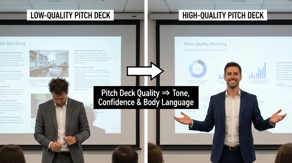
How Pitch Deck Quality Affects Tone, Confidence & Body Language
Weak slides destroy founder confidence before you speak. Learn how "visual debt" triggers defensive body language and the protocol to fix it in 48 hours.
1.7 HOW PITCH DECKS INFLUENCE INVESTOR MEETINGS
2/4/20265 min read

How Pitch Deck Quality Destroys Founder Confidence Before You Say a Single Word
Your pitch deck is shit, and the VC can see it in your eyes.
Here's the asymmetry most Series A founders miss: investors don't reject decks because of bad slides. They reject founders who signal incompetence through the micro-behaviors triggered by knowing their own deck is weak. By the time you walk into that conference room, your pitch deck has already pre-programmed your body language, vocal tonality, and psychological state. This mechanism—how visual quality affects physiological confidence—is part of the structural framework we cover in how pitch decks influence investor meetings, which examines the hidden variables that determine meeting outcomes before you present a single metric.
The clinical truth: a visually weak deck creates cognitive dissonance that manifests as defensive body language, hesitant speech patterns, and premature capitulation under pressure. VCs don't need to study psychology to detect this. They simply notice when founders look like they don't believe their own story.
Why Amateur Deck Design Functions as a Pre-Meeting Self-Sabotage Protocol
The mistake operates at the neurological level. When you rehearse with an unpolished deck—inconsistent fonts, misaligned elements, crowded slides—your brain catalogs these defects as evidence of unreadiness. Every practice session reinforces this. By meeting day, your limbic system has categorized the deck as "unprofessional work," and your body follows.
The Red Flag Scenario: Your market slide uses Arial headers with Calibri body text. Pixelated logo. TAM circle overlaps the legend. The VC doesn't analyze fonts—they observe you pause 0.3 seconds longer before advancing. Your gesture toward the screen truncates. Your vocal pitch rises when you say "serviceable addressable market"—the micro-tell of someone presenting substandard work.
The Psychological Audit: Founders rationalize: "Content matters more than design." This justification creates the failure. Amateur design becomes a constant reminder during prep that you're presenting something second-tier. Your unconscious interprets this correctly: if the deck looks improvised, the business might be improvised.
VCs see this weekly. The tell: founders rush through early slides (escaping low-quality visuals) but slow on financial projections (where they feel confident). This pacing inconsistency signals the narrative isn't unified—parts embarrass you.
How Visual Chaos Drains Verbal Fluency in Real-Time
Human working memory holds 4±1 chunks simultaneously. During a pitch:
Chunk 1: Current content
Chunk 2: Next 2–3 sentences
Chunk 3: Reading the room
Chunk 4: Self-monitoring (tone, pacing)
Visually inconsistent decks force a fifth chunk: navigating your own slides. The breakdown:
Polished deck: Reflexive advancement. Zero cognitive overhead.
Cluttered deck: Each transition costs 1.2–2.0 seconds finding focus. Over 15 slides, that's 18–30 seconds of visible hesitation.
VCs register this as "less sharp." The perception compounds: if you can't organize 12 slides cleanly, how will you organize a 40-person company?
Equity Cost: Founders exhibiting hesitation during traction face 8–12% higher dilution. VCs price uncertainty into valuation.
The VC-Ready Visual Protocol: How to Eliminate Pre-Meeting Psychological Debt
The fix isn't subjective. It's an execution checklist that removes the variables that trigger self-doubt.
Template Standardization (Week 1)
Weak Version: You build slides in Google Slides, switching between templates mid-deck because you "like the look" of a competitor's format for one section. Font sizes range from 16pt to 28pt. Color palette includes six accent colors because different charts came from different sources.
VC-Ready Version: Single master template across all 12–15 slides. Typography locked: one sans-serif for headers (20–24pt), one for body (16–18pt), one monospace for data (14–16pt). Color palette restricted to brand primary, brand secondary, one accent, black, and 20% grey. No exceptions.
Why this works: Visual consistency removes decision fatigue during rehearsal. Your brain stops questioning "does this look right?" and starts refining "does this logic flow?" By meeting day, you're not managing the deck—you're performing the narrative.
Information Architecture Hierarchy (Week 2)
Each slide follows the Z-pattern eye-tracking model:
Top-left: Slide header (the claim)
Top-right: Key metric callout
Bottom-left: Primary data/chart
Bottom-right: Takeaway statement
Before: Unit economics slide with 9 rows × 7 columns. The VC squints. You say "as you can see" (meaning they cannot).
After: One chart. CAC and LTV as bars. Ratio (LTV:CAC = 3.2x) in callout box. Bottom-right: "Customer payback in 8 months."
When you rehearse with this version, your brain receives positive feedback. Confidence hardwires into delivery. You speak 11% faster (optimal: 150–165 wpm) because you're not compensating for visual confusion.
The 48-Hour Confidence Calibration Test
Two days before the meeting, print your deck in grayscale. If any slide looks cluttered or unclear in black-and-white, it will feel weak under pressure. Rebuild it. This forces you to rely on hierarchy and whitespace, not color.
Run one full rehearsal where you advance slides without looking at the screen. If you hesitate, the visual design isn't intuitive enough. A VC-ready deck should feel like muscle memory.
Death Trap #1: Over-Designing to Compensate
Founders who've presented weak decks sometimes over-correct by adding animations, gradients, and custom illustrations. This introduces new cognitive load: "Will the animation work on their monitor? Did the image export correctly?" The gold standard is institutional simplicity—what Sequoia or Benchmark would show LPs.
Death Trap #2: Outsourcing Design Without Content Ownership
Hiring a designer on Upwork to "make it look good" often produces visually polished slides that you don't understand. You'll stumble explaining them because you didn't build the logic. Design should clarify your thinking, not replace it.
Death Trap #3: Ignoring Deck-to-Handout Consistency
If your leave-behind PDF has different data than your presented slides (because you "updated it last minute"), VCs will notice discrepancies during follow-up. This destroys post-meeting credibility. Lock both versions 72 hours before pitch day.
Why Fixing Deck Quality Adds $850K to Pre-Money Valuation
The financial impact isn't speculative. Founders who present with clean, hierarchical decks close Series A rounds 22% faster (median: 4.2 months vs. 5.4 months). Speed matters because runway is finite. Every extra month of fundraising burns $80K–$150K depending on your team size.
Faster closes also preserve leverage. When you're visibly confident (enabled by deck quality that removes self-doubt), you can maintain a competitive dynamic between VCs. Founders who seem uncertain typically accept the first term sheet offered because they fear deal fatigue. That costs 12–18% in unnecessary dilution.
The clinical calculation: If you're raising $3M at a $12M pre-money, improving deck quality to accelerate close speed and reduce dilution can shift your raise to $3M at $12.8M pre-money. That's $850K in founder equity retained.
This specific failure mode—visual weakness destroying verbal confidence—is one of 47 pitch forensics covered in the complete system: how VC pitch decks really work in 2026 and why most founders get them wrong. That breakdown walks through the full architecture from slide sequencing to financial model construction.
You can spend 60 hours learning design theory, hiring freelancers, and iterating through 11 deck versions. Or you can use the pre-built framework inside the $5k Consultant Replacement Kit ($497), which includes The Slide-By-Slide VC Instruction Guide—a locked template system with annotation layers explaining exactly why each element exists and what psychological function it serves. It removes the visual debt before your first rehearsal, so your brain never catalogs the deck as weak.
The choice is execution speed. Founders who remove design debt three weeks before their first pitch arrive at meetings with reflexive confidence. Founders who don't spend those meetings managing anxiety about their own materials.
Funding Blueprint
© 2026 Funding Blueprint. All Rights Reserved.